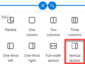
Vertical Section
Common Use Cases
- Quick links and navigation panels: display shortcuts, resources, contacts, or related links that stay visible alongside main content
- Announcements and callouts: highlight alerts, reminders, deadlines, or promotional content without interrupting the main page layout
- Contact and ownership info: show page owners, department contacts, help desk details, or How can we help panels
- Tools and widgets: surface weather, events, countdowns, Viva Engage, or embedded apps for fast access
- Branding and engagement elements: add visuals, campaign messaging, tips, or employee engagement components
Benefits
- Improved page structure: separates primary content from supporting information for cleaner, more readable pages
- Better visibility for important content: keeps key links and callouts in a consistent, high-attention area
- Enhanced intranet design: enables modern, magazine-style layouts without custom code
- Flexible and easy to update: supports most standard web parts and can be edited directly by page owners
- Fully out-of-the-box: no development or third-party tools required
Details
- Feature Category: Pages & Publishing
How It Works
- Pinned right column: a narrow column sits on the right side of a modern page, independent of the regular section layout
- Auto-sizing height: the section grows or shrinks automatically to match the length of the main page content
- Standard web parts: Quick Links, Text, Image, Events, and similar lightweight parts work best inside it
- Responsive behavior: on narrow browser windows the section moves below or above the main content instead of beside it
Limits and Nuances
- One per page: only a single vertical section is allowed, it always sits on the far right, and there is no left-side option
- No full-width pairing: Microsoft does not support a full-width section and a vertical section on the same page; adding a full-width section pushes the vertical section below it
- Mobile reflow: on phones and in narrow windows the section drops below or above the main canvas, and authors can choose which; never put content there that must appear first on a phone
- Desktop surprises: a browser window under roughly 1024 px wide or display scaling above 125 percent can push the section below the content even on a desktop
- Narrow by design: links, callouts, contacts, and small visuals fit; wide tables, large lists, and big images do not
- Width-hungry parts struggle: all web parts are technically allowed, but parts designed for width such as Hero and large galleries belong in the main canvas
- Deleting removes everything: removing the vertical section also removes the web parts inside it
- Less is more: overloading the section defeats its purpose; keep it to a handful of persistent, supporting elements so the page stays clear
Common Questions About the Vertical Section
What is the vertical section on a SharePoint page?
It is an optional narrow column that sits to the right of a modern page’s main content, acting as a fourth layout column outside the regular section grid. Page authors typically use it for content that should stay visible regardless of what the page is about – quick links, contacts, announcements, a countdown, or a help panel. It is fully out-of-the-box and requires no custom code.
Can I put the vertical section on the left side of the page?
No. SharePoint currently supports the vertical section only on the right side of the page, and only one per page. There is no setting to move it left or add a second one. If you need a left-hand panel look, the workaround is a multi-column section layout in the main canvas, though that content scrolls with the page rather than running alongside everything.
Why did my vertical section move below the page content?
That is responsive behavior, not a bug. When the browser window is narrower than about 1024 pixels – or Windows display scaling is set above 125 percent – SharePoint moves the vertical section below or above the main canvas. It returns to the right side when the window widens. You can choose top or bottom placement for small screens in the section’s Edit properties pane.
Which web parts work best in a vertical section?
Lightweight, narrow-friendly parts: Quick Links, Text, Image, Call to action, Events, Countdown Timer, People, and Weather all shine there. Technically every modern web part is allowed, but wide parts like Hero, large document libraries, or multi-column lists get cramped and hard to read. A good rule: if the content needs horizontal room to make sense, keep it in the main canvas.
Can I use a vertical section and a full-width section on the same page?
Microsoft does not support combining them. A full-width section spans the entire page edge to edge, which leaves no room for a right-hand column – so when both end up on a page, the vertical section gets pushed below instead of sitting alongside. Decide which layout matters more for the page: an edge-to-edge hero or a persistent side panel.
How is the vertical section used on real intranets?
Most commonly as the always-visible utility strip on a homepage: quick links to the tools employees open daily, the help desk contact, a compliance deadline countdown, or a small events list. In the intranet designs Greg, the SharePoint Maven, showcases on LookBook 365, the vertical section frequently carries exactly that supporting layer while news and hero content own the main canvas.