Divider Web Part
Benefits
- Improves readability: a simple horizontal line breaks long pages into clear, scannable blocks so each group of content stands on its own.
- Takes seconds to configure: just two sliders, length and weight, with a live preview as you drag.
- Keeps design consistent: with no color or style options, dividers look identical on every page across the intranet.
- Scales automatically: length is set as a percentage of the column, so the divider adapts to any section layout and screen width.
Settings
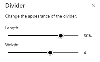
- Length: a slider from 20% to 100% of the column width; the divider previews the change live as you drag.
- Weight: a slider from 1 (thinnest) to 6 (thickest); this also previews live as you drag.
- That is the entire configuration: there is no color, style, or alignment option.
Limits and Nuances
- There is no color picker: the divider renders in a neutral line color you cannot change. If you need a colored separator, change the section background instead.
- Length is relative, not absolute: 100% means the full width of the column the divider sits in, so the same setting looks different in a one-column and a three-column section.
- It works in any section layout: the divider drops into any column of any section type and scales with the column width automatically.
- Vertical dividers are not supported: the web part only draws horizontal lines. To separate content side by side, use separate columns or sections.
- It is purely visual: the divider carries no text, link, or heading, so do not rely on it to structure or label content.
- Section backgrounds often separate content better: alternating section background colors create stronger visual zones with no extra web parts to maintain. Use the Divider for lighter breaks inside a zone.
Divider vs. the Alternatives
- Divider vs. section backgrounds: use the Divider for a light separation inside a section; use alternating section background colors when whole zones of the page should feel distinct.
- Divider vs. Spacer web part: the Spacer adds empty vertical space without a visible line; pick it when content needs breathing room rather than a printed boundary.
- Divider vs. a Text web part heading: if the break also needs a label, a heading in the Text web part communicates more than a bare line, and it shows up in the page structure.
Common Questions About the Divider Web Part
What does the Divider web part do in SharePoint?
The Divider web part adds a horizontal line between other web parts on a modern SharePoint page. Its only job is visual separation – it breaks a long page into readable blocks so each group of content stands on its own. It is one of the simplest out-of-the-box web parts, with just two settings: length and weight.
Can I change the color of the Divider web part?
No. There are only two controls – length and weight – with no color, style, or alignment option. The divider renders as a neutral line on every page. If you want a colored separation between content areas, the practical alternative is to give each page section a different background color, which creates a stronger visual break anyway.
What settings does the Divider web part have?
Exactly two. Length sets how wide the line runs, from 20% to 100% of the column it sits in, and weight sets the thickness on a scale of 1 (thinnest) to 6 (thickest). Both are sliders, and the divider updates live on the page as you drag them, so you can preview the result before saving. That is the entire configuration.
Can I make a vertical divider in SharePoint?
Not with this web part – the Divider only draws horizontal lines. SharePoint does not include an out-of-the-box vertical divider. The standard way to separate content side by side is to place it in separate columns within a section, or in separate sections with different background colors, which gives a similar visual effect without any custom work.
How do I add more visual structure beyond a single Divider?
Combine dividers with section backgrounds. Use a Divider for a light break between related web parts, and give whole zones of the page different section background colors when they should feel distinct. For a labeled break, add a heading in the Text web part so the structure also reads in the page outline. Together these give you flexible, consistent separation with no custom work.
When should I use a Divider instead of a section background?
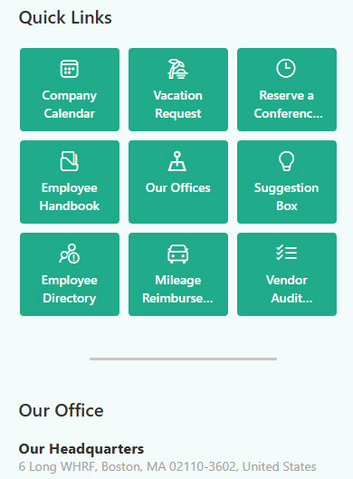
Use a Divider for a light break between related web parts inside the same zone, and section backgrounds when entire areas of the page should feel distinct. The polished intranet designs on LookBook 365 – built entirely out-of-the-box, the only way Greg Zelfond works – typically combine both: section backgrounds define the zones, and dividers fine-tune spacing within them. Divider Web Part Example Divider Web Part Example Divider Web Part Settings