Long-Form or Above the Fold? A Practical Guide for Your SharePoint Pages.
Posted on May 6, 2026
Long-form versus above the fold is not a layout decision – it’s a purpose decision. Above the fold wins for high-traffic intranet homepages and task-oriented landing pages, where the first screen is your most valuable real estate. Long-form wins for department sites, knowledge hubs, onboarding portals, and editorial newsletters, where users return repeatedly, and length is a feature, not a bug.
The short answer (in case you don’t want to scroll)
- Above the fold wins for high-traffic intranet homepages and task-oriented landing pages.
- Long-form wins for department sites, knowledge hubs, onboarding portals, and company news.
- The deciding factor is the page’s purpose, not your personal layout preference.
- Most healthy intranets use both – different page types, different rules.
Note: If you want the reasoning, keep reading – the rest of the post walks through when each layout earns its place.
What is “Above the Fold?”
The phrase “above the fold” comes from newspapers (remember them?). The front page was literally folded in half, and the stories on top sold the paper. Early websites adopted the idea because screens were small and the whole concept of scrolling was “new”.
Fast forward to today, and it is a completely different story. People scroll on their phones, even when they’re sitting on the toilet 😊. Scroll is no longer a barrier; it’s the default behavior.
So it is not uncommon to have web pages with infinite scrolls now (think Facebook feeds and LinkedIn). However, an intranet audience is different.
“Above the Fold” in SharePoint
Let me demonstrate the difference between the two layout options using one of my Intranet Homepage designs.
The image below depicts the Intranet Homepage design for an Insurance company. As you can see, there is a lot of content, including a nice hero with a mission statement, new events, links, etc.
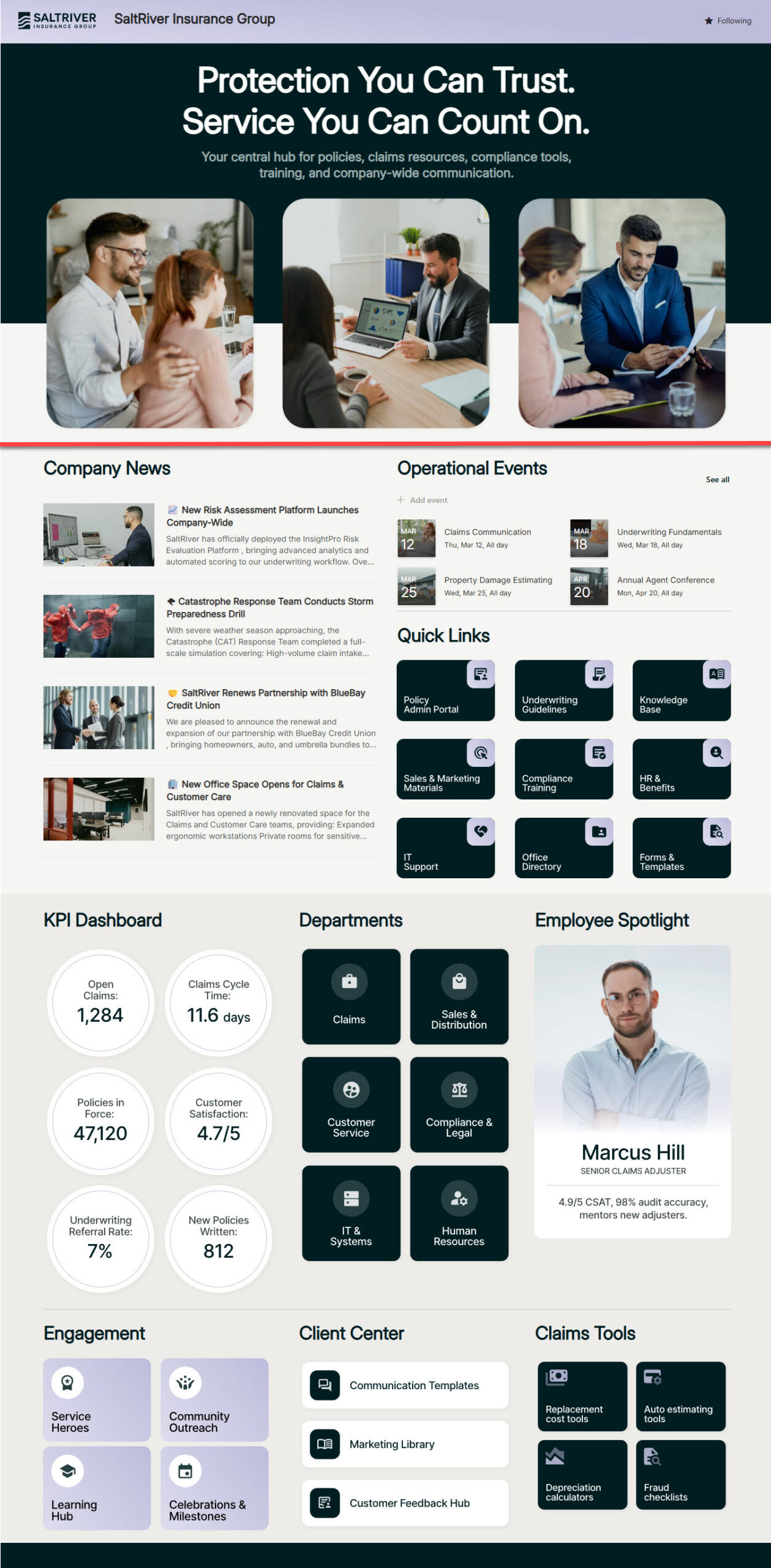
Intranet Homepage design for an Insurance company
The red line above depicts the imaginary fold. Everything below that line won’t be visible until the user scrolls down. As proof, below is a screenshot of the same design, taken from my monitor.
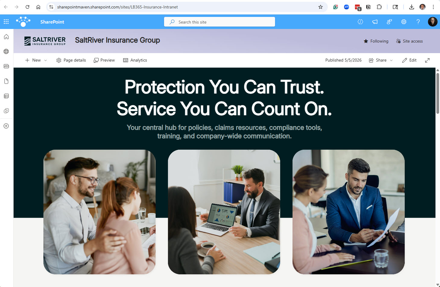
Same Intranet Homepage displayed on a computer screen
When Above the Fold wins
There are two scenarios where the traditional above-the-fold method works:
1. High-traffic intranet homepages
On a company homepage visited by hundreds or thousands of employees every morning, the first screen is your most valuable piece of digital real estate. Nielsen Norman Group’s analysis of more than 57,000 eyetracking fixations backs this up: the 100 pixels just above the fold get viewed about twice as much as the 100 pixels just below, and over 42% of total viewing time happens in the top fifth of the page. This is where executive messages, urgent announcements, and the top quick links earn their spot. Check out this example of a Senior Living Intranet, where the most important links are at the top of the page.
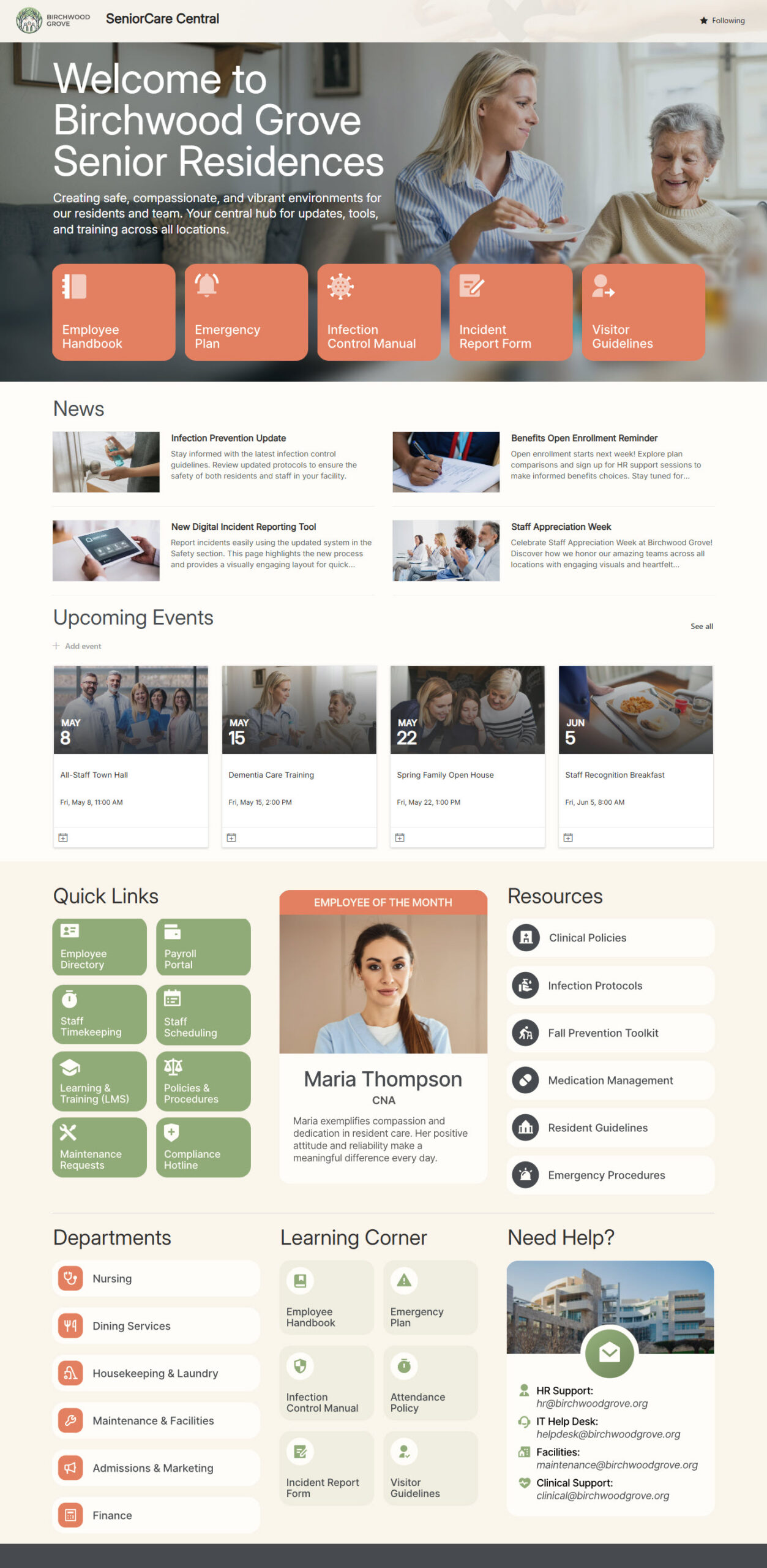
Intranet example with the most Important Links at the top
2. Task-oriented landing pages
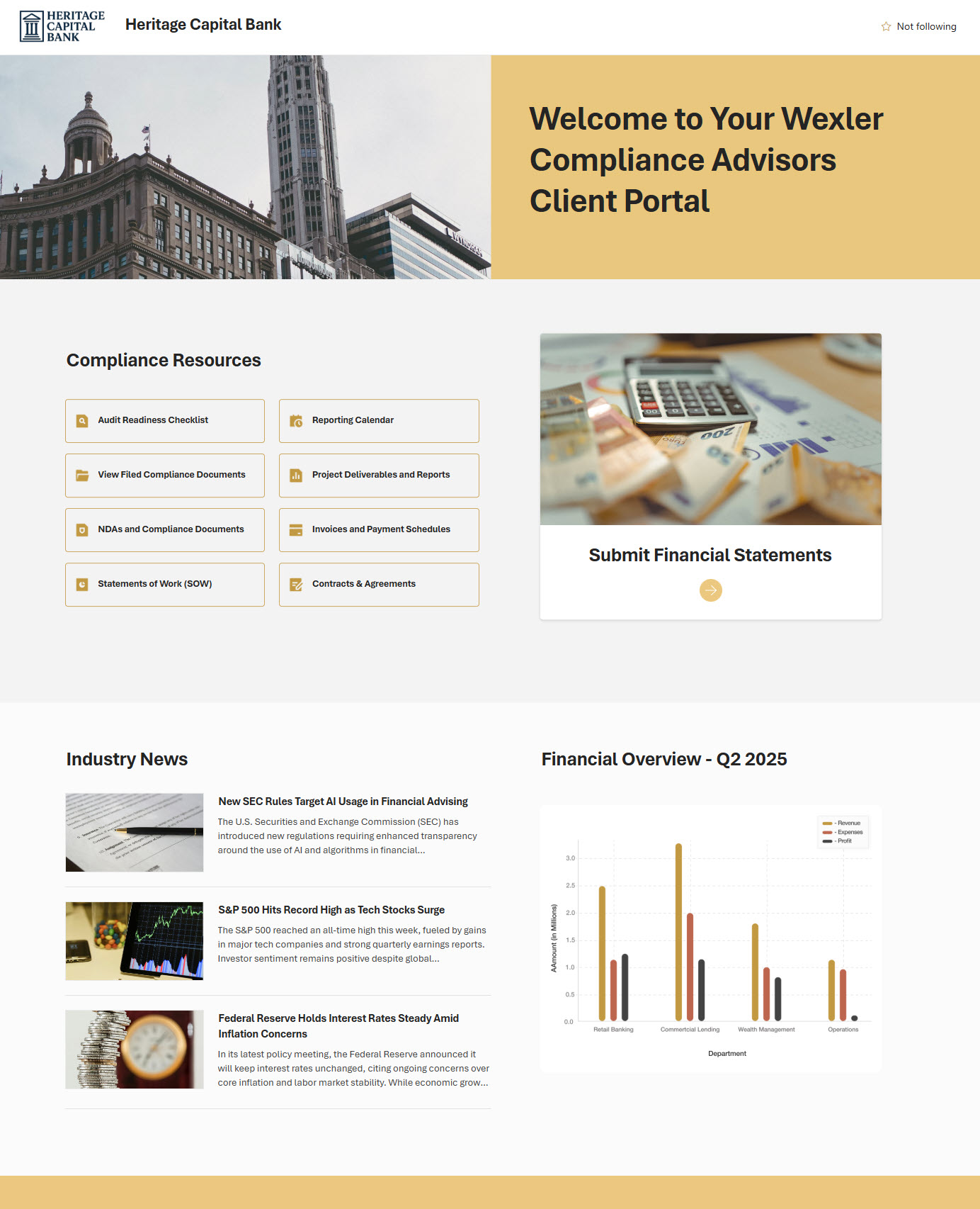
If the whole point of a page is for the user to take immediate action, it makes sense to place the important links at the top, as shown in this example. A Client Portal is a good illustration: the user came to do one thing, and the page should let them do it quickly.
When Long-Form wins
Now, let’s switch to Long-Form. Here are the examples where it shines:
1. Department sites and knowledge hubs
A Human Resources Department is a destination of choice. People come back to it repeatedly, looking for different things each time: the travel policy today, the vacation form tomorrow, the employee handbook next week. A long, well-sectioned page with clear headings is far more useful than a cramped one in this case. And the stakes are higher than they sound: Gartner’s 2023 Digital Worker Survey found that 47% of employees struggle to find the information they need at least half of the time, so a department page that’s easy to scan section by section directly addresses one of the most common digital workplace frustrations.
2. Onboarding and journey pages
The Employee Onboarding Portal is built with a long-term purpose in mind. A new hire doesn’t need all the information above the fold; they need it in a logical sequence. Length here is not a bug, it is a feature 😀. Even Steve Krug, who in his usability classic Don’t Make Me Think generally recommends trimming pages to minimize scrolling, makes an explicit exception for news and content-driven articles — which is exactly where onboarding journeys, company news, and editorial-style intranet pages live.
3. News and storytelling
A company blog or a news section is content that people expect to scroll through. Trying to shoehorn a newsletter into one screen strips out the very thing that makes it feel editorial.
Key Takeaways
- Long-form vs. above-the-fold is a purpose decision, not a layout preference.
- Above-the-fold is most valuable on pages where attention competes hardest – homepages and action pages.
- Long-form earns its length on pages people return to, scan, and read in sections: HR, knowledge, onboarding, and news.
- Both layouts can live happily in the same SharePoint environment, and most healthy intranets use a mix.
- Get the first impression zone right; the rest of the page can be exactly as long as the content honestly needs.
| Above the Fold | Long-Form | |
| Best for | Homepages, landing pages | Department sites, knowledge hubs, onboarding, news |
| User goal | Take quick action or scan key updates | Find specific info or read in sequence |
| Content updates | Often – daily or weekly | Less often – reference-style |
| Risk if you choose wrong | Important content gets buried below the fold | Page feels cramped or shallow |