Mini Trend Line


Overview
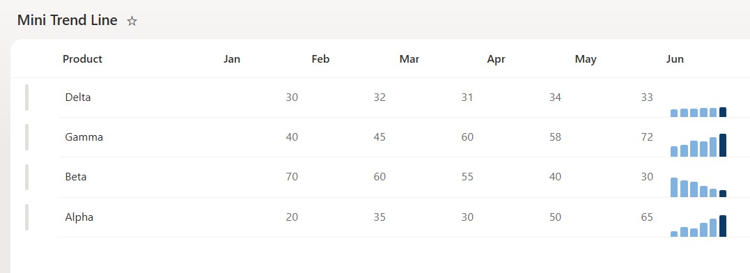
- Draws a mini bar chart inline from a handful of history columns
- Each bar’s height reflects that period’s value on a shared 0 to 100 scale
- The most recent bar is highlighted, so the latest point stands out
- Reads six month columns by name, and is easy to extend or shorten in the JSON
- Turns a row of numbers into a trend you can read without a chart web part
- Applied as column-formatting JSON, so it changes nothing about the underlying data
Common Use Cases
- Six-month signups, sales, or traffic per item
- Weekly ticket volume by team
- Monthly spend by category
- Usage or adoption trend per product
- Score history per student or candidate
- Any short series you want shown inline as a trend
Details
- Design Pattern: Metrics & Progress
- Format Scope: Column
Required Columns
| Display name | Column type | Internal name |
|---|---|---|
| Product | Single line of text | [Title] |
| Jan | Number | [Jan] |
| Feb | Number | [Feb] |
| Mar | Number | [Mar] |
| Apr | Number | [Apr] |
| May | Number | [May] |
| Jun | Number | [Jun] |
Prerequisites
- Build a list with these columns before you paste the JSON.
- Then populate each row with a value for every month on a 0 to 100 scale.
- The JSON reads the month columns by name, so their internal names (in brackets) must match the JSON exactly – or edit the names in the JSON to match yours.
- Apply the formatting to any one of the month columns; it draws the whole series.
- It shows six fixed monthly bars, January through June, and highlights June – it does not calculate an actual trend or direction.
How to Apply JSON code
- On the Jun column, open the column header menu, choose Column settings, then Format this column.
- Switch to Advanced mode.
- Paste the JSON below and click Save.
JSON Code
{
  "$schema": "https://developer.microsoft.com/json-schemas/sp/v2/column-formatting.schema.json",
  "elmType": "div",
  "style": {
    "display": "flex",
    "align-items": "flex-end",
    "gap": "3px",
    "height": "38px",
    "padding": "0 0 0 14px",
    "box-sizing": "border-box"
  },
  "children": [
    {
      "elmType": "div",
      "style": {
        "width": "9px",
        "border-radius": "2px 2px 0 0",
        "align-self": "flex-end",
        "background-color": "#7fb2e0",
        "height": "=(if(Number([$Jan]) < 0, 0, if(Number([$Jan]) > 100, 100, Number([$Jan]))) / 100 * 34) + 'px'"
      }
    },
    {
      "elmType": "div",
      "style": {
        "width": "9px",
        "border-radius": "2px 2px 0 0",
        "align-self": "flex-end",
        "background-color": "#7fb2e0",
        "height": "=(if(Number([$Feb]) < 0, 0, if(Number([$Feb]) > 100, 100, Number([$Feb]))) / 100 * 34) + 'px'"
      }
    },
    {
      "elmType": "div",
      "style": {
        "width": "9px",
        "border-radius": "2px 2px 0 0",
        "align-self": "flex-end",
        "background-color": "#7fb2e0",
        "height": "=(if(Number([$Mar]) < 0, 0, if(Number([$Mar]) > 100, 100, Number([$Mar]))) / 100 * 34) + 'px'"
      }
    },
    {
      "elmType": "div",
      "style": {
        "width": "9px",
        "border-radius": "2px 2px 0 0",
        "align-self": "flex-end",
        "background-color": "#7fb2e0",
        "height": "=(if(Number([$Apr]) < 0, 0, if(Number([$Apr]) > 100, 100, Number([$Apr]))) / 100 * 34) + 'px'"
      }
    },
    {
      "elmType": "div",
      "style": {
        "width": "9px",
        "border-radius": "2px 2px 0 0",
        "align-self": "flex-end",
        "background-color": "#7fb2e0",
        "height": "=(if(Number([$May]) < 0, 0, if(Number([$May]) > 100, 100, Number([$May]))) / 100 * 34) + 'px'"
      }
    },
    {
      "elmType": "div",
      "style": {
        "width": "9px",
        "border-radius": "2px 2px 0 0",
        "align-self": "flex-end",
        "background-color": "#0b3b66",
        "height": "=(if(Number([$Jun]) < 0, 0, if(Number([$Jun]) > 100, 100, Number([$Jun]))) / 100 * 34) + 'px'"
      }
    }
  ]
}
Common Questions About the Mini Trend Line
What is the Mini Trend Line built with?
It is built with a standard Microsoft List (SharePoint list) and a small piece of column-formatting JSON. There is no custom development, no SPFx solution, and no third-party tools. It is the kind of clean, maintainable formatting Greg Zelfond builds for teams that want a row that carries its own inline trend chart without ongoing development overhead.
What columns does it need?
It needs a short series of Number columns – here six months, Jan through Jun – plus any label column such as the product name. The JSON reads those columns by name and draws one bar for each.
Does this design use any custom development or third-party tools?
No. It uses only out-of-the-box SharePoint column formatting, which Microsoft supports natively. That keeps it stable and easy to maintain, and nothing breaks when SharePoint is updated. Out-of-the-box is the only way Greg builds, so you can own and extend the design yourself for years.
If LookBook 365 is code-free and out-of-the-box, why does this example include JSON?
Because SharePoint formatting JSON is not custom code – it is a native configuration feature built into lists and libraries. It is declarative: it only describes how an existing column looks, and cannot run scripts, reach external services, or change your data. Nothing is deployed and nothing breaks when Microsoft updates SharePoint, and you can edit or remove it anytime. That is why LookBook 365 treats it as out-of-the-box and low risk.
Can I use more or fewer points?
Yes. The bars are a list in the JSON, one per column. Add or remove entries and point them at your own column names to draw a longer or shorter series.
Can Greg build a design like this for our lists?
Yes – this is exactly the kind of work Greg Zelfond does. As an independent SharePoint consultant and Microsoft MVP, he designs out-of-the-box list and library formatting like this so your team can read and maintain it without a developer. Reach out through the contact page to talk about your lists.