Action Card

Overview
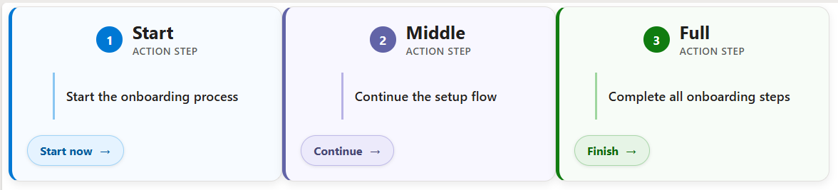
- Renders each item as a card with a prominent action button using the SharePoint Gallery layout
- The title and a short description explain the action, and the button label is set per row
- The button opens a link, so it can launch a form, a page, or a Power Automate flow
- It turns a plain list into a tidy set of self-service actions
- Applied as gallery view formatting JSON, so the whole list switches to cards without changing the underlying data
- Works on any list of services or requests, and the labels and links are easy to adapt
Common Use Cases
- Self-service request hub
- IT or HR help actions
- Launch buttons for Power Automate flows
- Form shortcuts for the team
- Booking and ordering actions
- Quick links to start a process
How to Apply JSON Formatting
1. Create a list with the following columns. The internal name [in brackets] must match the JSON code exactly:
– [Title] Single line of text
– [Description] Single line of text
– [ActionLabel] Single line of text
– [ActionUrl] Hyperlink
2. Populate the list with data. ActionUrl can be a form link, a page, or a Power Automate flow trigger URL.
3. Create a Gallery view on the list (view dropdown at the top right, Create new view, set the layout to Gallery, then Create).
4. With the new gallery view open, open the view dropdown again and choose Format current view.
5. Switch to Advanced mode, paste the JSON below, and click Save.
JSON Code – Select, Copy and Paste
{
  "$schema": "https://developer.microsoft.com/json-schemas/sp/v2/tile-formatting.schema.json",
  "height": 215,
  "width": 335,
  "hideSelection": true,
  "formatter": {
    "elmType": "div",
    "style": {
      "height": "100%",
      "width": "100%",
      "box-sizing": "border-box",
      "padding": "18px",
      "border-radius": "14px",
      "border": "1px solid #e1dfdd",
      "border-left": "=if([$Title] == 'Start', '5px solid #0078d4', if([$Title] == 'Middle', '5px solid #6264a7', '5px solid #107c10'))",
      "background-color": "=if([$Title] == 'Start', '#f7fbff', if([$Title] == 'Middle', '#f8f7ff', '#f7fcf7'))",
      "box-shadow": "0 3px 10px rgba(0,0,0,0.08)",
      "display": "flex",
      "flex-direction": "column",
      "justify-content": "space-between",
      "overflow": "hidden"
    },
    "children": [
      {
        "elmType": "div",
        "style": {
          "display": "flex",
          "align-items": "center",
          "gap": "12px"
        },
        "children": [
          {
            "elmType": "div",
            "txtContent": "=if([$Title] == 'Start', '1', if([$Title] == 'Middle', '2', '3'))",
            "style": {
              "width": "32px",
              "height": "32px",
              "border-radius": "50%",
              "display": "flex",
              "align-items": "center",
              "justify-content": "center",
              "font-weight": "700",
              "font-size": "15px",
              "color": "white",
              "background-color": "=if([$Title] == 'Start', '#0078d4', if([$Title] == 'Middle', '#6264a7', '#107c10'))",
              "flex-shrink": "0"
            }
          },
          {
            "elmType": "div",
            "style": {
              "min-width": "0"
            },
            "children": [
              {
                "elmType": "div",
                "txtContent": "[$Title]",
                "style": {
                  "font-size": "22px",
                  "font-weight": "700",
                  "color": "#201f1e",
                  "line-height": "26px",
                  "white-space": "nowrap",
                  "overflow": "hidden",
                  "text-overflow": "ellipsis"
                }
              },
              {
                "elmType": "div",
                "txtContent": "ACTION STEP",
                "style": {
                  "font-size": "12px",
                  "font-weight": "600",
                  "letter-spacing": "0.6px",
                  "color": "#605e5c",
                  "margin-top": "2px"
                }
              }
            ]
          }
        ]
      },
      {
        "elmType": "div",
        "style": {
          "margin-top": "18px",
          "margin-bottom": "18px",
          "padding": "4px 4px 4px 14px",
          "border-left": "=if([$Title] == 'Start', '3px solid #8ac6f2', if([$Title] == 'Middle', '3px solid #b7b2e5', '3px solid #9fd69f'))",
          "min-height": "58px",
          "display": "flex",
          "align-items": "center",
          "box-sizing": "border-box"
        },
        "children": [
          {
            "elmType": "div",
            "txtContent": "[$Description]",
            "style": {
              "font-size": "16px",
              "line-height": "22px",
              "font-weight": "600",
              "color": "#201f1e",
              "overflow": "hidden"
            }
          }
        ]
      },
      {
        "elmType": "a",
        "attributes": {
          "href": "[$ActionUrl]",
          "target": "_blank"
        },
        "style": {
          "display": "inline-flex",
          "align-items": "center",
          "justify-content": "center",
          "gap": "8px",
          "align-self": "flex-start",
          "padding": "9px 15px",
          "border-radius": "999px",
          "background-color": "=if([$Title] == 'Start', '#e5f3ff', if([$Title] == 'Middle', '#eceafb', '#e6f4e6'))",
          "border": "=if([$Title] == 'Start', '1px solid #9fd3f7', if([$Title] == 'Middle', '1px solid #beb9e8', '1px solid #aad7aa'))",
          "color": "=if([$Title] == 'Start', '#005a9e', if([$Title] == 'Middle', '#464775', '#0b6a0b'))",
          "font-size": "14px",
          "font-weight": "700",
          "text-decoration": "none",
          "box-shadow": "0 1px 4px rgba(0,0,0,0.10)"
        },
        "children": [
          {
            "elmType": "span",
            "txtContent": "[$ActionLabel]"
          },
          {
            "elmType": "span",
            "txtContent": "→",
            "style": {
              "font-size": "17px",
              "font-weight": "700",
              "line-height": "16px"
            }
          }
        ]
      }
    ]
  }
}
Common Questions About the Action Card
What is the Action Card built with?
It is built with a standard Microsoft List (SharePoint list) and gallery view formatting expressed in JSON. There is no custom development, no SPFx solution, and no third-party tools. It is the kind of clean, maintainable formatting Greg Zelfond builds for teams that want self-service actions without ongoing development overhead.
What does the button do?
The button opens whatever address you put in the ActionUrl column. That can be a SharePoint or Microsoft Forms link, another page, or a Power Automate flow that is set up to run from a link – so the card becomes a launch point for a real action.
What columns does it need?
It uses four columns: a Title, a Description, an ActionLabel for the button text, and an ActionUrl. The card refers to each by its internal name, so the JSON and the columns must line up exactly – here those names are Title, Description, ActionLabel, and ActionUrl.
Does this design use any custom development or third-party tools?
No. It uses only out-of-the-box SharePoint view formatting, which Microsoft supports natively. That keeps it stable and easy to maintain, and nothing breaks when SharePoint is updated. Out-of-the-box is the only way Greg builds, so you can own and extend the design yourself for years.
If LookBook 365 is code-free and out-of-the-box, why does this example include JSON?
Because SharePoint formatting JSON is not custom code – it is a native configuration feature built into lists and libraries. It is declarative: it only describes how existing columns and views look, and cannot run scripts, reach external services, or change your data. Nothing is deployed and nothing breaks when Microsoft updates SharePoint, and you can edit or remove it anytime. That is why LookBook 365 treats it as out-of-the-box and low risk.
Can Greg build a view like this for our team?
Yes – this is exactly the kind of work Greg Zelfond does. As an independent SharePoint consultant and Microsoft MVP, he designs out-of-the-box list and library formatting like this so your team can read and maintain it without a developer. Reach out through the contact page to talk about your lists.