KPI Stat Tile (View Formatting)


Overview
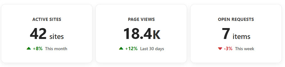
- Renders each list item as a scorecard with one large metric using the SharePoint Gallery layout
- The value shows with its own unit, such as percent, K, M, or x, set per row
- A change figure shows below with a green up or red down arrow keyed to whether it rose or fell
- A short period caption, such as vs last month, gives the comparison context
- Applied as gallery view formatting JSON, so the whole list switches to tiles without changing the underlying data
- Works on any list of measures, and the fields are easy to adapt to your own KPIs
Common Use Cases
- Executive or team KPI dashboard
- Sales and revenue scorecards
- Support metrics such as response and resolution
- Marketing funnel and conversion metrics
- Operational health metrics
- Any list of numbers that should read as scorecards
How to Apply JSON Formatting
1. Create a list with the following columns. The internal name [in brackets] must match the JSON code exactly:
[Title] Single line of text
[Value] Number
[Suffix] Single line of text
[Delta] Number
[Period] Single line of text
2. Populate the list with data. Put the unit in Suffix (for example % or K), the change in Delta as a positive or negative number, and the comparison in Period (for example vs last month).
3. Create a Gallery view on the list (view dropdown at the top right, Create new view, set the layout to Gallery, then Create).
4. With the new gallery view open, open the view dropdown again and choose Format current view.
5. Switch to Advanced mode, paste the JSON below, and click Save.
JSON Code – Select, Copy and Paste
{
  "$schema": "https://developer.microsoft.com/json-schemas/sp/v2/tile-formatting.schema.json",
  "height": 165,
  "width": 255,
  "hideSelection": true,
  "formatter": {
    "elmType": "div",
    "style": {
      "display": "flex",
      "flex-direction": "column",
      "align-items": "center",
      "justify-content": "center",
      "box-sizing": "border-box",
      "height": "100%",
      "padding": "18px 18px 16px 18px",
      "border": "1px solid #edebe9",
      "border-radius": "12px",
      "background-color": "#ffffff",
      "box-shadow": "0 4px 12px rgba(0,0,0,0.06)"
    },
    "children": [
      {
        "elmType": "div",
        "style": {
          "font-size": "12px",
          "font-weight": "700",
          "color": "#3b3a39",
          "text-align": "center",
          "text-transform": "uppercase",
          "letter-spacing": "0.45px",
          "margin-bottom": "7px"
        },
        "txtContent": "[$Title]"
      },
      {
        "elmType": "div",
        "style": {
          "display": "flex",
          "align-items": "baseline",
          "justify-content": "center",
          "line-height": "1",
          "margin-top": "2px"
        },
        "children": [
          {
            "elmType": "span",
            "style": {
              "font-size": "43px",
              "font-weight": "750",
              "color": "#242424",
              "letter-spacing": "-1px"
            },
            "txtContent": "[$Value]"
          },
          {
            "elmType": "span",
            "style": {
              "display": "=if([$Suffix] == '', 'none', 'inline-block')",
              "font-size": "=if([$Suffix] == 'K', '34px', '20px')",
              "font-weight": "=if([$Suffix] == 'K', '700', '600')",
              "color": "#323130",
              "margin-left": "=if([$Suffix] == 'K', '1px', '7px')"
            },
            "txtContent": "[$Suffix]"
          }
        ]
      },
      {
        "elmType": "div",
        "style": {
          "display": "flex",
          "align-items": "center",
          "justify-content": "center",
          "margin-top": "14px"
        },
        "children": [
          {
            "elmType": "span",
            "attributes": {
              "iconName": "=if(Number([$Delta]) >= 0, 'CaretSolidUp', 'CaretSolidDown')"
            },
            "style": {
              "font-size": "13px",
              "margin-right": "4px",
              "color": "=if(Number([$Delta]) >= 0, '#107c10', '#d13438')"
            }
          },
          {
            "elmType": "span",
            "style": {
              "font-size": "13px",
              "font-weight": "700",
              "color": "=if(Number([$Delta]) >= 0, '#107c10', '#d13438')"
            },
            "txtContent": "=if(Number([$Delta]) >= 0, '+', '') + [$Delta] + '%'"
          },
          {
            "elmType": "span",
            "style": {
              "font-size": "12px",
              "font-weight": "500",
              "color": "#605e5c",
              "margin-left": "7px"
            },
            "txtContent": "[$Period]"
          }
        ]
      }
    ]
  }
}
Common Questions About the KPI Stat Tile
What is the KPI Stat Tile built with?
It is built with a standard Microsoft List (SharePoint list) and gallery view formatting expressed in JSON. There is no custom development, no SPFx solution, and no third-party tools. It is the kind of clean, maintainable formatting Greg Zelfond builds for teams that want a scorecard view without ongoing development overhead.
What columns does it need?
It uses five columns: a Title for the metric name, a Value number, a Suffix for the unit, a Delta number for the change, and a Period caption. The tile refers to each column by its internal name, so the JSON and the columns must line up exactly – here those names are Title, Value, Suffix, Delta, and Period.
How does the up or down arrow decide its color?
The arrow reads the Delta number: zero or positive shows a green up arrow, and negative shows a red down arrow. If a falling number is good for one of your metrics, Greg can flip that logic for that tile so the color still means good or bad the way your team expects.
Does this design use any custom development or third-party tools?
No. It uses only out-of-the-box SharePoint view formatting, which Microsoft supports natively. That keeps it stable and easy to maintain, and nothing breaks when SharePoint is updated. Out-of-the-box is the only way Greg builds, so you can own and extend the design yourself for years.
If LookBook 365 is code-free and out-of-the-box, why does this example include JSON?
Because SharePoint formatting JSON is not custom code – it is a native configuration feature built into lists and libraries. It is declarative: it only describes how existing columns and views look, and cannot run scripts, reach external services, or change your data. Nothing is deployed and nothing breaks when Microsoft updates SharePoint, and you can edit or remove it anytime. That is why LookBook 365 treats it as out-of-the-box and low risk.
Can Greg build a KPI dashboard like this for our team?
Yes – this is exactly the kind of work Greg Zelfond does. As an independent SharePoint consultant and Microsoft MVP, he designs out-of-the-box list and library formatting like this so your team can read and maintain it without a developer. Reach out through the contact page to talk about your metrics.