Mini Column Chart


Overview
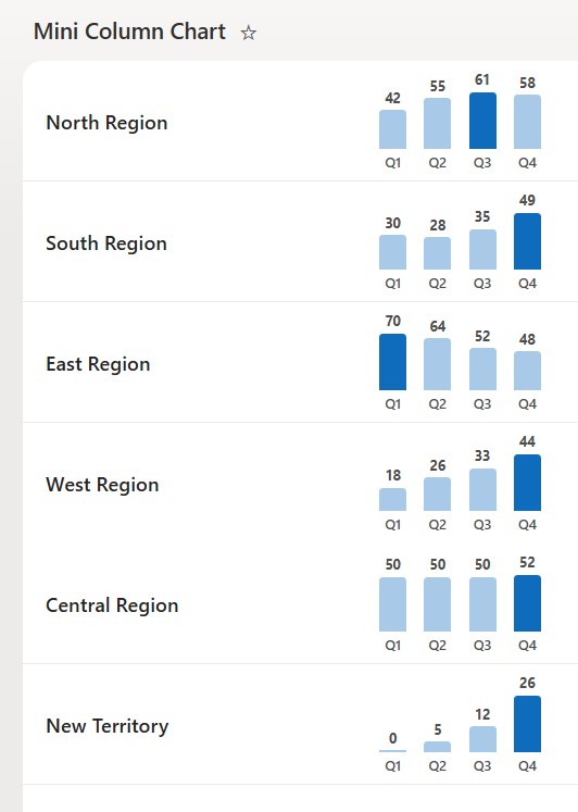
- Draws a compact vertical bar chart inside one list cell from four Number columns
- Scales every bar to that row’s own highest value, so each mini chart is self-contained
- Highlights the tallest bar so the peak period stands out at a glance
- Labels each bar with its value and its period, so the chart stays readable at a small size
- Applied as column-formatting JSON on a spare column, so it visualizes the numbers without changing them
- Easy to relabel the periods or recolor the bars to match your data and brand
Common Use Cases
- Quarterly sales, revenue, or volume by region
- A four-period KPI on a scorecard
- Survey or rating breakdowns per item
- Headcount or capacity by quarter
- Budget compared across periods
- Any four related numbers you want to compare per row
Details
- Design Pattern: Metrics & Progress
- Format Scope: Column
Required Columns
| Display name | Column type | Internal name |
|---|---|---|
| Chart | Single line of text | [Chart] |
| Q1 | Number | [Q1] |
| Q2 | Number | [Q2] |
| Q3 | Number | [Q3] |
| Q4 | Number | [Q4] |
Prerequisites
- Build a list with these columns before you paste the JSON.
- Then fill in the four quarter numbers per row – leave the Chart column empty, as it only hosts the bars.
- Internal column names (in brackets) must match the JSON exactly.
- Each row’s bars scale to that row’s own highest value, so rows with different totals still read clearly.
- The verified JSON references the internal names _x0051_1, _x0051_2, _x0051_3, and _x0051_4 – the names SharePoint generated for the Q1 to Q4 columns in the tested list.
- Before deploying, open each quarter column’s settings and check the Field= value in the browser address; if the client’s internal names differ, replace the four field references in the JSON before saving.
- Fill in all four numbers before applying – the tallest value is highlighted, and tied highest values may all take the highlight color.
How to Apply JSON code
- Select the Chart column header, then Column settings, then Format this column.
- Switch to Advanced mode.
- Paste the JSON below and click Save.
- Widen the Chart column so all four bars have room.
JSON Code
{
  "$schema": "https://developer.microsoft.com/json-schemas/sp/v2/column-formatting.schema.json",
  "elmType": "div",
  "style": {
    "display": "flex",
    "align-items": "center",
    "height": "96px",
    "overflow": "hidden"
  },
  "children": [
    {
      "elmType": "div",
      "style": {
        "display": "flex",
        "align-items": "flex-end",
        "gap": "14px",
        "height": "80px",
        "padding": "0 12px 0 28px"
      },
      "children": [
        {
          "elmType": "div",
          "style": {
            "display": "flex",
            "flex-direction": "column",
            "align-items": "center",
            "justify-content": "flex-end",
            "height": "80px",
            "gap": "3px"
          },
          "children": [
            {
              "elmType": "div",
              "style": {
                "font-size": "11px",
                "line-height": "13px",
                "font-weight": "700",
                "color": "#4f4f4f"
              },
              "txtContent": "=[$_x0051_1]"
            },
            {
              "elmType": "div",
              "style": {
                "width": "22px",
                "min-height": "2px",
                "border-radius": "3px 3px 0 0",
                "height": "=(([$_x0051_1] / if(([$_x0051_1]+[$_x0051_2]+[$_x0051_3]+[$_x0051_4]) == 0, 1, if([$_x0051_1] >= [$_x0051_2] && [$_x0051_1] >= [$_x0051_3] && [$_x0051_1] >= [$_x0051_4], [$_x0051_1], if([$_x0051_2] >= [$_x0051_3] && [$_x0051_2] >= [$_x0051_4], [$_x0051_2], if([$_x0051_3] >= [$_x0051_4], [$_x0051_3], [$_x0051_4]))))) * 46) + 'px'",
                "background-color": "=if([$_x0051_1] == if([$_x0051_1] >= [$_x0051_2] && [$_x0051_1] >= [$_x0051_3] && [$_x0051_1] >= [$_x0051_4], [$_x0051_1], if([$_x0051_2] >= [$_x0051_3] && [$_x0051_2] >= [$_x0051_4], [$_x0051_2], if([$_x0051_3] >= [$_x0051_4], [$_x0051_3], [$_x0051_4]))), '#0f6cbd', '#a9c9e8')"
              }
            },
            {
              "elmType": "div",
              "style": {
                "font-size": "11px",
                "line-height": "14px",
                "font-weight": "600",
                "color": "#4f4f4f"
              },
              "txtContent": "Q1"
            }
          ]
        },
        {
          "elmType": "div",
          "style": {
            "display": "flex",
            "flex-direction": "column",
            "align-items": "center",
            "justify-content": "flex-end",
            "height": "80px",
            "gap": "3px"
          },
          "children": [
            {
              "elmType": "div",
              "style": {
                "font-size": "11px",
                "line-height": "13px",
                "font-weight": "700",
                "color": "#4f4f4f"
              },
              "txtContent": "=[$_x0051_2]"
            },
            {
              "elmType": "div",
              "style": {
                "width": "22px",
                "min-height": "2px",
                "border-radius": "3px 3px 0 0",
                "height": "=(([$_x0051_2] / if(([$_x0051_1]+[$_x0051_2]+[$_x0051_3]+[$_x0051_4]) == 0, 1, if([$_x0051_1] >= [$_x0051_2] && [$_x0051_1] >= [$_x0051_3] && [$_x0051_1] >= [$_x0051_4], [$_x0051_1], if([$_x0051_2] >= [$_x0051_3] && [$_x0051_2] >= [$_x0051_4], [$_x0051_2], if([$_x0051_3] >= [$_x0051_4], [$_x0051_3], [$_x0051_4]))))) * 46) + 'px'",
                "background-color": "=if([$_x0051_2] == if([$_x0051_1] >= [$_x0051_2] && [$_x0051_1] >= [$_x0051_3] && [$_x0051_1] >= [$_x0051_4], [$_x0051_1], if([$_x0051_2] >= [$_x0051_3] && [$_x0051_2] >= [$_x0051_4], [$_x0051_2], if([$_x0051_3] >= [$_x0051_4], [$_x0051_3], [$_x0051_4]))), '#0f6cbd', '#a9c9e8')"
              }
            },
            {
              "elmType": "div",
              "style": {
                "font-size": "11px",
                "line-height": "14px",
                "font-weight": "600",
                "color": "#4f4f4f"
              },
              "txtContent": "Q2"
            }
          ]
        },
        {
          "elmType": "div",
          "style": {
            "display": "flex",
            "flex-direction": "column",
            "align-items": "center",
            "justify-content": "flex-end",
            "height": "80px",
            "gap": "3px"
          },
          "children": [
            {
              "elmType": "div",
              "style": {
                "font-size": "11px",
                "line-height": "13px",
                "font-weight": "700",
                "color": "#4f4f4f"
              },
              "txtContent": "=[$_x0051_3]"
            },
            {
              "elmType": "div",
              "style": {
                "width": "22px",
                "min-height": "2px",
                "border-radius": "3px 3px 0 0",
                "height": "=(([$_x0051_3] / if(([$_x0051_1]+[$_x0051_2]+[$_x0051_3]+[$_x0051_4]) == 0, 1, if([$_x0051_1] >= [$_x0051_2] && [$_x0051_1] >= [$_x0051_3] && [$_x0051_1] >= [$_x0051_4], [$_x0051_1], if([$_x0051_2] >= [$_x0051_3] && [$_x0051_2] >= [$_x0051_4], [$_x0051_2], if([$_x0051_3] >= [$_x0051_4], [$_x0051_3], [$_x0051_4]))))) * 46) + 'px'",
                "background-color": "=if([$_x0051_3] == if([$_x0051_1] >= [$_x0051_2] && [$_x0051_1] >= [$_x0051_3] && [$_x0051_1] >= [$_x0051_4], [$_x0051_1], if([$_x0051_2] >= [$_x0051_3] && [$_x0051_2] >= [$_x0051_4], [$_x0051_2], if([$_x0051_3] >= [$_x0051_4], [$_x0051_3], [$_x0051_4]))), '#0f6cbd', '#a9c9e8')"
              }
            },
            {
              "elmType": "div",
              "style": {
                "font-size": "11px",
                "line-height": "14px",
                "font-weight": "600",
                "color": "#4f4f4f"
              },
              "txtContent": "Q3"
            }
          ]
        },
        {
          "elmType": "div",
          "style": {
            "display": "flex",
            "flex-direction": "column",
            "align-items": "center",
            "justify-content": "flex-end",
            "height": "80px",
            "gap": "3px"
          },
          "children": [
            {
              "elmType": "div",
              "style": {
                "font-size": "11px",
                "line-height": "13px",
                "font-weight": "700",
                "color": "#4f4f4f"
              },
              "txtContent": "=[$_x0051_4]"
            },
            {
              "elmType": "div",
              "style": {
                "width": "22px",
                "min-height": "2px",
                "border-radius": "3px 3px 0 0",
                "height": "=(([$_x0051_4] / if(([$_x0051_1]+[$_x0051_2]+[$_x0051_3]+[$_x0051_4]) == 0, 1, if([$_x0051_1] >= [$_x0051_2] && [$_x0051_1] >= [$_x0051_3] && [$_x0051_1] >= [$_x0051_4], [$_x0051_1], if([$_x0051_2] >= [$_x0051_3] && [$_x0051_2] >= [$_x0051_4], [$_x0051_2], if([$_x0051_3] >= [$_x0051_4], [$_x0051_3], [$_x0051_4]))))) * 46) + 'px'",
                "background-color": "=if([$_x0051_4] == if([$_x0051_1] >= [$_x0051_2] && [$_x0051_1] >= [$_x0051_3] && [$_x0051_1] >= [$_x0051_4], [$_x0051_1], if([$_x0051_2] >= [$_x0051_3] && [$_x0051_2] >= [$_x0051_4], [$_x0051_2], if([$_x0051_3] >= [$_x0051_4], [$_x0051_3], [$_x0051_4]))), '#0f6cbd', '#a9c9e8')"
              }
            },
            {
              "elmType": "div",
              "style": {
                "font-size": "11px",
                "line-height": "14px",
                "font-weight": "600",
                "color": "#4f4f4f"
              },
              "txtContent": "Q4"
            }
          ]
        }
      ]
    }
  ]
}
Common Questions About the Mini Column Chart
What is the Mini Column Chart built with?
It is built with a standard Microsoft List (SharePoint list) and a small piece of column-formatting JSON applied to a spare column. There is no custom development, no SPFx solution, and no third-party tools. It is the kind of clean, maintainable visualization Greg Zelfond builds for teams that want an at-a-glance trend without ongoing development overhead.
What columns does it need?
It needs four Number columns for the periods plus a spare column to host the chart. The bars refer to the number columns by their internal names, so the JSON and the columns must line up – in this example those internal names are Q1, Q2, Q3, and Q4.
How are the bar heights decided?
Each row’s bars are scaled to that row’s own highest value, so the tallest bar always fills the cell and the others sit in proportion. That keeps every mini chart readable even when one region is far larger than another, and the tallest bar is highlighted so the peak period stands out.
Does this design use any custom development or third-party tools?
No. It uses only out-of-the-box SharePoint column formatting, which Microsoft supports natively. That keeps it stable and easy to maintain, and nothing breaks when SharePoint is updated. Out-of-the-box is the only way Greg builds, so you can own and extend the design yourself for years.
If LookBook 365 is code-free and out-of-the-box, why does this example include JSON?
Because SharePoint formatting JSON is not custom code – it is a native configuration feature built into lists and libraries. It is declarative: it only describes how an existing column looks, and cannot run scripts, reach external services, or change your data. Nothing is deployed and nothing breaks when Microsoft updates SharePoint, and you can edit or remove it anytime. That is why LookBook 365 treats it as out-of-the-box and low risk.
Can Greg build in-cell charts like this for our lists?
Yes – this is exactly the kind of work Greg Zelfond does. As an independent SharePoint consultant and Microsoft MVP, he designs out-of-the-box list and library formatting like this so your team can read and maintain it without a developer. Reach out through the contact page to talk about your lists.