Stacked Progress Bar (Column JSON)


Overview
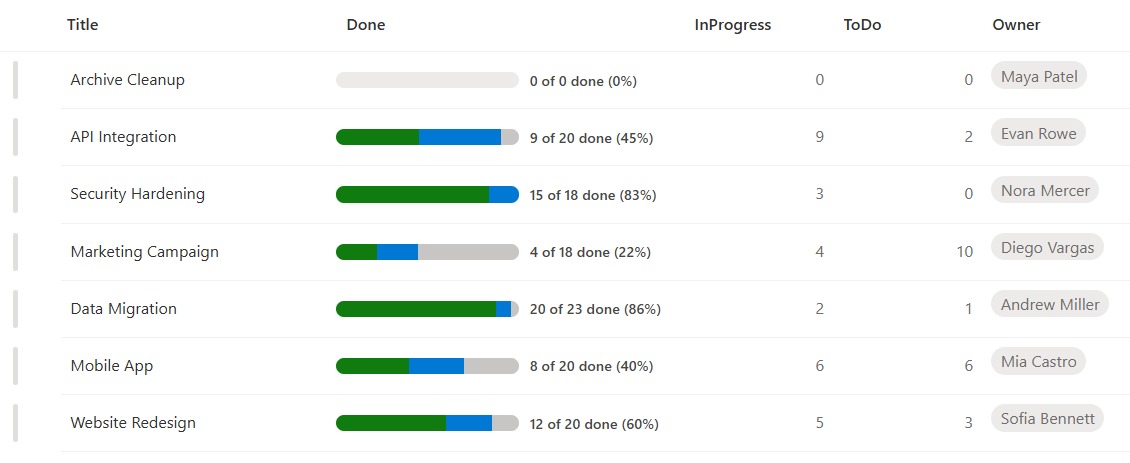
- Renders three count columns as one bar split into proportional colored segments
- Green shows Done, blue shows In Progress, and gray shows what is still To Do
- A running label beside the bar reads X of Y done so the numbers stay explicit
- Each segment sizes itself from the counts, with a clean empty bar when there is nothing yet
- Built as column-formatting JSON that reads the count columns by name, so it works in a standard list
- Pure formatting, so nothing about the underlying data changes
Common Use Cases
- Project task status breakdown
- Sprint or backlog progress by state
- Survey or response status (answered, partial, pending)
- Onboarding step completion across stages
- Ticket queue breakdown (open, in progress, resolved)
- Budget split across spent, committed, and remaining
Details
- Design Pattern: Metrics & Progress
- Format Scope: Column
Required Columns
| Display name | Column type | Internal name |
|---|---|---|
| Title | Single line of text | [Title] |
| Done | Number | [Done] |
| In Progress | Number | [InProgress] |
| To Do | Number | [ToDo] |
| Owner | Person or Group | [Owner] |
Prerequisites
- Build a list with these columns before you paste the JSON.
- Populate the list with data (the counts of items in each state).
- Internal column names (in brackets) must match the JSON exactly.
How to Apply JSON code
- On the Done column, open the column header menu, choose Column settings, then Format this column.
- Switch to Advanced mode.
- Paste the JSON below and click Save.
JSON Code
{
  "$schema": "https://developer.microsoft.com/json-schemas/sp/v2/column-formatting.schema.json",
  "elmType": "div",
  "style": {
    "display": "flex",
    "align-items": "center"
  },
  "children": [
    {
      "elmType": "div",
      "style": {
        "display": "flex",
        "flex-direction": "row",
        "width": "160px",
        "flex-shrink": "0",
        "height": "14px",
        "border-radius": "7px",
        "overflow": "hidden",
        "background-color": "#edebe9"
      },
      "children": [
        {
          "elmType": "div",
          "style": {
            "flex-grow": "=if([$Done] == '', 0, Number([$Done]))",
            "flex-shrink": "1",
            "flex-basis": "0",
            "background-color": "#107c10"
          }
        },
        {
          "elmType": "div",
          "style": {
            "flex-grow": "=if([$InProgress] == '', 0, Number([$InProgress]))",
            "flex-shrink": "1",
            "flex-basis": "0",
            "background-color": "#0078d4"
          }
        },
        {
          "elmType": "div",
          "style": {
            "flex-grow": "=if([$ToDo] == '', 0, Number([$ToDo]))",
            "flex-shrink": "1",
            "flex-basis": "0",
            "background-color": "#c8c6c4"
          }
        }
      ]
    },
    {
      "elmType": "span",
      "style": {
        "margin-left": "9px",
        "font-size": "12.5px",
        "font-weight": "500",
        "color": "#484644",
        "white-space": "nowrap"
      },
      "txtContent": "=if((if([$Done] == '', 0, Number([$Done])) + if([$InProgress] == '', 0, Number([$InProgress])) + if([$ToDo] == '', 0, Number([$ToDo]))) == 0, '0 of 0 done (0%)', if([$Done] == '', 0, Number([$Done])) + ' of ' + (if([$Done] == '', 0, Number([$Done])) + if([$InProgress] == '', 0, Number([$InProgress])) + if([$ToDo] == '', 0, Number([$ToDo]))) + ' done (' + floor((if([$Done] == '', 0, Number([$Done])) / (if([$Done] == '', 0, Number([$Done])) + if([$InProgress] == '', 0, Number([$InProgress])) + if([$ToDo] == '', 0, Number([$ToDo])))) * 100) + '%)')"
    }
  ]
}Common Questions About the Stacked Progress Bar
What is the Stacked Progress Bar built with?
It is built with a standard Microsoft List (SharePoint list) and a small piece of column-formatting JSON applied to one of the count columns. There is no custom development, no SPFx solution, and no third-party tools. It is the kind of clean, maintainable formatting Greg Zelfond builds for teams that want a polished list without ongoing development overhead.
What columns does it need?
It needs three Number columns for the counts – Done, InProgress, and ToDo – plus whatever else your list holds, such as a Title and an Owner. The JSON reads the three count columns by their internal names, so create them as single words and make sure all three are shown in the view; the bar then sizes each segment as that count’s share of the total.
Does this design use any custom development or third-party tools?
No. It uses only out-of-the-box SharePoint column formatting, which Microsoft supports natively. That keeps it stable and easy to maintain, and nothing breaks when SharePoint is updated. Out-of-the-box is the only way Greg builds, so you can own and extend the design yourself for years.
If LookBook 365 is code-free and out-of-the-box, why does this example include JSON?
Because SharePoint formatting JSON is not custom code – it is a native configuration feature built into lists and libraries. It is declarative: it only describes how existing columns and views look, and cannot run scripts, reach external services, or change your data. Nothing is deployed and nothing breaks when Microsoft updates SharePoint, and you can edit or remove it anytime. That is why LookBook 365 treats it as out-of-the-box and low risk.
How are the segment widths calculated?
Each segment grows in proportion to its count using the flexbox layout, so Done, In Progress, and To Do simply share the bar by their relative sizes. There is no division to break, and if all three are zero the bar shows clean and empty.
Can Greg build formatting like this for our lists?
Yes – this is exactly the kind of work Greg Zelfond does. As an independent SharePoint consultant and Microsoft MVP, he designs out-of-the-box list and library formatting like this so your team can read and maintain it without a developer. Reach out through the contact page to talk about your lists.