Flexible Sections
Flexible Sections in SharePoint allow you to freely drag, position, and resize web parts within a section, making it possible to create custom, responsive page layouts without being limited to fixed column structures.
Common Use Cases
- Designing an intranet homepage with a hero banner, news feed, and quick links arranged in visually balanced columns
- Creating department landing pages with side-by-side content—such as team profiles alongside event calendars
- Highlighting important announcements or seasonal campaigns using section-level background colors or images
- Building a resource hub where links, documents, and videos are grouped into separate, easily scannable sections
Benefits
- Improves content hierarchy by allowing high-priority items to stand out visually
- Enables rapid layout changes to support campaigns, updates, or reorganizations without developer involvement
- Encourages consistent design patterns across pages, which helps users navigate intuitively
- Enhances visual appeal and supports mobile responsiveness for better user engagement
Key Considerations
- Overcomplicated layouts may overwhelm users; keep section designs clean and consistent
- Large background images can slow page load—optimize for performance
- Ensure color and contrast choices meet accessibility standards
- Layout changes require page editor or owner permissions
- Ensure Mobile layout renders well as well
Flexible Alignment with Flexible Sections

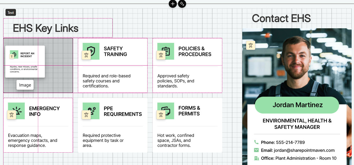
Example of Hero section built with Flexible Sections
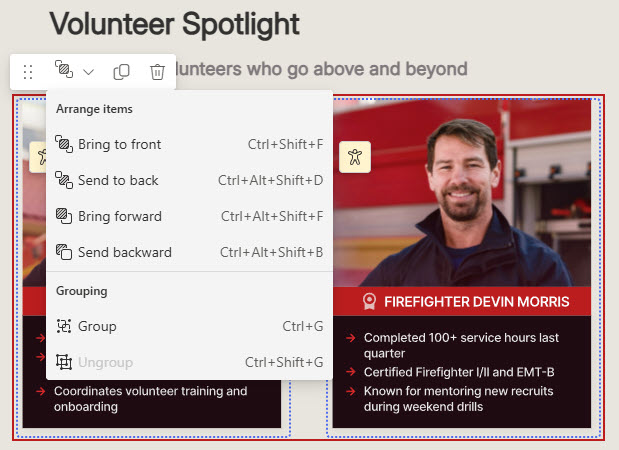
Grouping Images with Flexible Sections
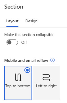
Mobile Settings with Flexible Sections