Common Questions About Dashboards
Charts & Dashboard Basics
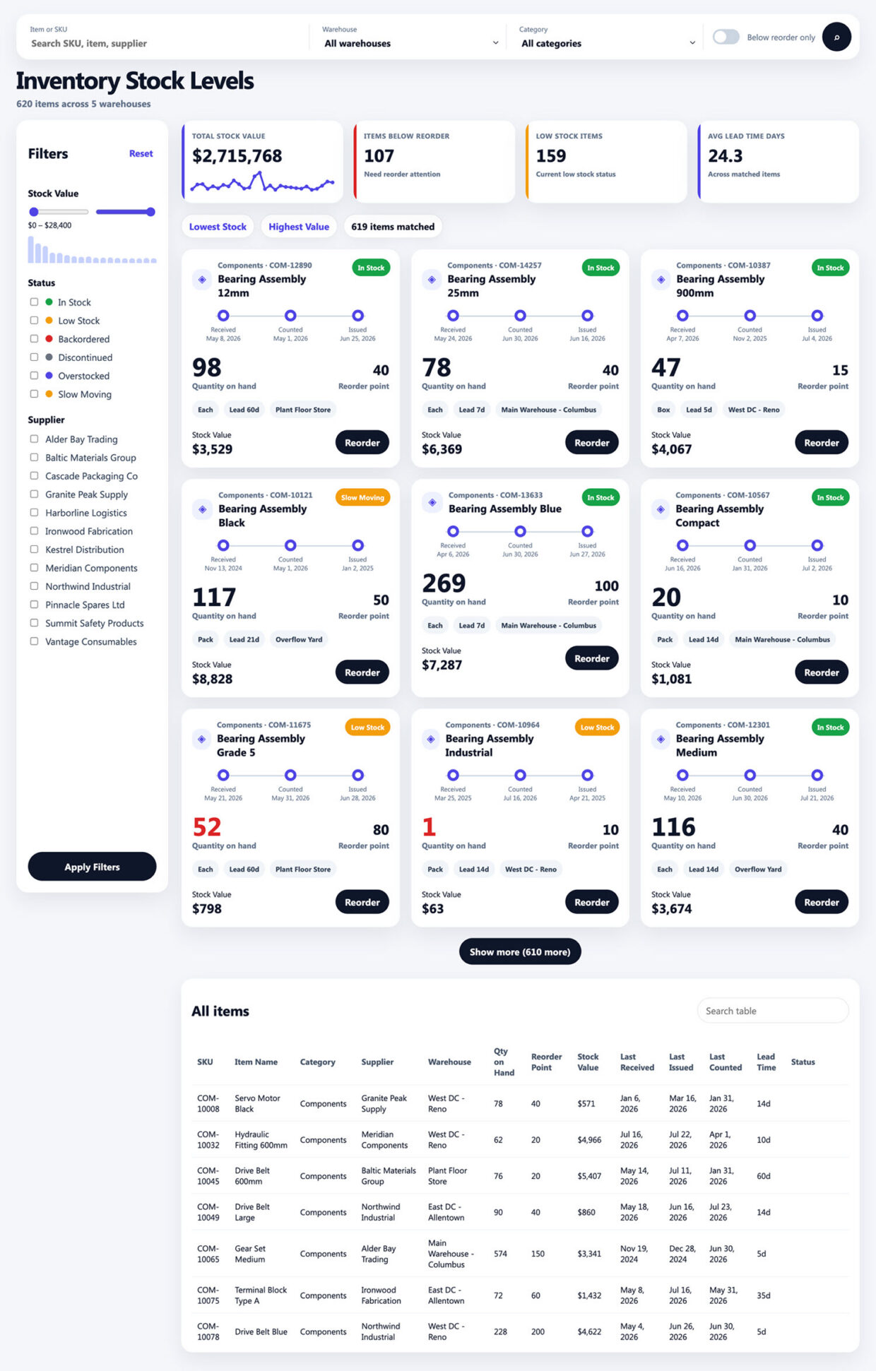
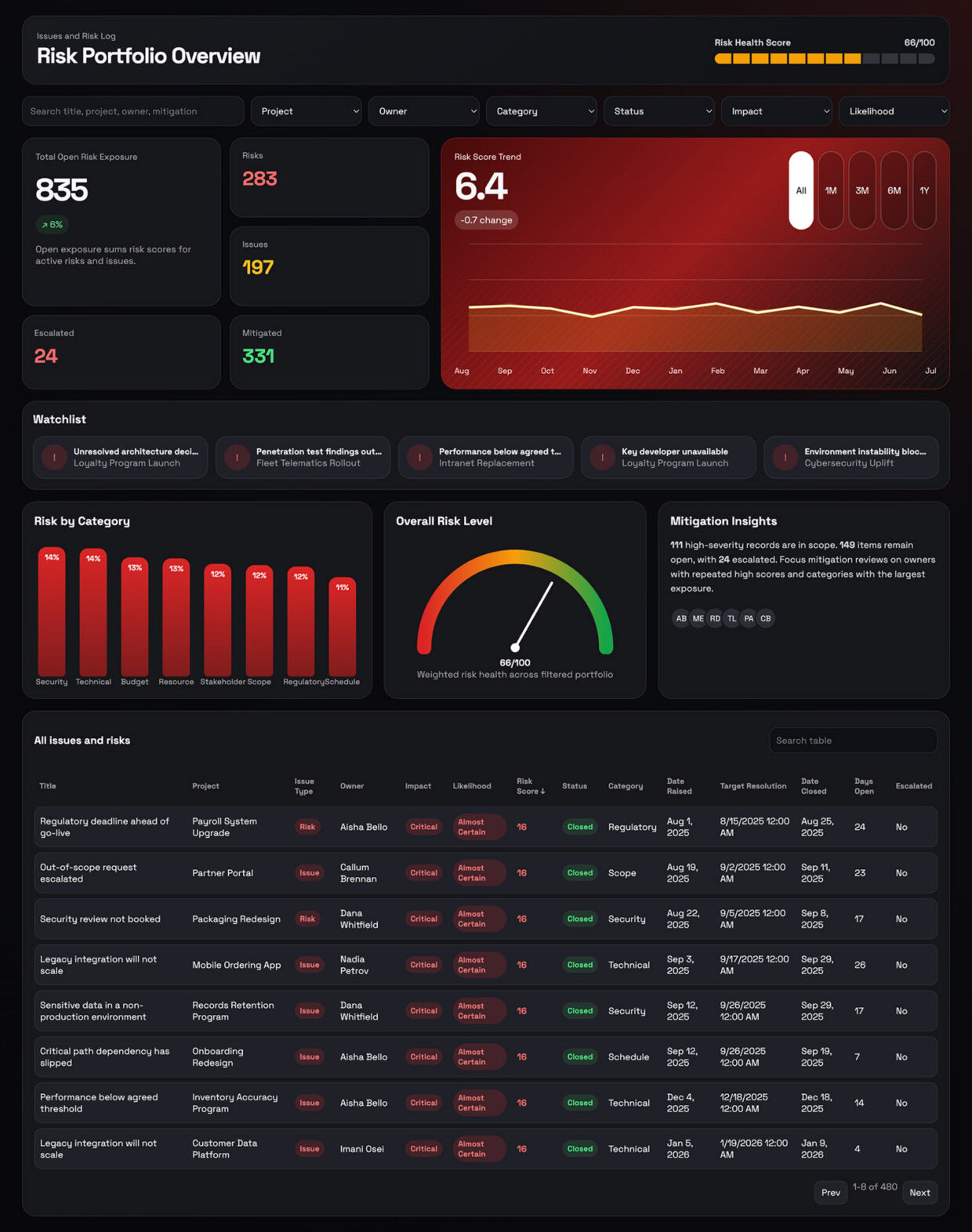
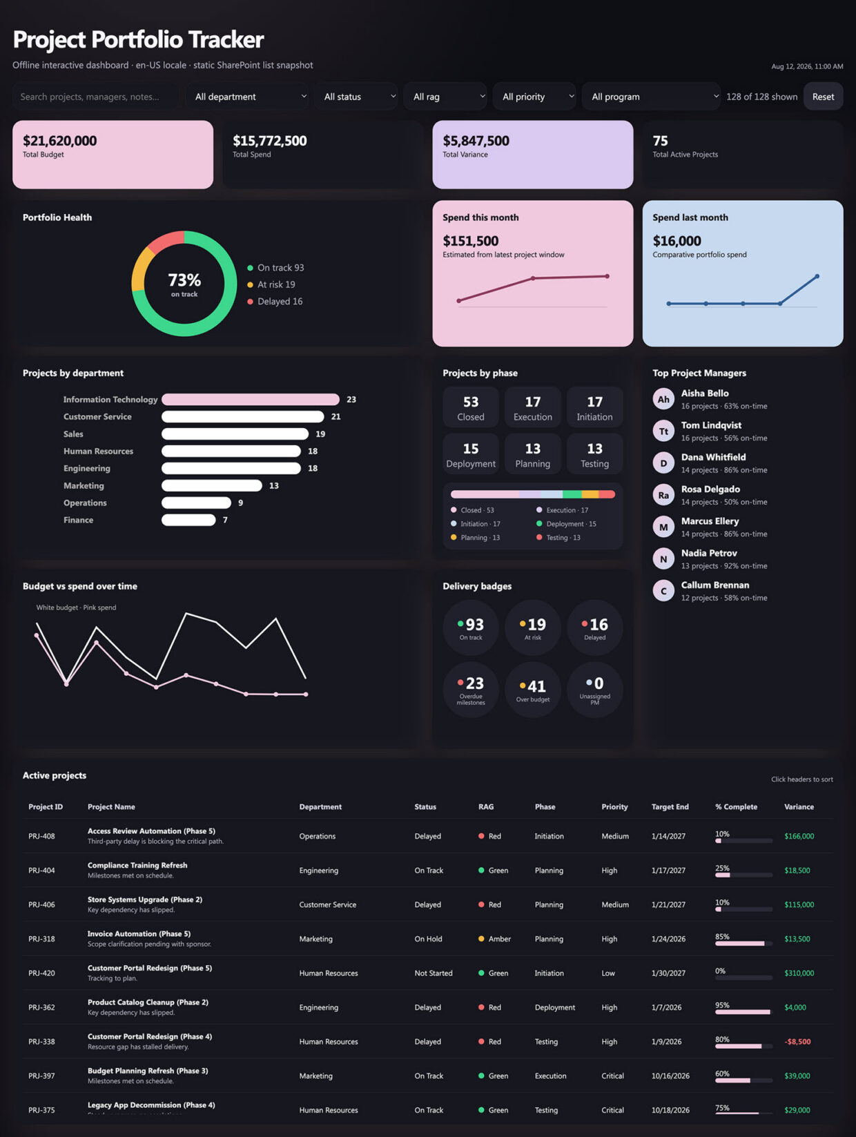
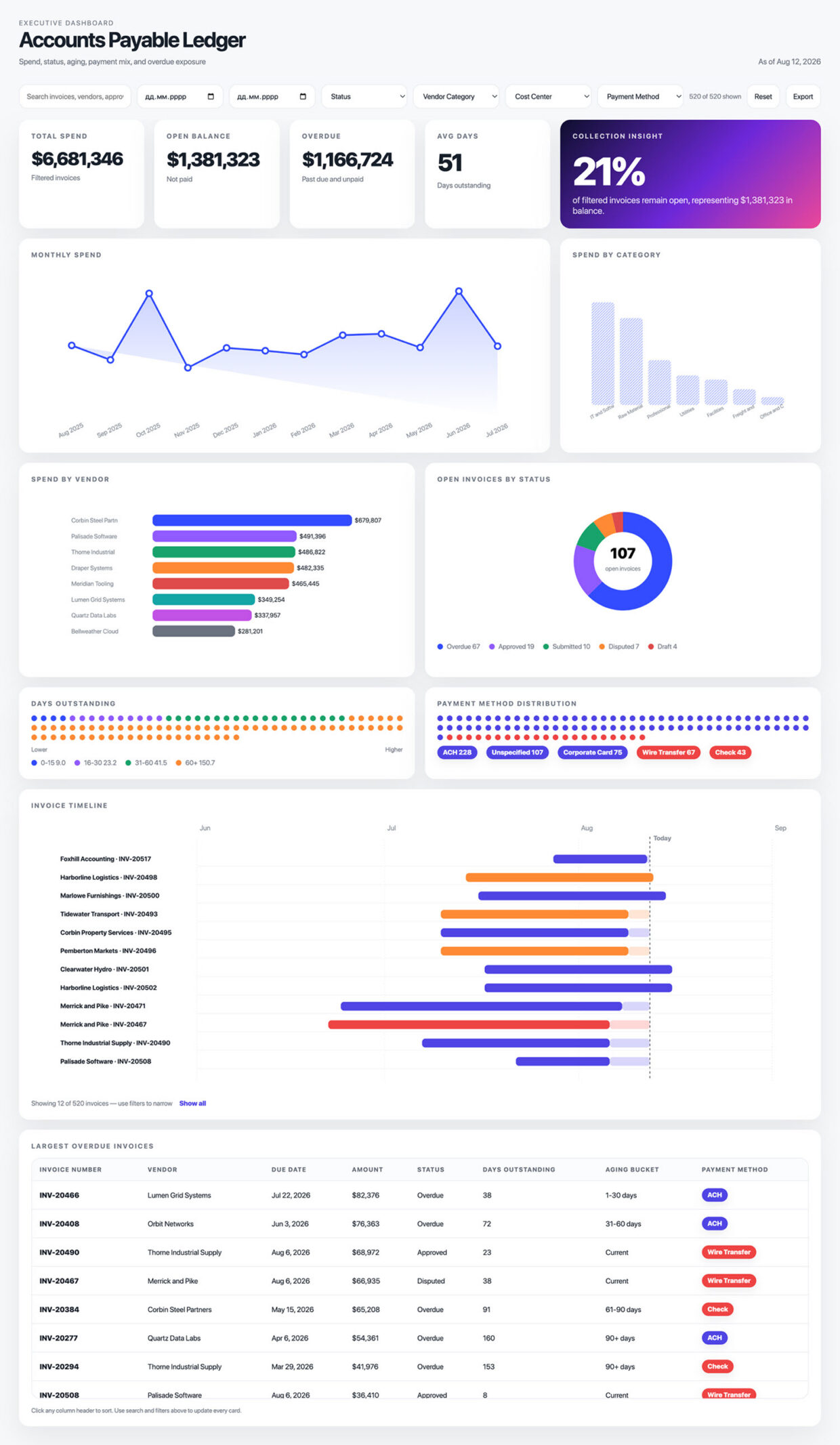
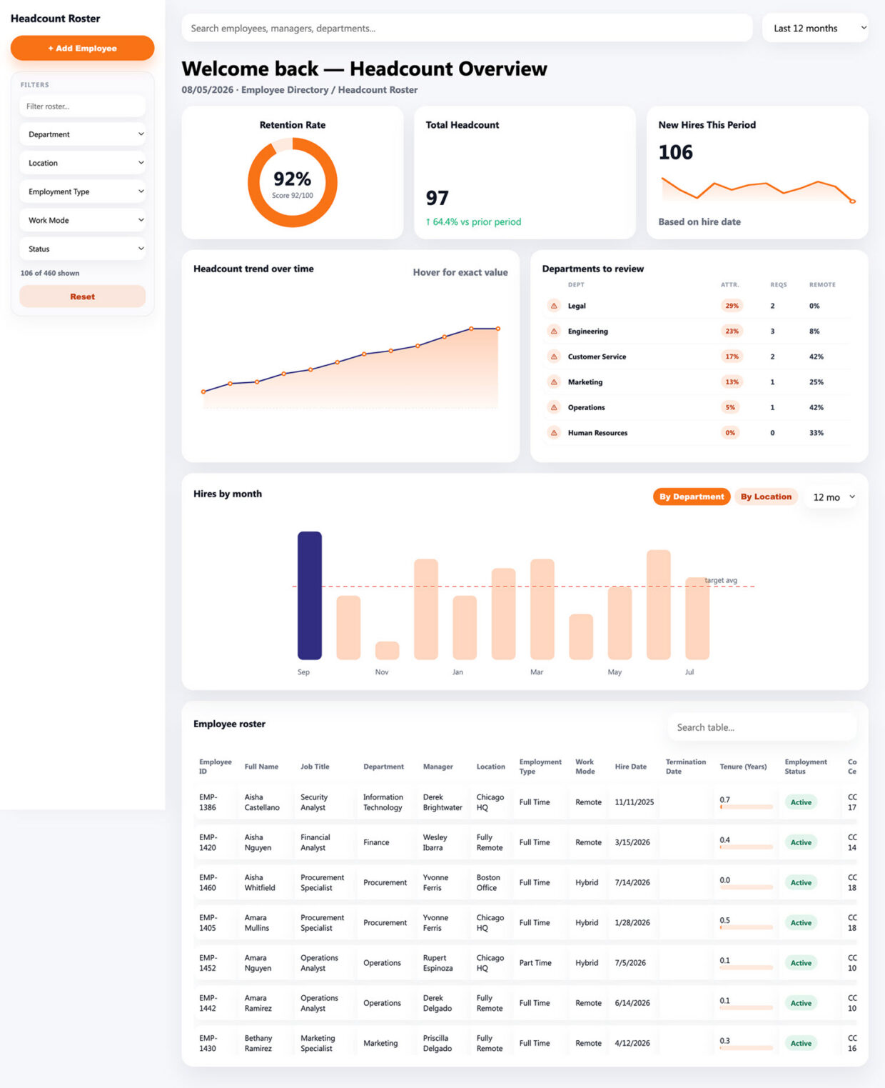
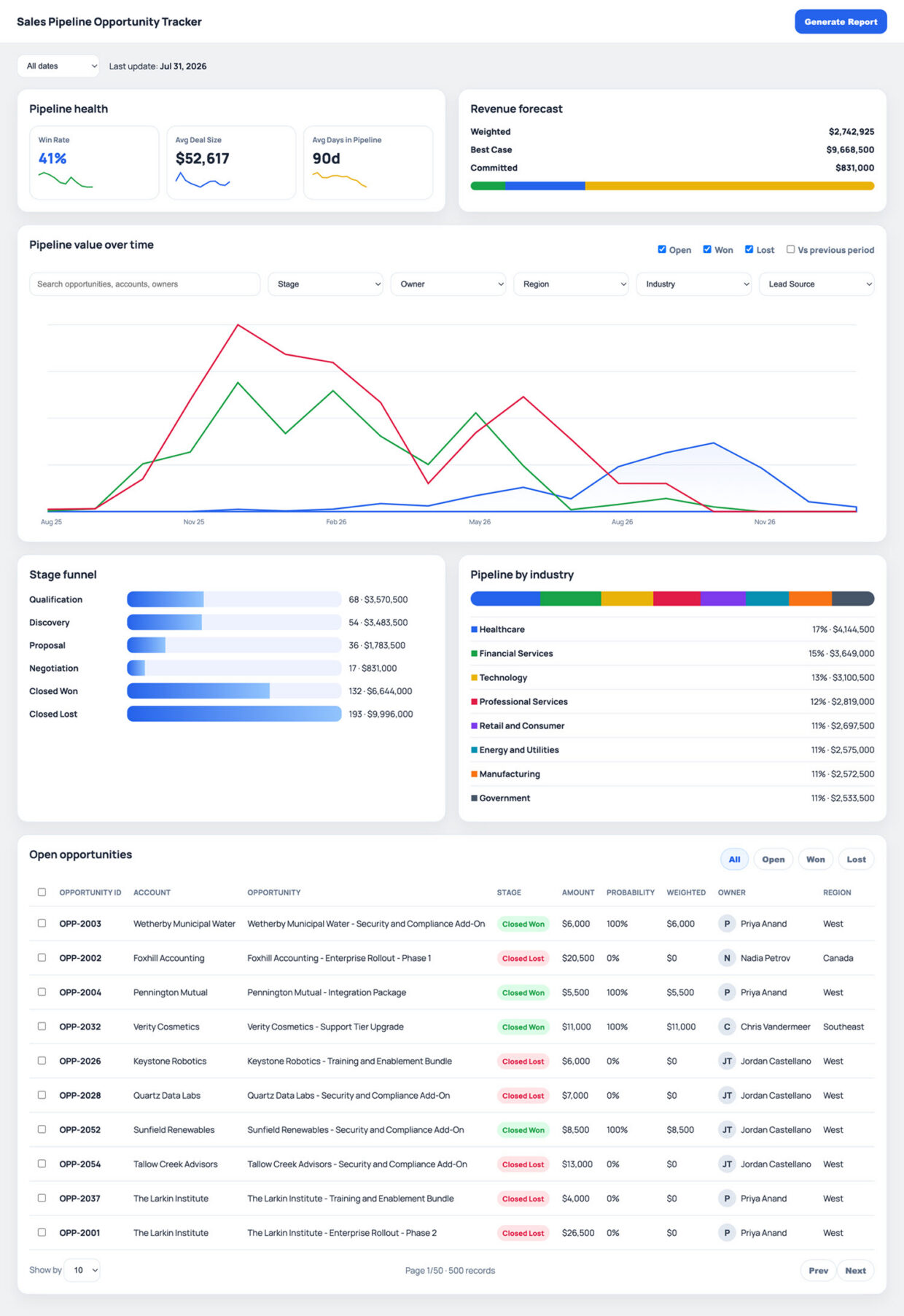
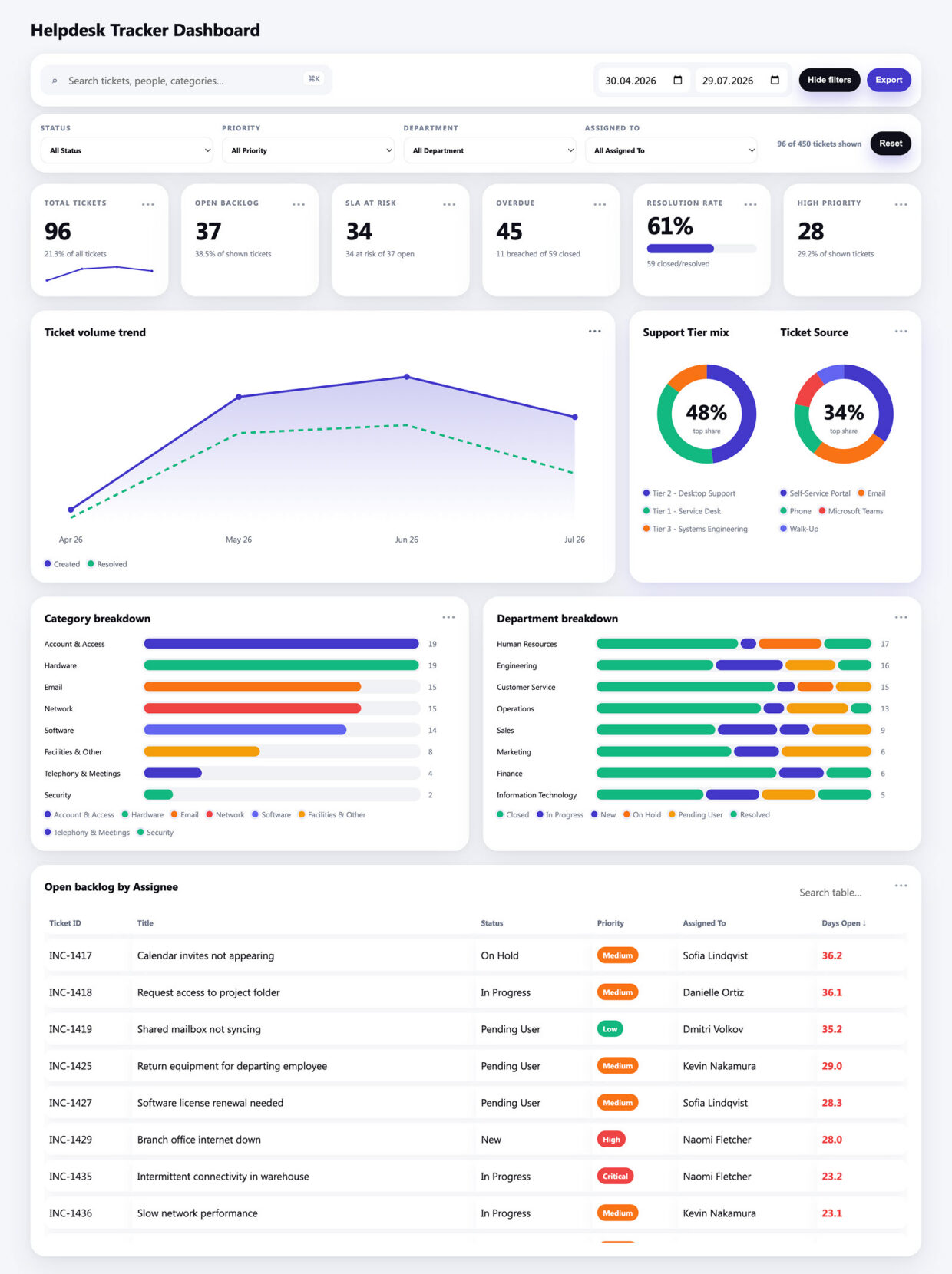
A SharePoint dashboard is a single page that turns an ordinary list or Excel file into something leadership will read: KPI tiles, trend lines, breakdown bars, and a sortable table, all filtered together. Every dashboard in this gallery is built out-of-the-box, with no custom code and no third-party reporting tools.
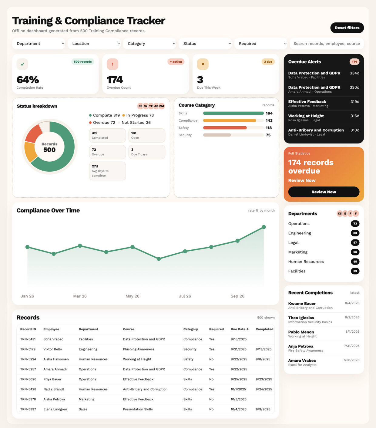
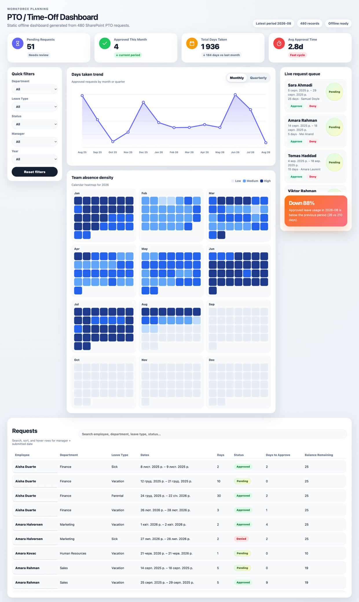
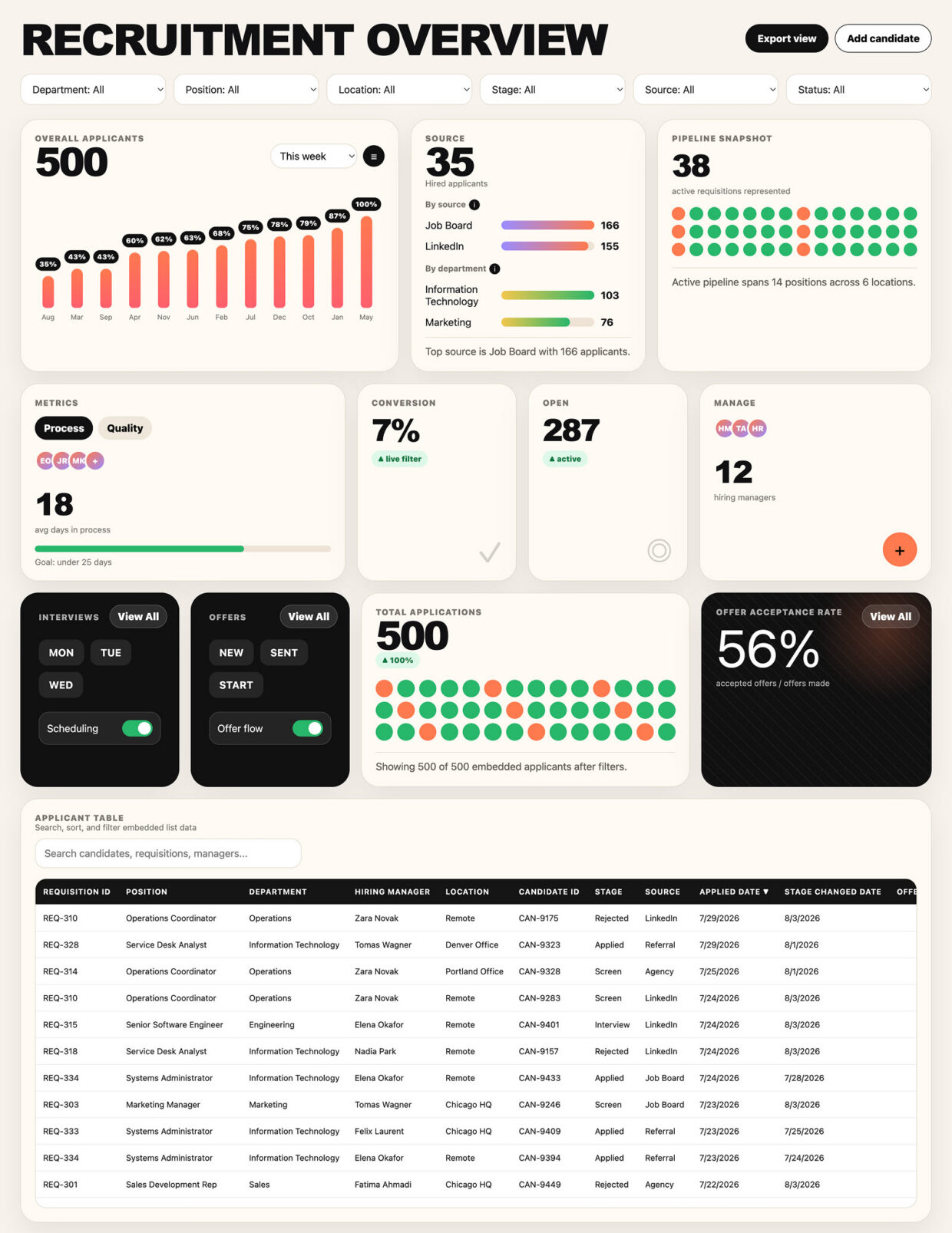
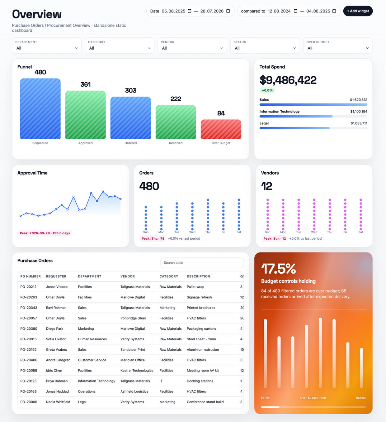
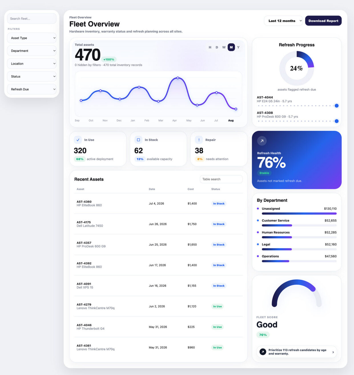
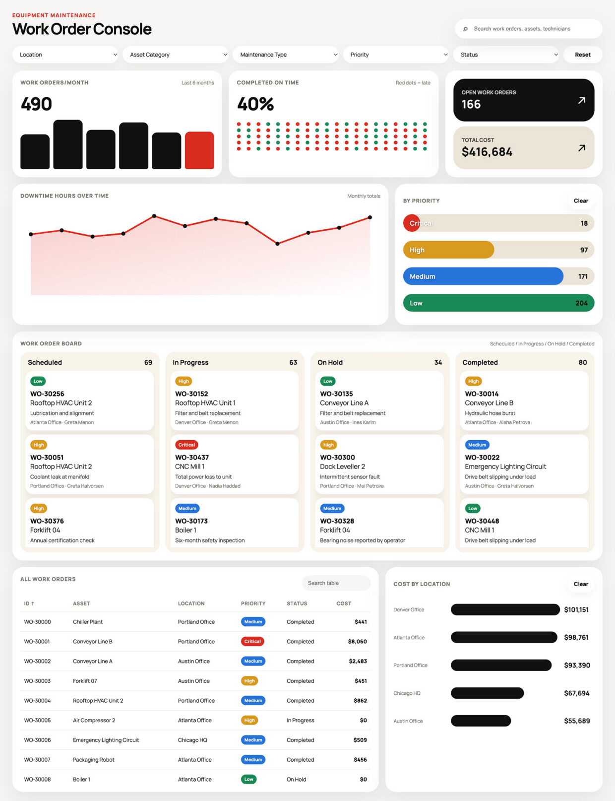
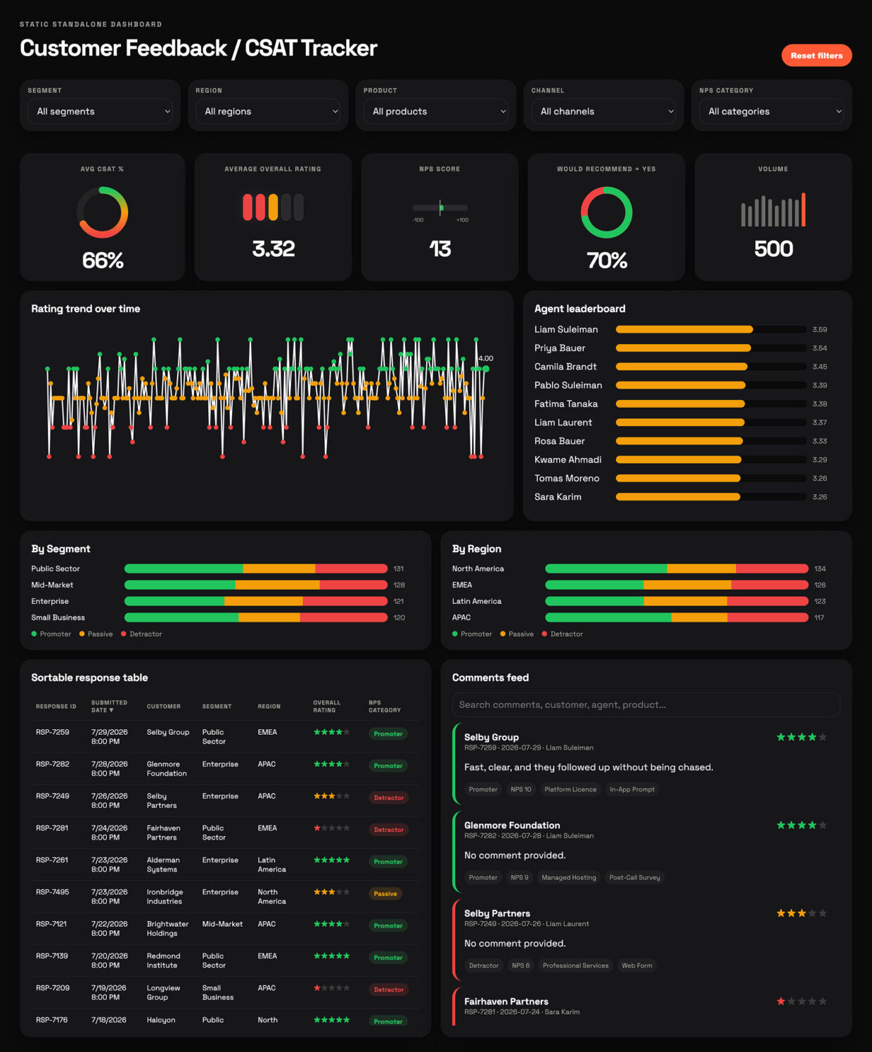
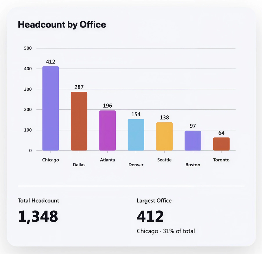
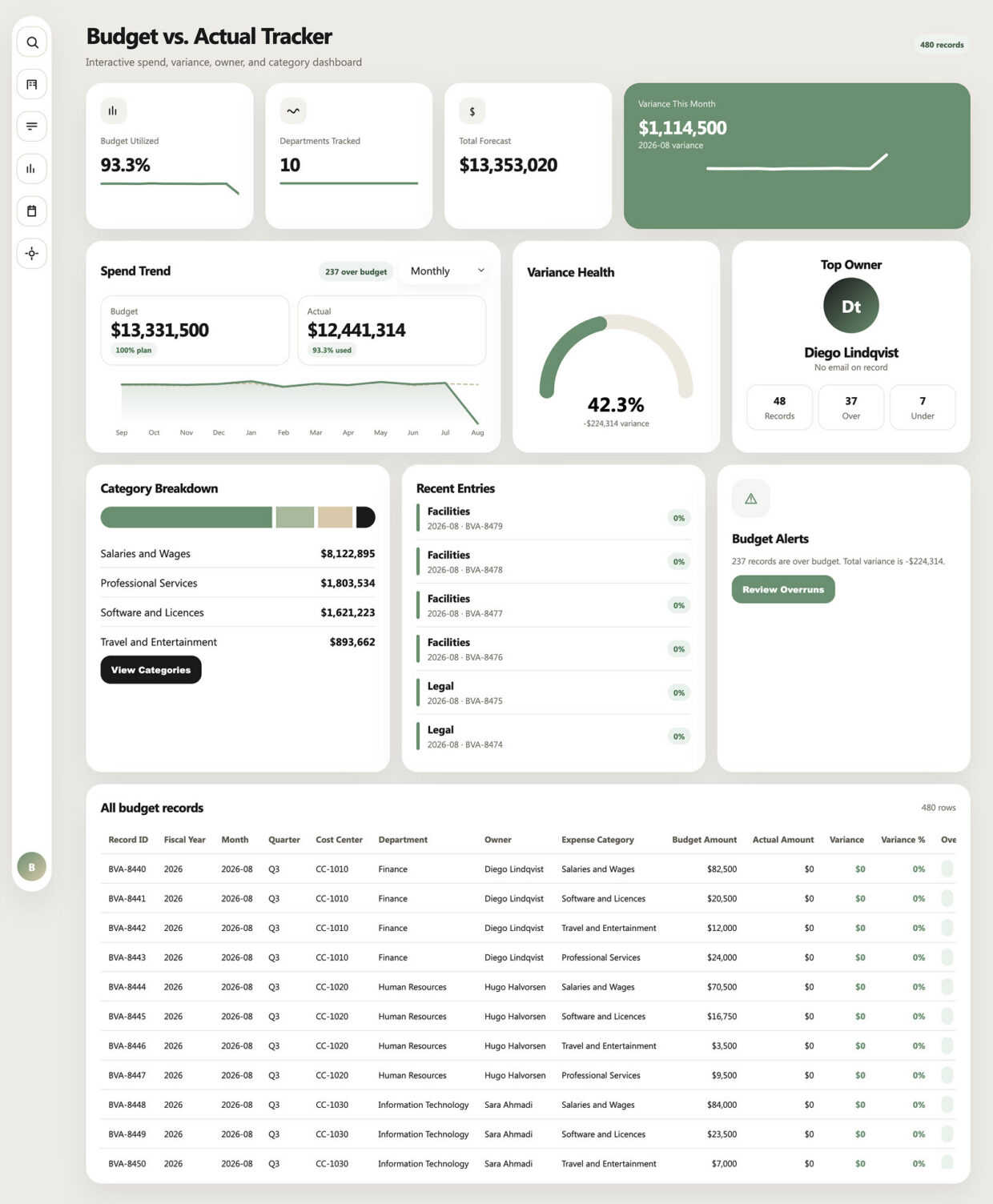
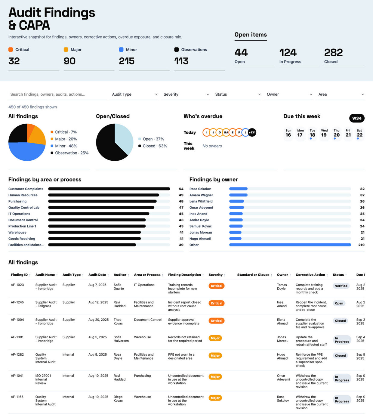
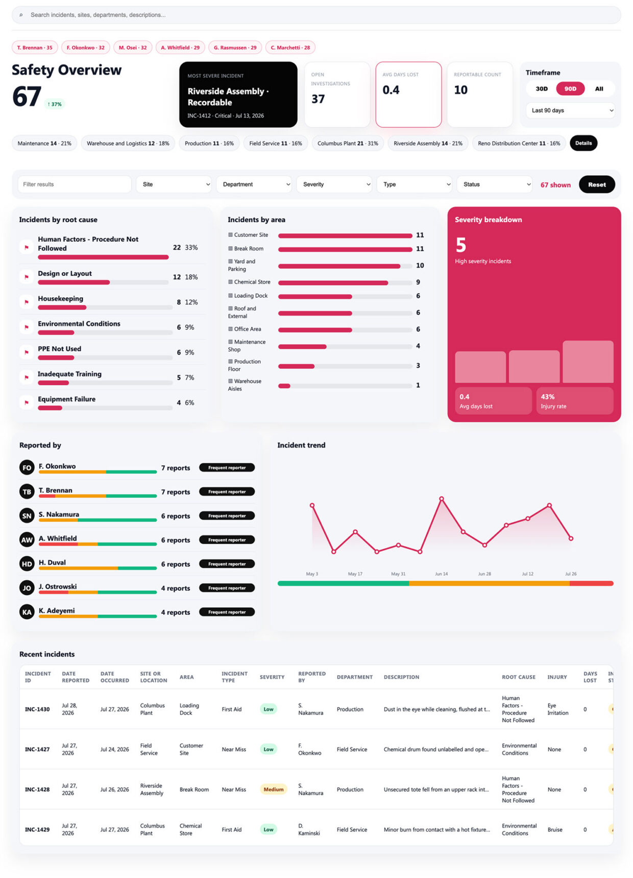
The gallery includes help desk ticket, sales pipeline, accounts payable, project portfolio, employee headcount, issues and risk, inventory stock, incident and safety, recruitment, time off, training compliance, purchase order, IT asset, equipment maintenance, customer feedback, budget versus actual, and audit findings examples, alongside simpler single-metric charts.
Four ways, all out-of-the-box: Copilot in SharePoint for full interactive dashboards, the Quick Chart web part for a single simple metric, the Chart web part for AI-assisted visuals on a page, and Power BI where an organization already owns it. Each example is tagged with the approach Greg Zelfond used.
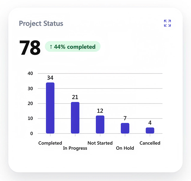
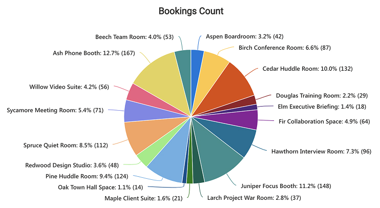
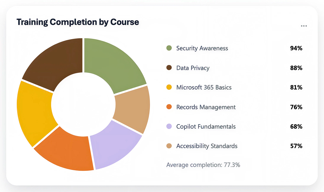
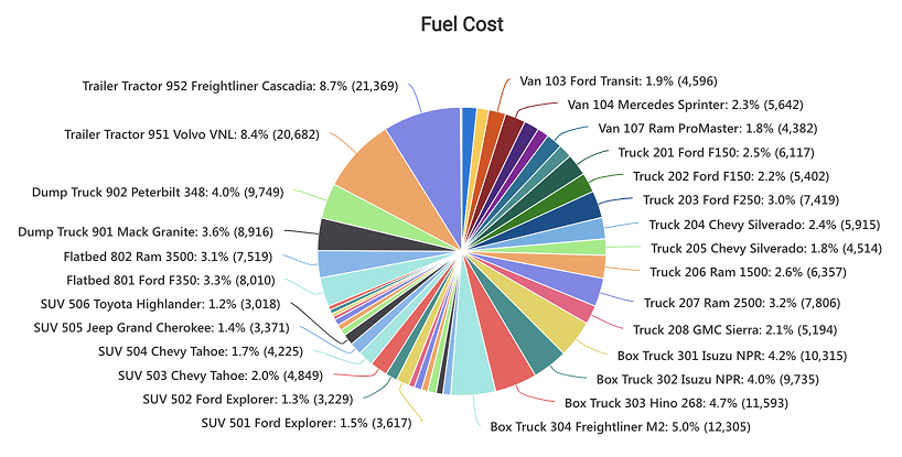
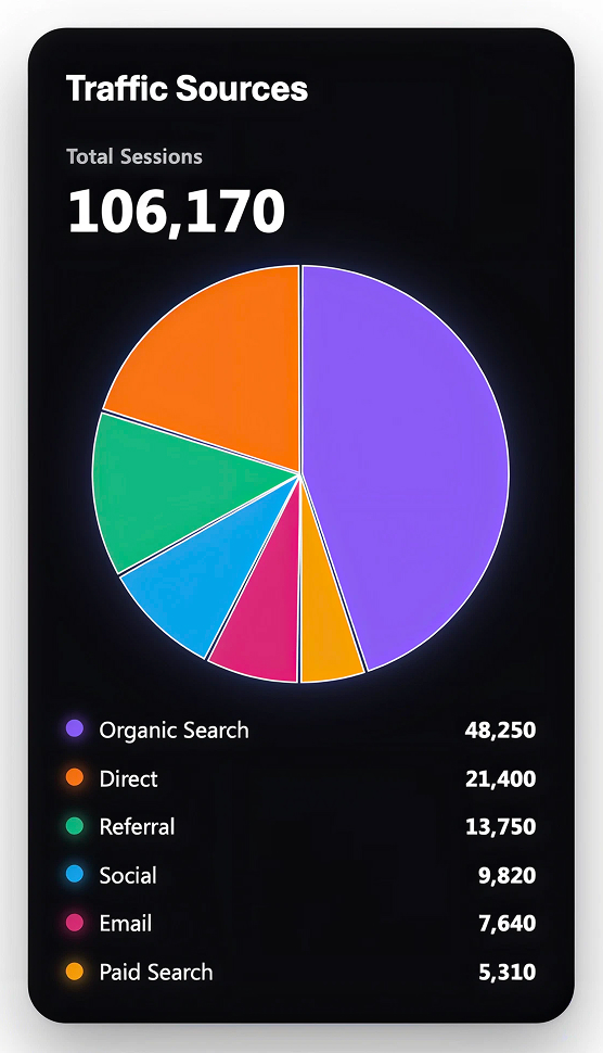
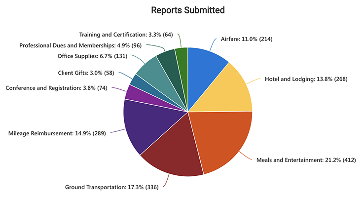
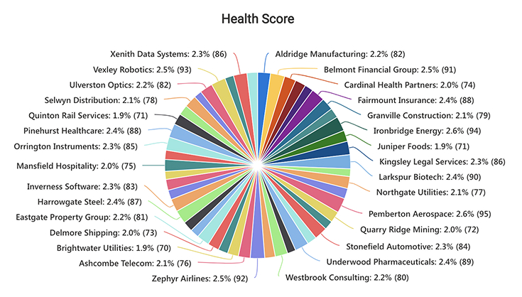
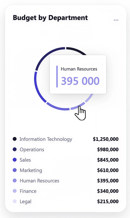
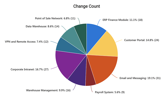
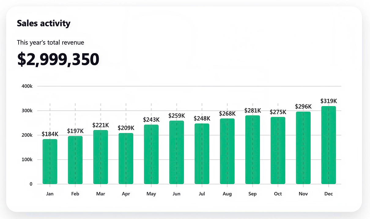
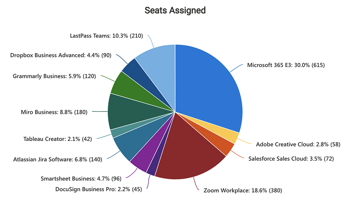
A chart is one visual answering one question, such as budget by department or fleet mileage, and drops onto any page in minutes. A dashboard is a full page combining tiles, several charts, an alert feed, and a records table under shared filters. The gallery deliberately shows both, because most teams need both.
No. Nothing in this gallery requires custom development, third-party reporting software, or an external database. The dashboards are assembled from features already included in Microsoft 365, which keeps them stable through updates and avoids another product to license and administer. Out-of-the-box is the only way Greg Zelfond builds.
From a standard SharePoint list or an Excel file your team already maintains, such as a ticket log, an applicant list, an invoice register, or a training record. No separate data warehouse is involved. Because the source stays where people already work, the dashboard reflects the same records the team updates daily.
Building Reports From Your Data
For dashboards built with Copilot in SharePoint, yes, a Microsoft Copilot license is required. The Quick Chart and Chart web part examples do not need one, so an organization without Copilot can still build useful visuals. Greg Zelfond matches the approach to the licensing you actually have.
Yes, and that is usually the fastest path. If the list already carries clean status, date, and category columns, it can drive a dashboard with no restructuring. Where the data is messy, Greg Zelfond tidies the columns and views first, because a dashboard is only as good as the list underneath it.
Yes. Filters, search, and reset controls redraw every tile, chart, and table at once, and clicking a chart segment narrows the records table to that slice. That is what lets one page serve both an executive scanning totals and a manager chasing individual records, instead of two separate reports.
Yes. Because a dashboard reads directly from the underlying SharePoint list or Excel file, it reflects changes as the team makes them. There is no manual export, no chart to refresh, and no weekly spreadsheet to rebuild, which is the main reason teams replace their existing reporting routine with one.
Yes. The page, the web parts, and the source list are all standard Microsoft 365 objects, so your team can adjust filters, edit visuals, and add records through the normal interface without a developer. Greg Zelfond includes training so the owners can extend the dashboard as reporting needs change.
Yes, this is exactly the kind of work Greg Zelfond does. As an independent SharePoint consultant and Microsoft MVP, he builds out-of-the-box charts and dashboards like the ones in this gallery, on top of the lists your team already keeps. Reach out through the contact page and describe what leadership needs to see.