Project Portfolio (Dashboard)




Overview
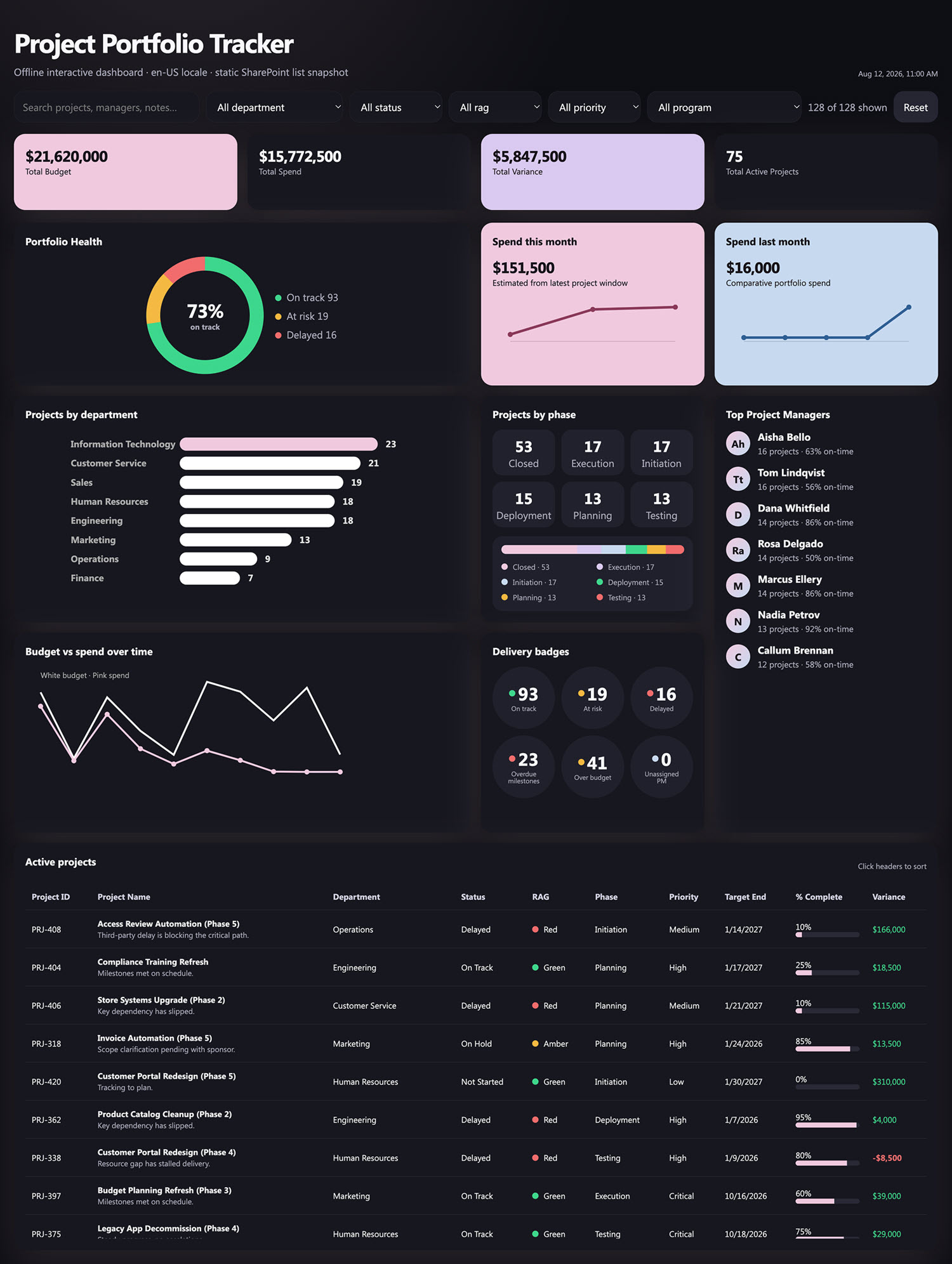
- Filter row with search plus Department, Status, RAG, Priority, and Program, a live count of projects shown, and a reset
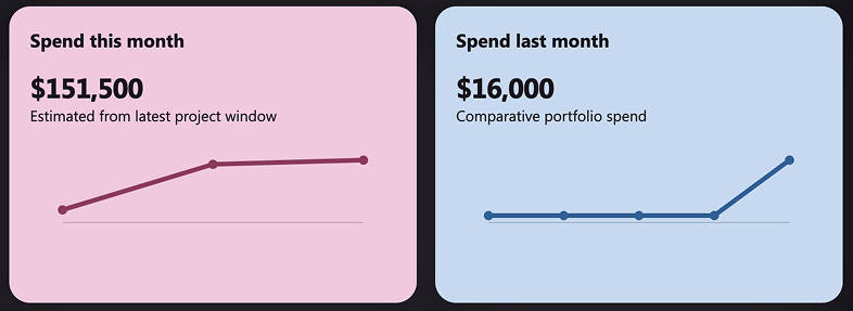
- Four KPI cards – total budget, total spend, total variance, and active projects – alongside spend this month and spend last month, each carrying a cumulative sparkline
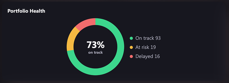
- Portfolio health as a donut with the percentage on track in the middle and a legend splitting on track, at risk, and delayed
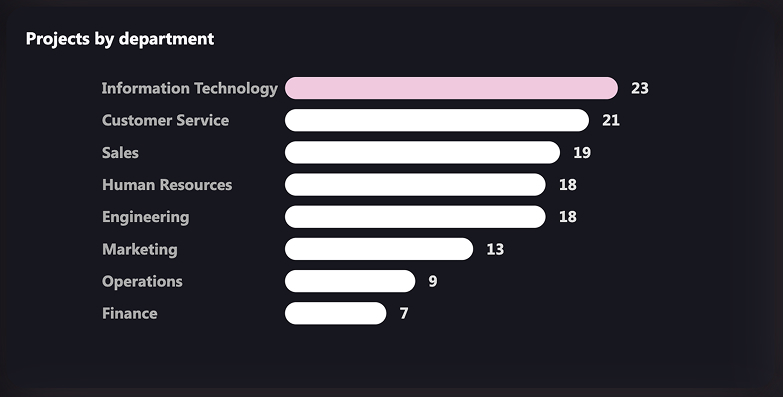
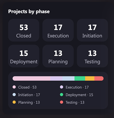
- Projects by department as sorted horizontal bars, and projects by phase as count tiles with a stacked share bar and legend underneath
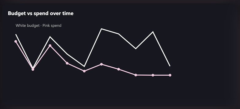
- Budget against spend over time as a two-line chart across the most recent months, with the spend figure on every point
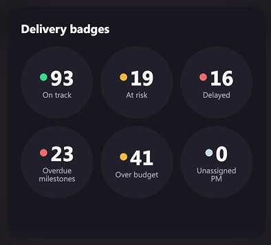
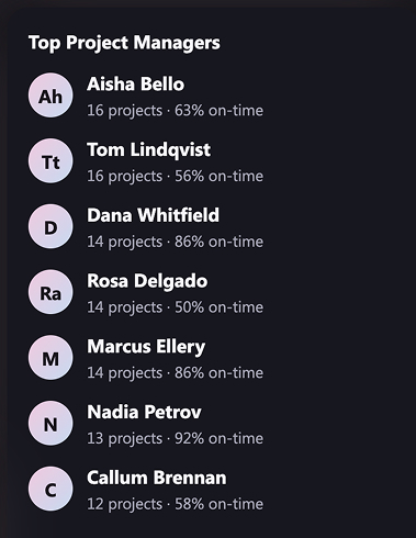
- Delivery badges counting on track, at risk, delayed, overdue milestones, over budget, and unassigned project manager, beside a top project managers panel
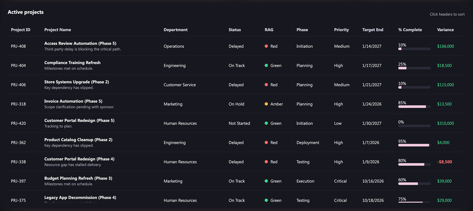
- Active projects table with sortable columns, inline percent complete bars, and variance colour-coded – and everything recalculates together when a filter changes
Benefits
- Replaces the monthly portfolio slide pack and the status chase that produces it
- Puts schedule, budget, and RAG status on one page instead of across three separate reports
- Turns the exception list into six countable badges, so the steering meeting starts with what is actually wrong
- Shows over-budget projects while there is still budget left to reallocate
- Turns a list the PMO already maintains into reporting, with no new system to buy or roll out
- Serves both the executive sponsor and the program manager, because the filters change who the page is for
- Opens in any browser and can be embedded directly into a SharePoint page
Details
- Build Method: Copilot Dashboard
- Chart Types: KPI card, Sparkline, Donut chart, Bar chart, Stacked bar chart, Line chart
Common Questions About the Project Portfolio Dashboard
What is this project portfolio dashboard built with?
It is built on a standard SharePoint list of projects, with Microsoft 365 Copilot generating the dashboard page from that list. There is no project management platform to buy and nothing to license beyond Microsoft 365. The charts, filters, and tables all live on one page that can be embedded in a SharePoint site – the kind of clean, maintainable reporting Greg Zelfond builds for PMOs.
What is included on the project portfolio dashboard?
KPI cards for total budget, spend, variance, and active projects, plus spend this month and last month with sparklines. Below them sit a RAG health donut, projects by department and by phase, budget against spend over time, six delivery badges, a top project managers panel, and an active projects table with percent complete bars. Filters cover department, status, RAG, priority, and program.
Where does the dashboard data come from?
A single SharePoint list with eighteen columns – project ID and name, program, sponsor, project manager, department, status, RAG status, phase, priority, start date, target and actual end dates, percent complete, budget, spend to date, budget variance, and health notes. Most PMOs already keep a version of this list somewhere.
Does the dashboard refresh automatically from the SharePoint list?
This example carries its data with it, so it opens instantly and works offline, and it is refreshed by regenerating the page from the current list. When a live-refreshing view is the requirement instead, the same numbers can be charted with the Quick Chart web part directly on a SharePoint page, or with Power BI when scheduled refresh is needed.
Should we use Copilot, the Quick Chart web part, or Power BI?
It depends on how much you need. The Quick Chart web part is the lightest option – one chart, pointed at a list, no setup. A Copilot-generated dashboard suits a full page with filters and several linked charts that move together. Power BI earns its place when data volumes are large, sources need joining, or row-level security and scheduled refresh matter.
Can Greg build this dashboard for our organization?
Yes – this is exactly the kind of work Greg Zelfond does. As an independent SharePoint consultant and Microsoft MVP, he sets up the underlying list, shapes the columns so the charts are worth drawing, and builds the dashboard around the questions your leadership actually asks rather than the ones the data happens to answer. Reach out through the contact page.