Meeting Room Utilization (Quick Chart)



Overview
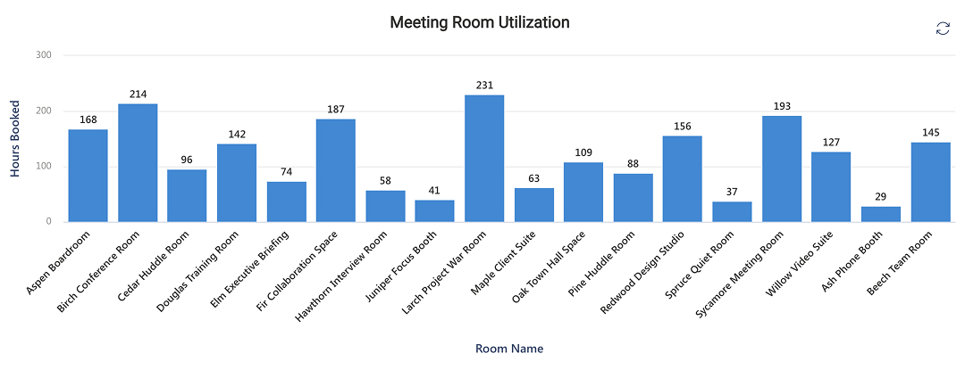
- Column chart, the first of the two chart types the Quick Chart web part offers, rendering hours booked by room
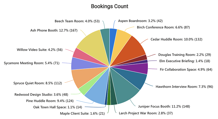
- Pie chart, the web part’s second chart type, added as a separate Quick Chart web part on the same page so one dataset answers two questions at once
- Automatic value labels above every column, with the category names angled along the axis so eighteen of them stay readable at full page width
- A value axis the web part scales and labels on its own, running here from zero to 300 in even steps
- Chart title plus custom X and Y axis titles, all typed straight into the web part property pane
- Pie slices labeled automatically with the category, its percentage, and the underlying value – built-in behavior rather than a setting to switch on
- Both charts read their source live and cap at fifty data points, the web part’s display ceiling; eighteen rooms sit comfortably inside it
Benefits
- Answers the space question with evidence rather than with the impression people have of it
- Separates hours from bookings, which is the difference between needing more rooms and needing different rooms
- Identifies the rooms nobody uses, which is usually where the next desk conversion comes from
- Turns a list facilities already maintains into reporting, with no new system to buy or roll out
- Serves both the facilities lead and the office manager, because both charts come off the same list
- Reads the list live, so the chart moves as the booking figures are refreshed
- Takes about five minutes to set up, with no code and nothing to license beyond Microsoft 365
Details
- Chart Types: Column chart, Pie chart
Common Questions About the Meeting Room Utilization Chart
What is this meeting room chart built with?
The Quick Chart web part, out of the box in SharePoint, pointed at a standard SharePoint list. There is no room-booking analytics module, no Copilot license, and nothing to license beyond Microsoft 365. Both charts sit directly on a SharePoint page next to the list they read from – the kind of clean, maintainable reporting Greg Zelfond builds for facilities teams.
What is included in this meeting room example?
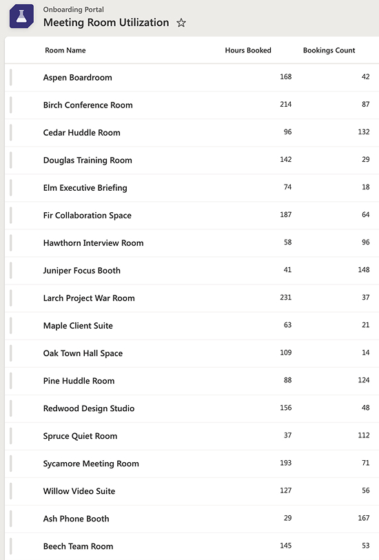
An eighteen-row SharePoint list of rooms, a column chart of hours booked by room, and a pie chart of bookings count. The column chart ranks hours from the Larch Project War Room at 231 down to the Ash Phone Booth at 29. The pie splits 1,319 bookings across the same eighteen rooms.
Where does the chart data come from?
A single SharePoint list with three columns – room name, hours booked, and bookings count – and eighteen rows, one per room. Quick Chart plots rows exactly as they sit, so the totals are worked out in the list rather than by the chart.
What are the limits of the Quick Chart web part?
Four worth knowing. It draws column and pie charts only. It shows at most fifty items. The list needs one text column for the X axis and one number or currency column for the Y axis, or it will not appear as a data source. And it does no grouping or summing – one row becomes one data point, so the list must be pre-aggregated. It does read the list live, so an updated figure appears without republishing.
Should we use Copilot, the Quick Chart web part, or Power BI?
It depends on how much you need. The Quick Chart web part is the lightest option – one chart, pointed at a list, no setup. A Copilot-generated dashboard suits a full page with filters and several linked charts that move together. Power BI earns its place when data volumes are large, sources need joining, or row-level security and scheduled refresh matter.
Can Greg build this for our organization?
Yes – this is exactly the kind of work Greg Zelfond does. As an independent SharePoint consultant and Microsoft MVP, he sets up the underlying list, shapes the columns so the chart is worth drawing, and builds the reporting around the questions your leadership actually asks rather than the ones the data happens to answer. Reach out through the contact page.