Issues and Risk (Dashboard)




Overview
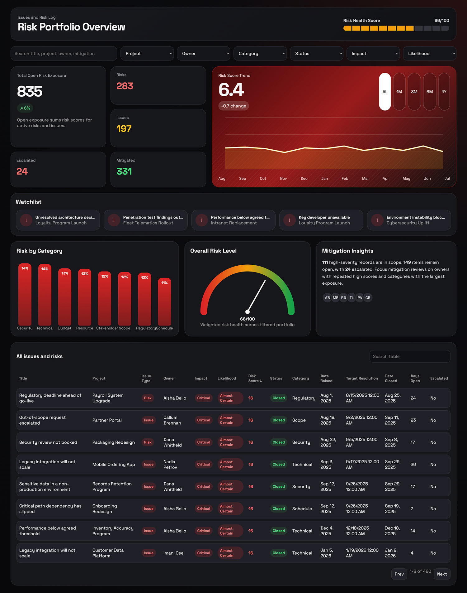
- Filter row with search plus Project, Owner, Category, Status, Impact, and Likelihood, next to a risk health score out of one hundred shown as a segmented meter
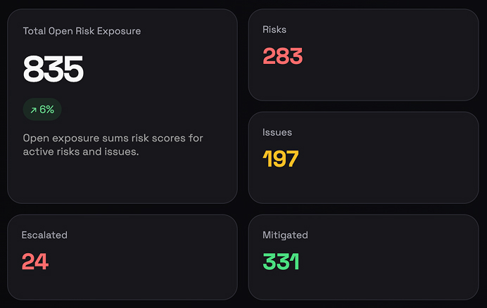
- Total open risk exposure as the headline number, summing the risk scores of everything still active, with counters beside it for risks, issues, escalated, and mitigated
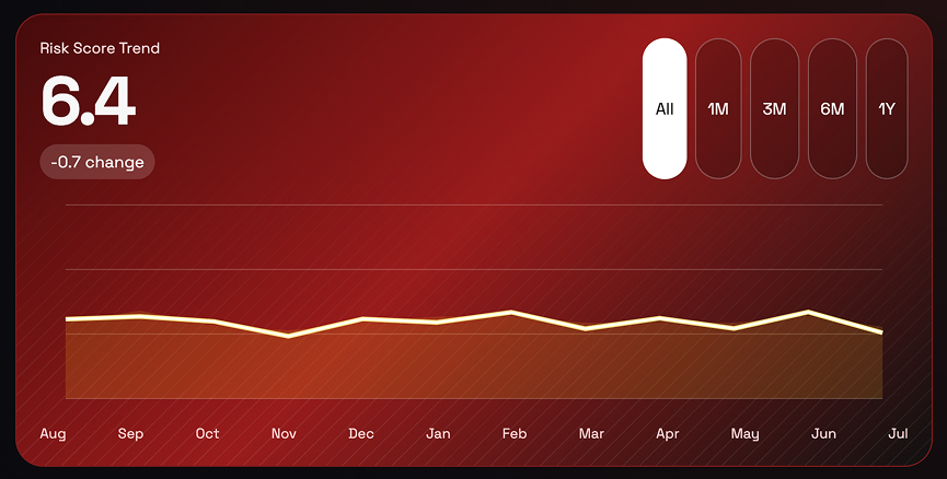
- Risk score trend as an area line chart with range buttons for all time, one, three, six months, and a year, and a hover readout giving the month, the score, and the change
- Watchlist chips putting the five highest-scoring open items, each with its project, in front of the reader before anything else
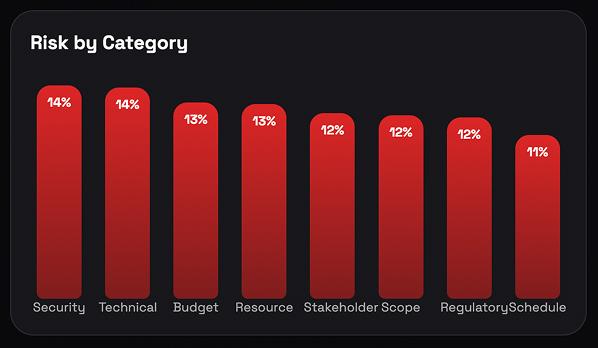
- Risk by category as vertical bars showing each category’s share of total exposure, largest first
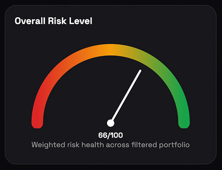
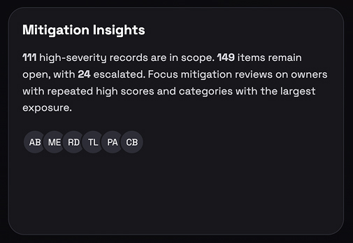
- Overall risk level as a needle gauge on a red to green arc, beside a mitigation insights panel summarising high-severity, open, and escalated counts with the owners involved
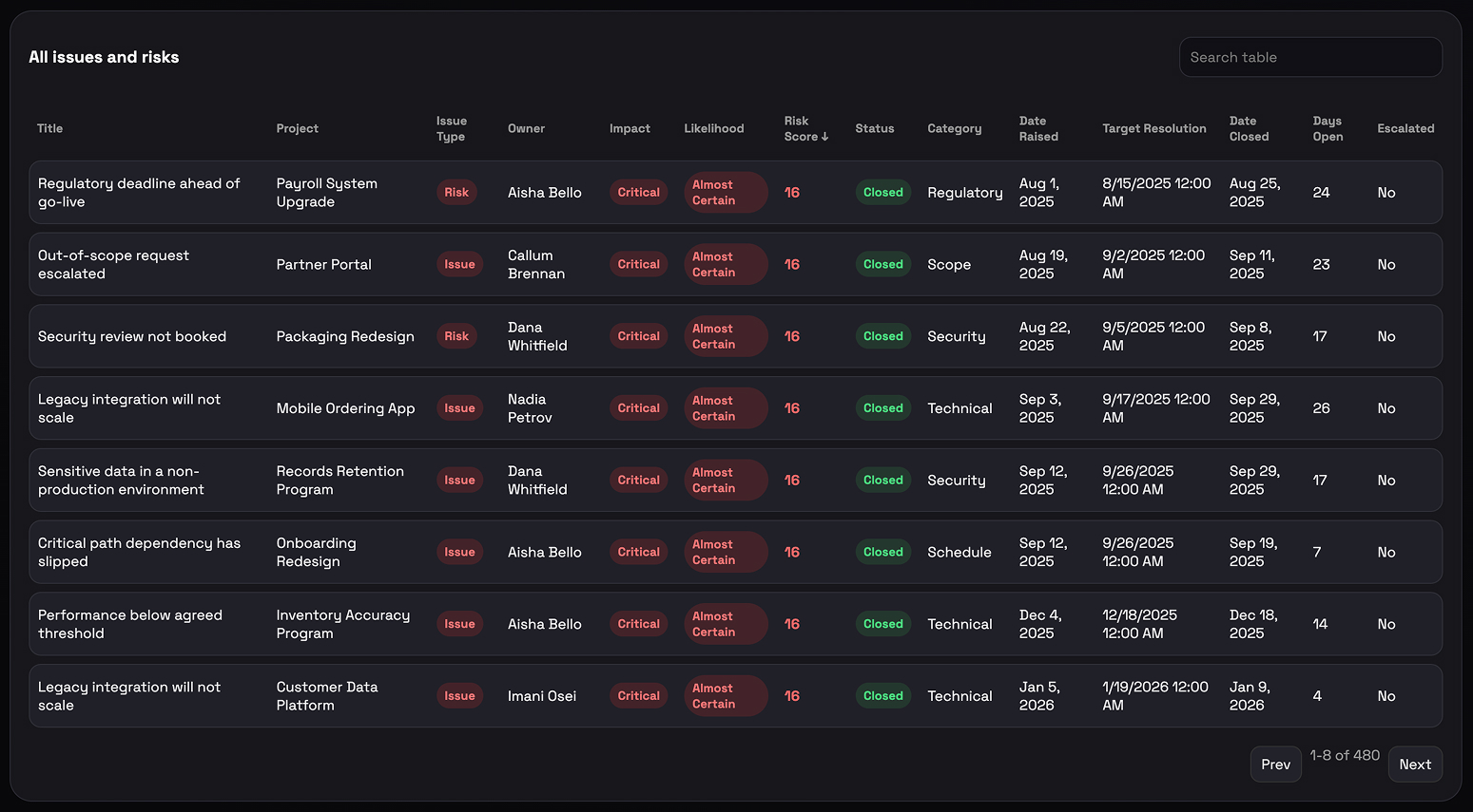
- A paged, sortable table of every issue and risk with impact, likelihood, and risk score badges – and everything recalculates together when a filter changes
Benefits
- Replaces the risk register review that currently happens by scrolling a spreadsheet
- Puts the five items that most deserve attention on screen first, rather than buried on row forty
- Gives leadership a single risk health score they can track meeting to meeting
- Shows whether average risk scores are drifting up or down over the year
- Turns a log the delivery team already maintains into reporting, with no new system to buy or roll out
- Separates risks from issues on the same page, so what might happen is never mistaken for what already has
- Opens in any browser and can be embedded directly into a SharePoint page
Details
- Build Method: Copilot Dashboard
- Chart Types: KPI card, Gauge chart, Area chart, Column chart, Table
Common Questions About the Issues and Risk Dashboard
What is this issues and risk dashboard built with?
It is built on a standard SharePoint risk log, with Microsoft 365 Copilot generating the dashboard page from that list. There is no governance platform to buy and nothing to license beyond Microsoft 365. The charts, filters, and tables all live on one page that can be embedded in a SharePoint site – the kind of clean, maintainable reporting Greg Zelfond builds for delivery teams.
What is included on the issues and risk dashboard?
A risk health score, total open risk exposure, and counters for risks, issues, escalated, and mitigated items. Below them sit a risk score trend with time range buttons, a watchlist of the five highest-scoring open items, risk by category bars, an overall risk level gauge, a mitigation insights panel, and a paged table of the full log. Filters cover project, owner, category, status, impact, and likelihood.
Where does the dashboard data come from?
A single SharePoint list with seventeen columns – item ID, type, title, project, raised by, owner, impact, likelihood, risk score, status, category, date raised, target resolution, date closed, days open, mitigation plan, and an escalated flag. Most delivery teams already keep a version of this log somewhere.
Does the dashboard refresh automatically from the SharePoint list?
This example carries its data with it, so it opens instantly and works offline, and it is refreshed by regenerating the page from the current list. When a live-refreshing view is the requirement instead, the same numbers can be charted with the Quick Chart web part directly on a SharePoint page, or with Power BI when scheduled refresh is needed.
Should we use Copilot, the Quick Chart web part, or Power BI?
It depends on how much you need. The Quick Chart web part is the lightest option – one chart, pointed at a list, no setup. A Copilot-generated dashboard suits a full page with filters and several linked charts that move together. Power BI earns its place when data volumes are large, sources need joining, or row-level security and scheduled refresh matter.
Can Greg build this dashboard for our organization?
Yes – this is exactly the kind of work Greg Zelfond does. As an independent SharePoint consultant and Microsoft MVP, he sets up the underlying list, shapes the columns so the charts are worth drawing, and builds the dashboard around the questions your leadership actually asks rather than the ones the data happens to answer. Reach out through the contact page.