Audit Findings (Dashboard)




Overview
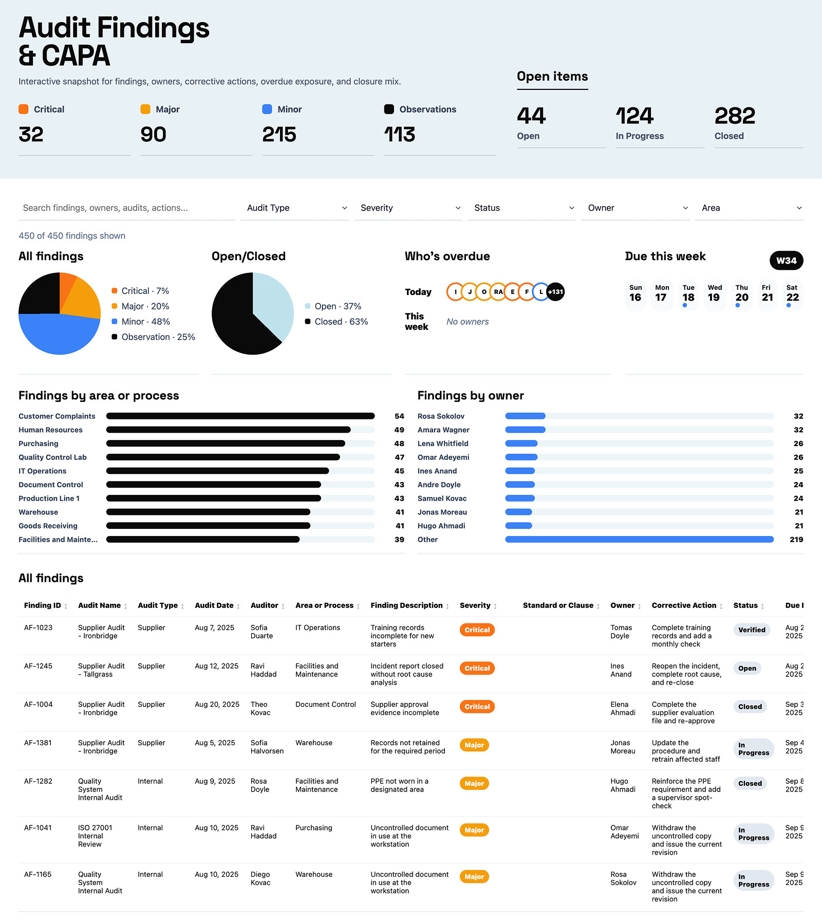
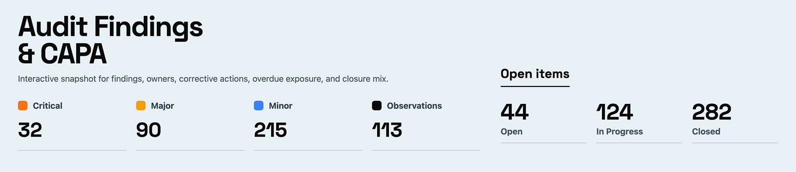
- Four severity tiles in the hero – Critical, Major, Minor, and Observations – each carrying the count and its share of the current selection
- An Open items row splitting the same findings into Open, In Progress, and Closed, so the closure position reads before any chart does
- Filter bar with search plus Audit Type, Severity, Status, Owner, and Area, with a live count of how many findings are currently shown
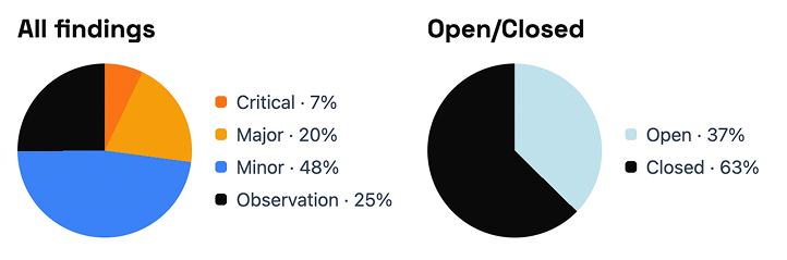
- Two pie charts side by side for the severity mix and the open-versus-closed split, each with a percentage legend beside it
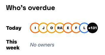
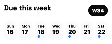
- A Who’s overdue panel naming the owners carrying overdue corrective actions, next to a seven-day calendar strip that dots the days actions fall due this week
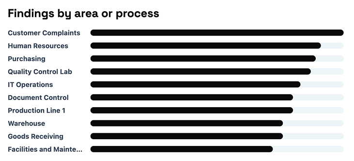
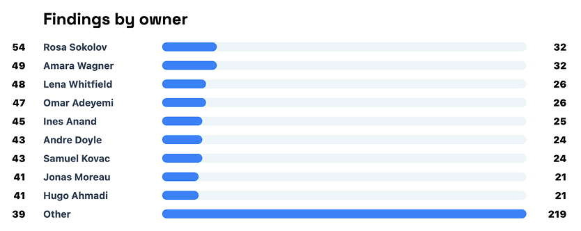
- Sorted horizontal bars for findings by area or process and findings by owner, so the biggest source of findings is obvious without reading a single number
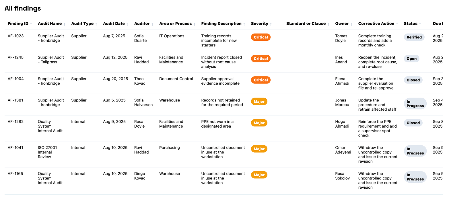
- A sortable sixteen-column findings table with severity badges and overdue days flagged in red, and everything on the page recalculates together when a filter changes
Benefits
- Replaces the findings spreadsheet that gets rebuilt by hand before every management review
- Shows overdue corrective actions while there is still time to chase them, rather than at the next audit
- Makes the repeat-finding rate visible, which is the number auditors ask about first
- Gives each area owner their own view without anyone exporting the findings log
- Turns a list the quality team already maintains into reporting, with no new system to buy or roll out
- Serves the compliance lead and the process owner from one page, because the filters change who the page is for
- Opens in any browser and can be embedded directly into a SharePoint page
Details
- Build Method: Copilot Dashboard
- Chart Types: KPI card, Pie chart, Bar chart, Heatmap, Table
Common Questions About the Audit Findings Dashboard
What is this audit findings dashboard built with?
It is built on a standard SharePoint list of audit findings and corrective actions, with Microsoft 365 Copilot generating the dashboard page from that list. There is no third-party reporting tool and nothing to license beyond Microsoft 365. The charts, filters, and findings table all live on one page that can be embedded in a SharePoint site – the kind of clean, maintainable reporting Greg Zelfond builds for quality and compliance teams.
What is included on the audit findings dashboard?
Severity tiles for Critical, Major, Minor, and Observations, and an Open items row for Open, In Progress, and Closed. Below them sit pies for the severity mix and the open-versus-closed split, a Who’s overdue owner panel, a due-this-week calendar strip, sorted bars by process area and by owner, and a sortable findings table. Filters cover audit type, severity, status, owner, and area.
Where does the dashboard data come from?
A single SharePoint list with sixteen columns – finding ID, audit name and type, audit date, auditor, area or process, description, severity, standard or clause, owner, corrective action, status, due and closed dates, days overdue, and a repeat-finding flag. Most quality teams already keep a version of this list.
Does the dashboard refresh automatically from the SharePoint list?
This example carries its data with it, so it opens instantly and works offline, and it is refreshed by regenerating the page from the current list. When a live-refreshing view is the requirement instead, the same numbers can be charted with the Quick Chart web part directly on a SharePoint page, or with Power BI when scheduled refresh is needed.
Should we use Copilot, the Quick Chart web part, or Power BI?
It depends on how much you need. The Quick Chart web part is the lightest option – one chart, pointed at a list, no setup. A Copilot-generated dashboard suits a full page with filters and several linked charts that move together. Power BI earns its place when data volumes are large, sources need joining, or row-level security and scheduled refresh matter.
Can Greg build this dashboard for our organization?
Yes – this is exactly the kind of work Greg Zelfond does. As an independent SharePoint consultant and Microsoft MVP, he sets up the underlying list, shapes the columns so the charts are worth drawing, and builds the dashboard around the questions your leadership actually asks rather than the ones the data happens to answer. Reach out through the contact page.