Help Desk Ticket (Dashboard)




Overview
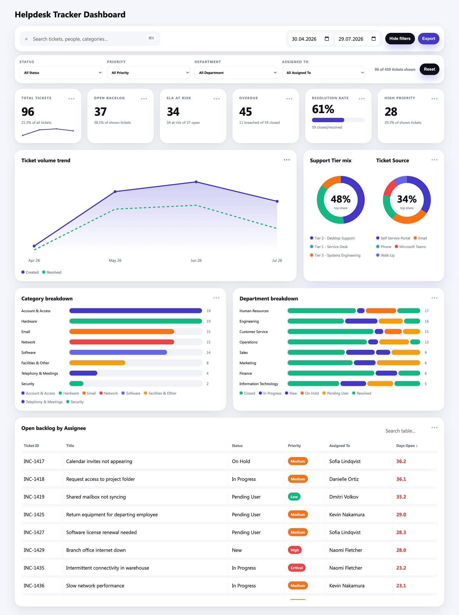
- Filter bar across the top with search, date range, and Status, Priority, Department, and Assigned To filters, plus a live count of how many tickets are currently shown
- Six KPI tiles carrying the headline numbers – total tickets, open backlog, SLA at risk, overdue, resolution rate, and high priority – each with a short line of plain-text context underneath
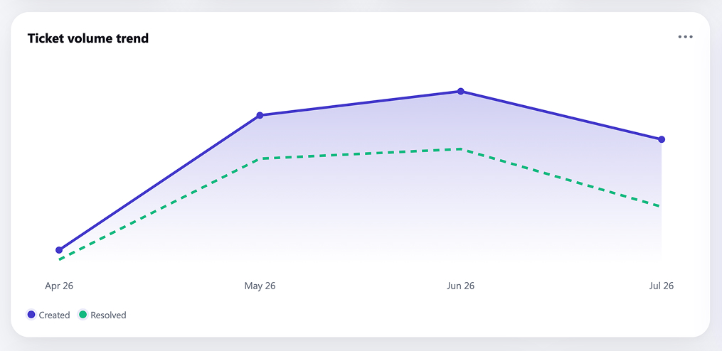
- Ticket volume trend comparing tickets created against tickets resolved month by month, which is the fastest read on whether the backlog is growing or shrinking
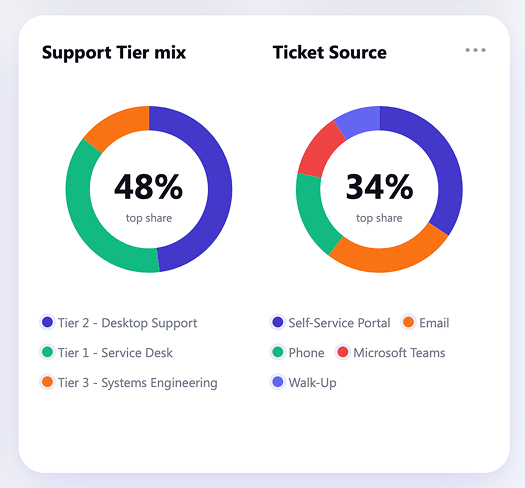
- Two donut charts breaking out support tier mix and ticket source, with the leading share called out in the center of each
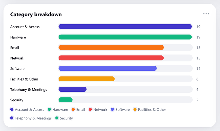
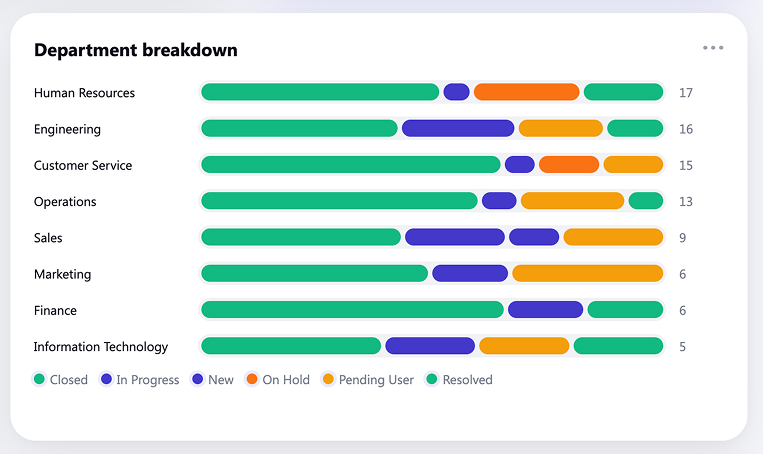
- Sorted horizontal bars for tickets by category and by department, so the biggest driver of volume is obvious without reading a single number
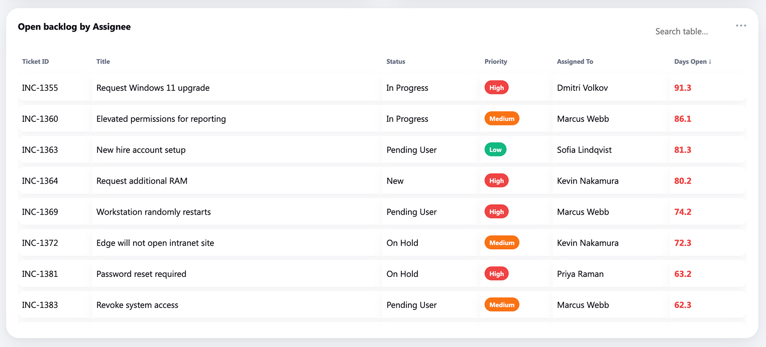
- A sortable, searchable open backlog table by analyst, with color-coded priority badges and overdue days flagged in red
- Everything recalculates together – filtering to one department reshapes the whole page rather than a single chart
Benefits
- Replaces the weekly ticket export and the manual chart refresh that goes with it
- Shows whether the backlog is growing or shrinking at a glance instead of across three separate reports
- Makes SLA breaches visible while there is still time to do something about them
- Gives team leads a per-analyst workload view without anyone opening the ticket queue
- Turns a list the team already maintains into reporting, with no new system to buy or roll out
- Serves both the IT director and the service desk lead, because the filters change who the page is for
- Opens in any browser and can be embedded directly into a SharePoint page
Details
- Build Method: Copilot Dashboard
- Chart Types: KPI card, Sparkline, Line chart, Donut chart, Bar chart, Table
Common Questions About the Help Desk Ticket Dashboard
What is this help desk dashboard built with?
It is built on a standard SharePoint list of help desk tickets, with Microsoft 365 Copilot generating the dashboard page from that list. There is no third-party reporting tool and nothing to license beyond Microsoft 365. The charts, filters, and tables all live on one page that can be embedded in a SharePoint site – the kind of clean, maintainable reporting Greg Zelfond builds for IT teams.
What is included on the help desk dashboard?
Six KPI tiles covering total tickets, open backlog, SLA at risk, overdue, resolution rate, and high priority. Below them sit a created-versus-resolved volume trend, donut charts for support tier and ticket source, sorted bars for category and department, and a searchable open-backlog table by analyst. A filter row across the top covers status, priority, department, and assignee.
Where does the dashboard data come from?
A single SharePoint list with sixteen columns – ticket ID, status, priority, category, requester, department, location, assignee, support tier, source, created and resolved dates, days open, SLA status, and an overdue flag. Most IT teams already keep a version of this list somewhere.
Does the dashboard refresh automatically from the SharePoint list?
This example carries its data with it, so it opens instantly and works offline, and it is refreshed by regenerating the page from the current list. When a live-refreshing view is the requirement instead, the same numbers can be charted with the Quick Chart web part directly on a SharePoint page, or with Power BI when scheduled refresh is needed.
Should we use Copilot, the Quick Chart web part, or Power BI?
It depends on how much you need. The Quick Chart web part is the lightest option – one chart, pointed at a list, no setup. A Copilot-generated dashboard suits a full page with filters and several linked charts that move together. Power BI earns its place when data volumes are large, sources need joining, or row-level security and scheduled refresh matter.
Can Greg build this dashboard for our organization?
Yes – this is exactly the kind of work Greg Zelfond does. As an independent SharePoint consultant and Microsoft MVP, he sets up the underlying list, shapes the columns so the charts are worth drawing, and builds the dashboard around the questions your leadership actually asks rather than the ones the data happens to answer. Reach out through the contact page.