Flexible Sections
Common Use Cases
- Hero banners with layered text: placing text and buttons directly over an image for a magazine-style page header
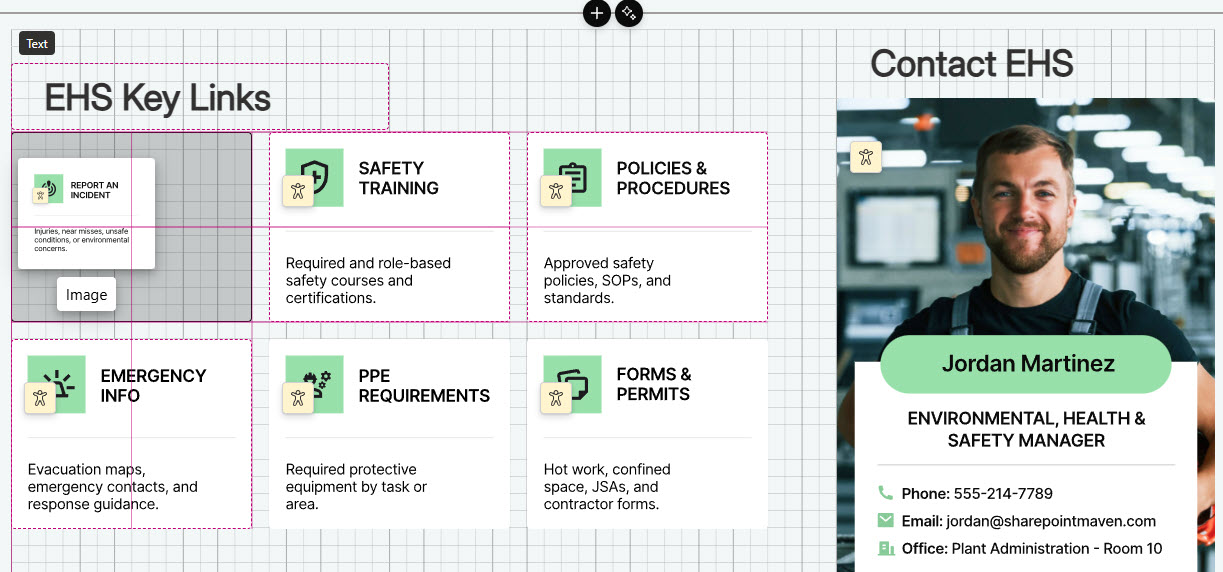
- Intranet homepage layouts: arranging news, quick links, events, and countdowns in precisely aligned card arrangements
- Department landing pages: pairing team profiles, calendars, and announcements side by side at exactly the sizes you want
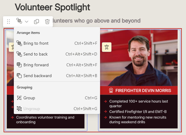
- Photo collages and spotlights: grouping overlapping images that move and reflow together as one unit
- Dashboard-style pages: sizing each web part to its content instead of stretching it to fill a fixed column
- Campaign and event sections: combining a section background with freely placed buttons, timers, and calls to action
Benefits
- True design freedom: web parts go exactly where you place them, not where the column grid allows
- No custom development: layered, magazine-style layouts come entirely from out-of-the-box editing tools
- Precise alignment: snapping and alignment cues keep free-form layouts looking professionally built
- Layering and overlap: text over images and stacked design elements that standard sections cannot achieve
- Grouped behavior: related web parts move together and stay together when the layout reflows
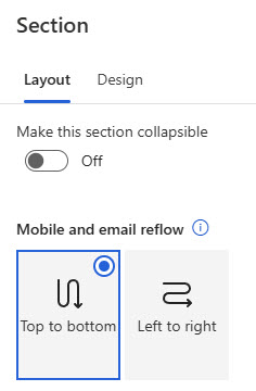
- Mobile-ready by default: built-in reflow rules collapse the layout into a single column on phones and in email
Details
- Feature Category: Pages & Publishing
How It Works
- Snap to grid: drag a web part and its top-left corner snaps to the nearest gridline, with a drop hint showing where it will land
- Alignment cues: guides appear as you move web parts, helping you line them up with each other or center them in the section
- Resize handles: size web parts from the handles on their borders, and the whole section from its corner handle
- Overlap support: web parts can sit on top of each other for layered looks like text over an image
- Grouping: related web parts can be bound together so they move as one and reflow together on mobile
- Preview: check how the section reflows on mobile, tablet, and in email before publishing
Limits and Nuances
- Background image weight: large section backgrounds slow page load; compress and resize images before uploading
- Accessibility contrast: check color choices against contrast standards, especially text placed over background images
- Edit permissions: changing a flexible section requires page edit rights; site members and owners can edit, visitors cannot
- Always check the mobile preview: on phones and in email, the section collapses into one column using your chosen reflow order
- Not every web part resizes freely: Text and Image scale to most widths, while web parts like People and Quick Links offer four preset sizes
- Avoid accidental overlaps: slight unintended border overlaps can render unpredictably at other screen sizes; overlap deliberately or not at all
- Reading and tab order: both follow the order web parts were added, not their position on the canvas; add web parts in reading order for accessibility
- Newer feature: flexible sections rolled out to Microsoft 365 tenants in spring 2025
Common Questions About Flexible Sections
What are flexible sections in SharePoint?
Flexible sections are a section type for SharePoint pages and news that removes the fixed column structure. Inside one, you can drag web parts anywhere on a two-dimensional grid, resize them, overlap them, and group them. They give page authors design-level control over layout using only out-of-the-box tools, and they reflow automatically into a single column on mobile.
How do I add a flexible section to a SharePoint page?
Edit the page, hover between sections, and select the plus sign to open the section toolbox – Flexible appears alongside the column-based section types. Once added, drag web parts in from the toolbox on the right, position them anywhere in the section, and use the resize handles to size each one. Save or republish the page when the layout looks right.
Can web parts overlap in a flexible section?
Yes – overlapping is supported and is how designers create layered looks like text over images. The Arrange dropdown in the web part toolbar controls stacking order. Use overlap deliberately, though: web parts whose borders overlap accidentally can render unpredictably when the screen size changes, so check the mobile and tablet previews before publishing.
How do flexible sections behave on mobile?
On phones and in email, a flexible section transforms into a single column. You control the stacking order through the section’s reflow setting – one algorithm prioritizes web parts left to right, the other top to bottom. Grouped web parts always reflow together as a unit. The Preview button shows exactly how the section will look on each device type.
Can every web part be resized freely in a flexible section?
Not all of them. Web parts like Text and Image resize to almost any width, while others – People and Quick Links, for example – offer four preset sizes that match their dimensions in standard sections. Custom web parts get the four preset sizes by default. Plan layouts around what each web part can actually do rather than fighting the presets.
Why do the LookBook 365 page designs rely on flexible sections?
Flexible sections are a signature element of the designs Greg Zelfond, the SharePoint Maven, builds on LookBook 365. They allow hero areas, layered images, and precisely aligned card layouts that fixed columns cannot achieve – all out-of-the-box, with no custom development. That means the polished look stays fully supported by Microsoft and survives every SharePoint update without maintenance.