Chart Web Part

Benefits
- Plain-language authoring: describe the chart you want in a chat pane and the web part builds it, with no data table to fill in and no settings panel to learn.
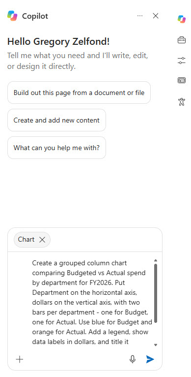
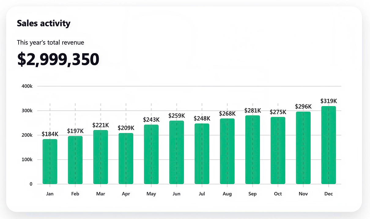
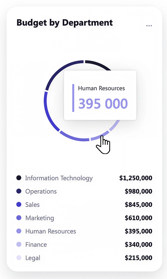
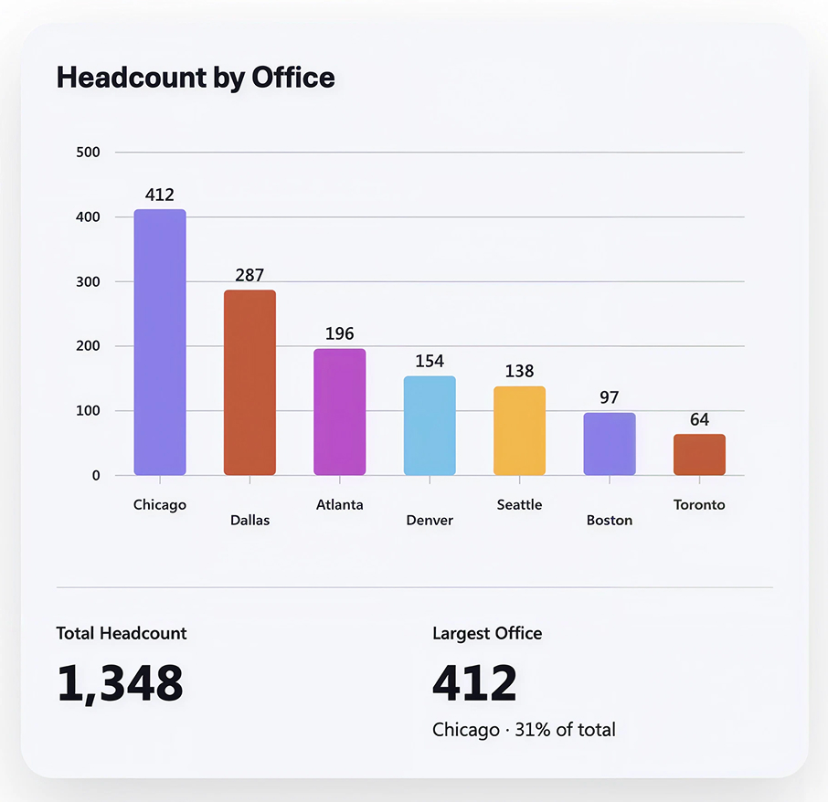
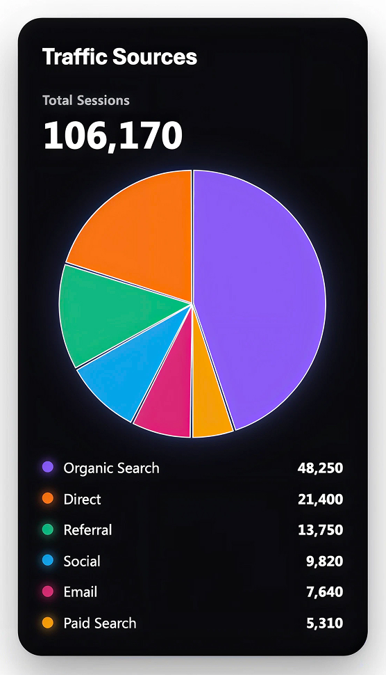
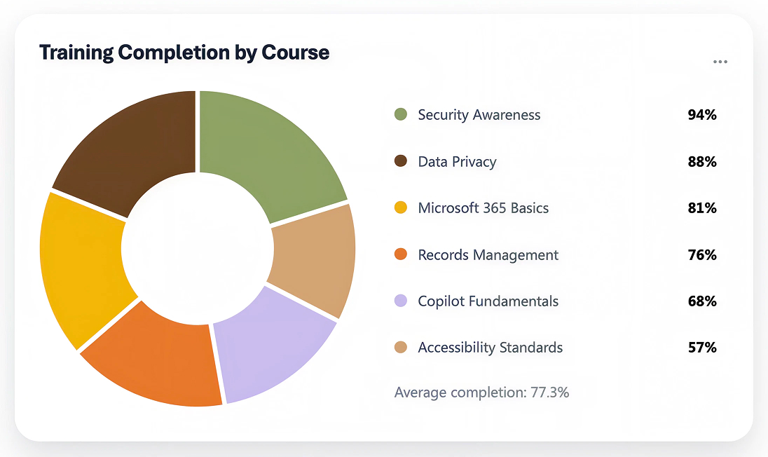
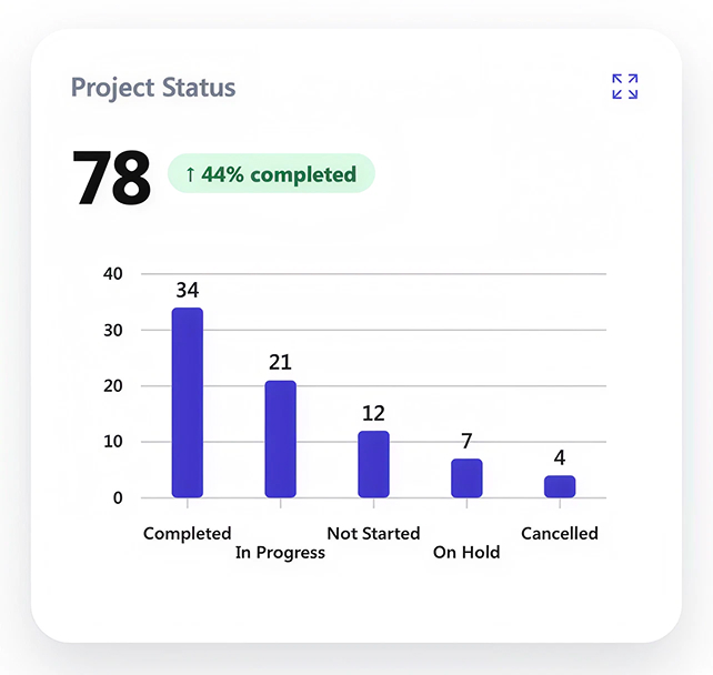
- Thirteen chart forms: scatter, bar, line, pie, area, donut, histogram, heatmap, funnel, sankey, table, polar scatter, and gauge, against the two shapes the classic Quick Chart web part offers.
- Iterative editing: follow-up prompts change the numbers, the labels, the title, and the styling, and an Undo button in the command bar rolls the chart back a version.
- Files as context: attach a workbook or document already stored in SharePoint or OneDrive and the web part reads the numbers out of it.
- No license for readers: only the page author needs a Microsoft 365 Copilot license; everyone viewing the published page sees the chart with no license at all.
- Two ways in: add it from the toolbox under the AI category, or start from the agent chat pane and ask for a chart – either route opens the same chat.
Settings
- The prompt: the main control – a plain-language description of the chart, its data, and how it should look, typed into the chat pane on the page.
- Attachments: point the prompt at a file already in SharePoint or OneDrive to supply the numbers; there is no upload button inside the web part itself.
- Chart type: named in the prompt, or changed afterwards by asking for a different form, such as turning a bar chart into a donut.
- Titles and labels: the chart title, axis labels, and legend are generated from the prompt and adjusted by asking for the wording you want.
- Styling: colors, ordering, and emphasis are requested in words rather than picked from a palette, so expect close-but-not-exact matches to a brand color.
- Undo: the Undo button in the command bar steps the chart back to a previous version when a prompt takes it in the wrong direction.
Limits and Nuances
- It does not connect to a list: there is no data source picker, so the web part does not bind to a SharePoint list, Dataverse, or SQL – the numbers come from the prompt or a referenced file.
- The data is a snapshot: editing the source file does not redraw the chart; someone has to prompt the web part to refresh and then republish the page.
- Authors need Copilot: creating or editing a chart requires a Microsoft 365 Copilot license, so it is an option for licensed authors rather than for every page owner.
- No upload inside the web part: a file has to already live in SharePoint or OneDrive before a prompt can point at it.
- Styling is approximate: color and formatting requests are interpreted rather than applied exactly, so precise brand colors are not guaranteed.
- Email renders a static image: when the page is shared by email the chart arrives as a picture; the interactive version exists only on the SharePoint page.
- A domain has to be reachable: charts fail to display if the site blocks loop.usercontent.microsoft – a site admin adds it under Site information, HTML Field Security.
- No KPI or big-number card: the supported forms cover charts and a table, not a single-number scorecard tile.
- Still rolling out: the release to worldwide standard availability completes around the end of August 2026, so some tenants see the web part before others.
Chart vs. the Alternatives
- Chart vs. the Quick Chart web part: Quick Chart draws only column and pie and caps at 12 manual data points or 50 list items, but it does bind to a list on the same site and refreshes on its own. Chart draws far more forms with far less effort and gives up the live list connection.
- Chart vs. the Power BI web part: Power BI is the answer when a report has to stay current, be filtered, and pull from real data sources. The Chart web part is for a single visual that illustrates a point on a page.
- Chart vs. an embedded Excel chart: an embedded workbook keeps the chart tied to the file it came from, so the file stays the source of truth. The Chart web part is faster to produce but is not tied to anything once the prompt is done.
- Chart vs. the List web part: the List web part shows the rows themselves with views, filters, and formatting; the Chart web part turns a set of numbers into a picture and nothing more.
Common Questions About the Chart Web Part
What is the Chart web part in SharePoint?
The Chart web part is SharePoint’s AI charting option, listed under the AI category in the web part toolbox. You describe the chart you want in plain language in a chat pane on the page, supply the numbers in the prompt or point at a file already stored in SharePoint or OneDrive, and the web part draws the chart. Follow-up prompts change the data, the labels, and the styling, and an Undo button steps the chart back a version.
Does the Chart web part connect to a SharePoint list?
No, and this is the point that surprises people most. The Chart web part has no data source picker, so it does not bind to a SharePoint list, Dataverse, or SQL. Its numbers come from what you type into the prompt or from a file that already lives in SharePoint or OneDrive. If the chart has to sit on top of a list, the classic Quick Chart web part is still the one that does that.
What chart types can the Chart web part create?
Microsoft lists scatter, bar, line, pie, area, donut, histogram, heatmap, funnel, sankey, table, polar scatter, and gauge – thirteen forms in all. You name the one you want in the prompt, or ask for a different form later and the web part redraws it. A single-number KPI card is not on the list, so a big-number scorecard tile still calls for a different approach.
Does the chart refresh automatically when the numbers change?
No. The chart is a snapshot, not a live connection. If it was built from a workbook and someone then edits that workbook, the chart on the page keeps showing the old numbers until an author opens the page, prompts the web part to refresh from the file, and republishes. That makes the Chart web part a good fit for illustrating a point and a poor fit for a metric people check daily.
Do I need a Copilot license to use the Chart web part?
The page author does. Creating or editing a chart requires a Microsoft 365 Copilot license. Viewers need nothing at all – once the page is published, anyone with access to it sees the chart. In practice that means charts get authored by the licensed people on a team and read by everyone else, which is worth knowing before a whole department is told to build its own.
When should I use Quick Chart or Power BI instead?
It comes down to whether the numbers move. Quick Chart is the choice when the data lives in a SharePoint list and the chart has to stay current on its own. Power BI is the choice for interactive reports over real data sources. The Chart web part wins when you want a good-looking visual on a page quickly and the numbers are settled. Greg Zelfond, the SharePoint consultant behind LookBook 365, treats that as a design decision made up front rather than something discovered after a dashboard goes stale.