Call to Action Web Part
Benefits
- One clear next step: the web part asks visitors to do one specific thing, which is exactly what makes a call to action effective.
- Impossible to miss: the message, the button, and an optional background image give the ask real visual weight on the page.
- Links to anything: internal pages, external sites, documents, forms, or an email address via mailto:.
- On-brand by default: the button follows the accent color of the site theme, so it always matches the design.
- Quick to set up: a short message, a button label, and a link are all it takes to drive a real action from an intranet page.
Settings
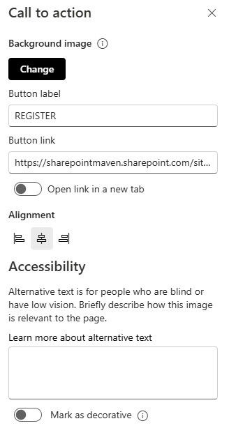
- Background: pick an image from your SharePoint files, upload one from your computer, or use the other image sources in the picker.
- Button label: the text on the button, such as Register Now or Contact HR.
- Button link: the URL the button opens; it must start with http://, https://, or mailto:.
- Open link in a new tab: choose whether the button opens its link in a new browser tab.
- Alignment: controls where the text and button sit within the web part; the default is Left.
- Call-to-action text: a short message typed directly on the page canvas, designed to fit on a single line.
- The button: one button with your own label, linked to any internal page, external site, or email address.
- Background image: an optional image behind the text and button (Microsoft recommends around 1204 pixels wide); the whole block is responsive across screen sizes and section layouts.
Limits and Nuances
- The call-to-action text does not wrap to a second line: long messages get cut off. Keep it short and put the detail on the destination page.
- You cannot pick the button color: it follows the accent color of the site theme. To change the button, change the theme.
- One button per web part: if you need two actions side by side, add two Call to Action web parts or consider the Hero web part instead.
- If you paste a link without http:// or https://, SharePoint adds https:// for you: double-check internal links that need a specific address.
Call to Action vs. the Alternatives
- Call to Action vs. Button: Button is just the button, with a label and a link. Call to Action adds the message text and a background image, so it carries more visual weight on the page.
- Call to Action vs. Hero: Hero showcases up to five visual tiles, each with its own optional call-to-action link. Use Hero for a set of featured destinations and Call to Action for one single, focused ask.
- Call to Action vs. Quick Links: Quick Links is for navigation to many places at once. Call to Action exists to drive one action, and that focus is exactly what makes it effective.
- Call to Action vs. Image with a link: an Image web part can be clickable too, but it gives no button and no prompt text. Call to Action makes the next step explicit.
Common Questions About the Call to Action Web Part
Can I change the color of the Call to Action button?
Not directly. The button takes its color from the accent color of your site theme, and there is no per-button color setting in the web part. If the button needs to match your brand, apply a custom site theme – the button, along with every other themed element on the site, will follow the new accent color automatically.
Why does my call-to-action text get cut off?
The call-to-action text is designed to stay on a single line, so it does not wrap and long messages get truncated. This is intentional – the web part works best with a short, punchy prompt. Keep the message tight, give the button a clear label, and let the destination page carry the full explanation.
What can the Call to Action button link to?
Any URL that starts with http://, https://, or mailto: – which covers internal SharePoint pages, external websites, documents, forms, and email addresses. The mailto: support is easy to miss and very handy: it turns the web part into a one-click Contact Us or Email the Team button. If you omit the protocol, SharePoint adds https:// for you.
What is the difference between the Call to Action and Button web parts?
Both put a clickable button on the page. The Button web part is the minimal version – a label and a link, nothing else. The Call to Action web part adds a message line and an optional background image, so it draws far more attention. Use Button inside a busy column and Call to Action when the action deserves a spotlight.
Do I need any special license to use the Call to Action web part?
No. The Call to Action web part is part of the modern SharePoint Online experience in Microsoft 365 and is available out of the box on modern pages – no add-on license or custom code is required. Everything described on this page applies to any standard SharePoint Online site, so you can add it, set the message, button, and link, and publish straight away.
Where does a Call to Action work best on an intranet page?
Right after the content that creates the intent – below a benefits-enrollment announcement, at the end of a policy summary, or in a homepage section promoting an event. One clear action per page section is the rule. The intranet designs on LookBook 365 use this exact out-of-the-box web part with a custom theme – the only way Greg Zelfond builds. Call to Action Web Part Example Call to Action Web Part Example Call to Action Web Part Settings