Hero Web Part
Benefits
- Instant visual impact: large images and headlines anchor the top of the homepage and set the tone for the whole intranet
- Up to five clickable destinations: tiles, layers, or slides that send people straight to key content
- Three layouts in one web part: Tiles, Layers, and Carousel cover navigation hubs, showcases, and rotating promotions
- Pre-loaded on Communication sites: the web part is already on the homepage template, ready for your own content
- Inline video playback: feature a CEO message or campaign clip that plays right on the page
- Focal point control: images stay framed correctly on every screen size, including mobile
Settings
Web part level:
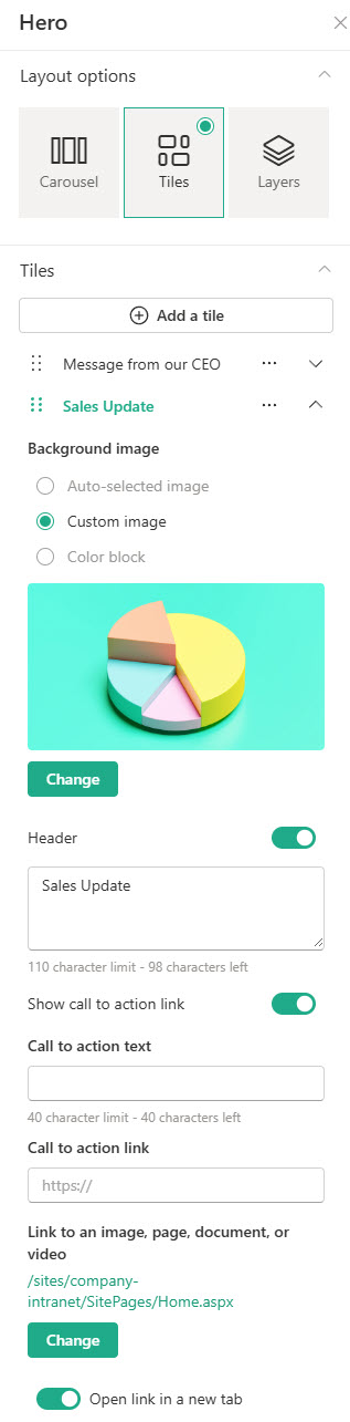
- Layout: Tiles, Layers, or Carousel, with up to five items added, reordered by dragging or moving them up and down
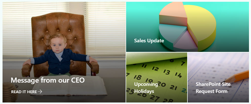
- Tiles: a grid of one to five clickable tiles; the web part keeps an 8:3 overall shape and images scale to roughly 4:3. Best for a homepage hub with several destinations
- Layers: one to five full-width horizontal bands, each with its own call to action link. Best for storytelling and showcase pages where every item deserves equal weight
- Carousel: up to five rotating slides with an optional Autoplay toggle and three slide styles (Image overlay, Text block, Diagonal split). Best for promoting a few timely campaigns without using vertical space
Per tile, layer, or slide:
- Link and background: choose the destination from Recent, Stock images, Web search, Your organization, OneDrive, Site, Upload, or a pasted link; set the background as a Custom image, Auto-selected, or Color only (Tiles layout, uses your site theme color)
- Focal point and text: drag the focus so the right part of the image stays in frame at every screen size, and set the header text and alternative text per item
- Call to action and slide style: a call to action link and text on every Layers band but only the largest Tiles tile, plus a per-slide Carousel slide style (Image overlay, Text block, or Diagonal split)
Limits and Nuances
- Five items is the hard ceiling: five tiles, five layers, or five carousel slides; there is no way to add a sixth
- Tiles layout has two quirks: only the largest tile gets a call to action button, and Color only backgrounds exist solely here and follow your site theme rather than an arbitrary color; switch to Layers if every item needs a button
- Hero is built for full width: to make it narrower, place it in a two- or three-column section instead
- Plan images around the scaling math: Tiles crops to roughly 4:3, Layers scales images near 9:16; always set a focal point so mobile cropping keeps the subject visible
- Hero content is manually curated: it never updates itself and existing Tiles and Layers web parts are never converted to Carousel automatically; for content that rotates as posts publish, use the News web part
- Videos play inline: viewers stay on the page and keep browsing instead of being taken to a new window
- No audience targeting on the Hero web part: everyone who can view the page sees the same items
- Government cloud nuance: in GCC High and DoD, links external to your site will not show an image preview
Hero vs. the Alternatives
- Hero vs. Quick Links: Hero sells up to five big destinations visually; Quick Links handles many links compactly with icons. Use Hero for impact, Quick Links for volume.
- Hero vs. Call to Action: Call to Action is one message with one button; Hero is up to five. For a single campaign banner, Call to Action is the lighter choice.
- Hero vs. Image: the Image web part just displays a picture; Hero turns pictures into clickable destinations with headlines and calls to action.
- Hero vs. News: News refreshes itself as new posts are published; Hero only changes when someone edits it. Promote evergreen destinations in Hero, fresh stories in News.
Common Questions About the Hero Web Part
What is the Hero web part in SharePoint?
It is the large visual banner that anchors most SharePoint intranet homepages – a set of up to five clickable items combining big images, headlines, and links to the content you want everyone to find. It comes included by default on Communication site templates. Nearly every intranet homepage design on LookBook 365 leads with this exact web part – out-of-the-box, the only way Greg Zelfond builds.
How many items can the Hero web part display?
Five is the maximum, whichever layout you choose – five tiles in the Tiles layout, five layers in the Layers layout, or five slides in the Carousel. You can also run it with fewer; a single tile makes a clean full-width banner. If you need to promote more than five destinations, pair the Hero with a Quick Links web part below it rather than cramming everything into the banner.
What image size works best in the Hero web part?
It depends on the layout. In Tiles, the web part keeps an 8:3 overall shape and images scale to roughly 4:3; in Layers, each layer is 8:3 with images scaling near 9:16. Use large, high-quality images and always set the focal point – that is what controls which part of the picture survives the cropping on different screen sizes and on mobile.
What is the difference between the Tiles, Layers, and Carousel layouts?
Tiles arranges up to five clickable items in a mosaic grid – the classic intranet homepage look. Layers stacks items as full-width horizontal bands, giving each one equal prominence and its own call to action. Carousel rotates up to five slides in one space, with an optional Autoplay toggle and three slide styles. Use Tiles for navigation hubs, Layers for showcases, and Carousel for timely promotions.
Can the Hero web part play videos?
Yes. You can link to or upload a video, and it plays inline – people watch right on the page instead of being sent to a new window. This works through the integration with Microsoft Stream. A video tile is a great way to feature a CEO message or campaign clip on the homepage while keeping the rest of the page visible and browsable.
Why do some tiles not show a call to action button?
That is by design. In the Tiles layout, the call to action link is only available on the largest tile – the smaller tiles show just the headline. If every item needs its own button, switch to the Layers layout, where each layer gets a call to action, or use the Call to Action web part for standalone buttons elsewhere on the page. Hero Web Part Tiles Layout Hero Web Part Tiles with embedded Videos Hero Web Part Layers Layout Hero Web Part Configuration Settings