Editorial Web Part
Benefits
- One polished card, zero design work: background image or color, section name, headline, description, and button come styled out of the box.
- Three distinct looks: Image Overlay, Color Block, and Split cover magazine-style features, bold announcements, and balanced story cards.
- Theme-aware branding: Color Block pulls its colors from the site theme, so every card automatically matches your brand.
- Built-in image editing: crop, adjust, filter, and set a focal point without leaving the page.
- Drives action: an optional call-to-action button puts a link right on the card.
- Perfect for spotlights: one story, announcement, or person at a time on homepages and landing pages.
Settings
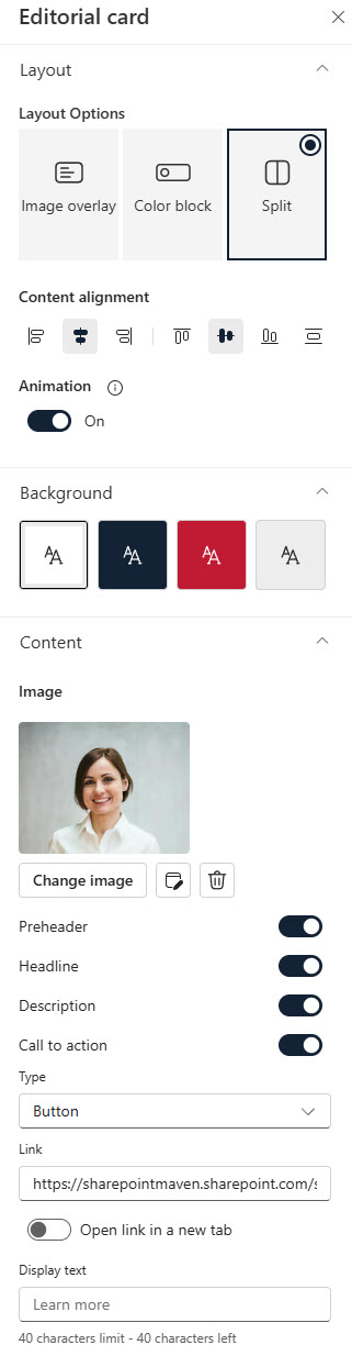
- Card text: section/category name, headline, and description, plus text size and formatting.
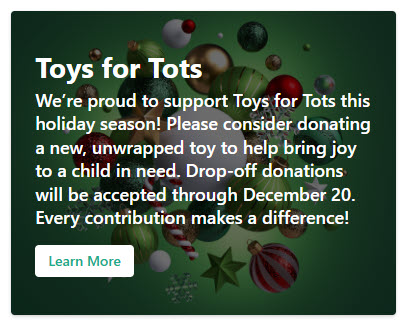
- Layout: switch between three responsive layouts at any time – Image Overlay (text on the image with adjustable overlay color and opacity, best for dramatic magazine-style features), Color Block (section name on the image, headline and description on a solid theme-color block, best for bold on-brand announcements), and Split (card divided between image and text, splitting vertically in narrow sections and horizontally in wide ones, best for balanced story cards).
- Background: an image or a solid color, with crop, adjustment, filter, and focal point editing for images.
- Overlay and alignment: overlay color and opacity for readability, plus content alignment options.
- Call to action: add a link, pick the type, and set the button display text.
Limits and Nuances
- The section/category name is capped at 40 characters: keep it to a short label like a department or topic.
- The call-to-action display text is also capped at 40 characters: one button per card, with one link.
- Color Block colors come from the site theme: to change the palette, change the theme, not the web part.
- Each web part is one card: to build a row of cards, add multiple Editorial web parts in side-by-side section columns.
- Content is static and authored on the card: you type the text directly on the card itself; it does not pull from a list, library, or news feed, which can surprise editors used to other web parts.
- This is one of the newest web parts, released in early 2025: it will not appear in older tenants’ screenshots or training materials.
- Readability comes first: on Image Overlay, raise the overlay opacity when text is hard to read over a busy photo; it is the most common mistake with this web part.
Editorial vs. the Alternatives
- Editorial vs. Hero: Hero is a banner of multiple link tiles in fixed arrangements; Editorial is a single, fully designed card with its own headline, description, and button. Use Hero for navigation, Editorial for storytelling.
- Editorial vs. Call to action: the Call to action web part is a simpler image-plus-button; Editorial adds a section name, headline, description, three layouts, and theme-aware color blocks.
- Editorial vs. Image: the Image web part shows a picture with an optional caption and link; Editorial wraps the image in structured text and a call-to-action button.
- Editorial vs. News: News surfaces published news posts automatically; Editorial is hand-authored. Use News for an ongoing feed, Editorial for one curated spotlight.
Common Questions About the Editorial Web Part
What is the Editorial web part in SharePoint used for?
It is a designed content card for spotlighting one thing at a time – a story, an announcement, an employee profile, or a campaign – with a background image or color, a short section name, a headline, a description, and an optional call-to-action button. It is most effective near the top of intranet homepages and landing pages, where a polished visual block draws clicks to important content.
What layouts does the Editorial web part offer?
Three: Image Overlay places the text directly on the image with an adjustable color overlay for contrast; Color Block pairs the image with a solid block in your site theme colors that holds the headline and description; and Split divides the card between image and text – vertically in narrow page sections and horizontally in wide ones. You can switch layouts at any time without rebuilding the card.
Can I show several Editorial cards in a row?
Yes, but each Editorial web part holds exactly one card. To create a row of cards – for example, three featured stories across the page – add a section with multiple columns and place one Editorial web part in each column. The cards resize responsively, and the Split layout automatically changes its orientation based on how wide each column is.
Why does my Editorial card use different colors than I expected?
The Color Block layout pulls its color choices from the theme applied to your site, which keeps every card consistent with your branding. If the available colors are not right, the fix is to adjust the site theme rather than the web part. This is exactly how the designs on LookBook 365 get their look – out-of-the-box web parts with a custom theme, the only way Greg Zelfond builds.
Does the Editorial web part pull content from a list or news posts?
No. The Editorial web part is static, hand-authored content – you type the section name, headline, and description directly on the card and set the link yourself. Nothing updates automatically. If you want content that refreshes on its own, use the News web part for news posts or the Highlighted content web part for rollups, and reserve Editorial for curated spotlights you update deliberately.
Why do I not see the Editorial web part in my toolbox?
It is one of the newest out-of-the-box web parts, with general availability rolling out in early 2025, so tenants received it at different times. It is listed under the name Editorial card – search for that exact name when adding web parts to a page. If it still does not appear, your tenant likely has not finished receiving the update yet; there is no setting a site owner needs to enable. Editorial Web Part Split Layout Editorial Web Part Overlay Layout Editorial Web Part Split Configuration Options