Button Web Part

Benefits
- One clear action per page area: a single labeled button makes the most important action impossible to miss.
- Faster navigation: routes people straight to key pages, documents, lists, or external tools in one click.
- Consistent branding: the button color follows the site theme automatically, so every page stays on brand.
- Flexible destinations: link to SharePoint content, external URLs, or a mailto: address that opens a pre-addressed email.
- No custom development: a clean, professional call to action straight out of the box.
Settings
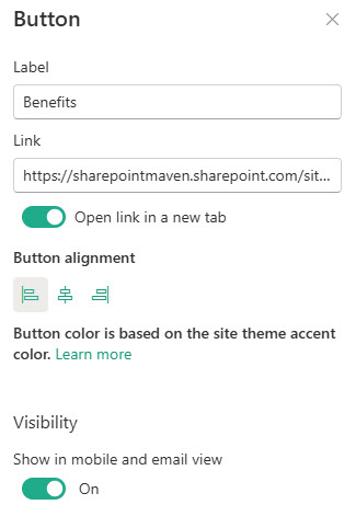
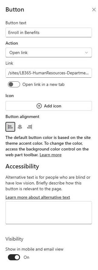
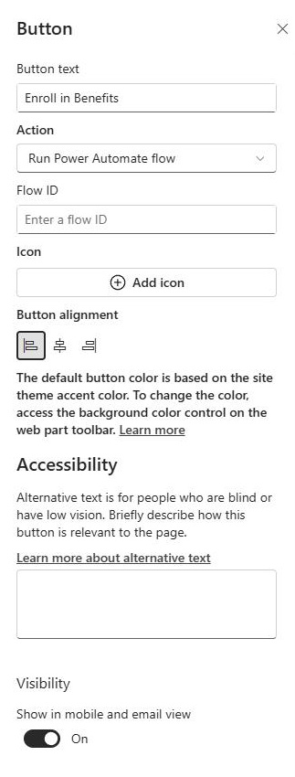
- Label: the text shown on the button; keep it short and action-oriented (Submit a Ticket, Book Time Off).
- Description: optional supporting text to go with the button.
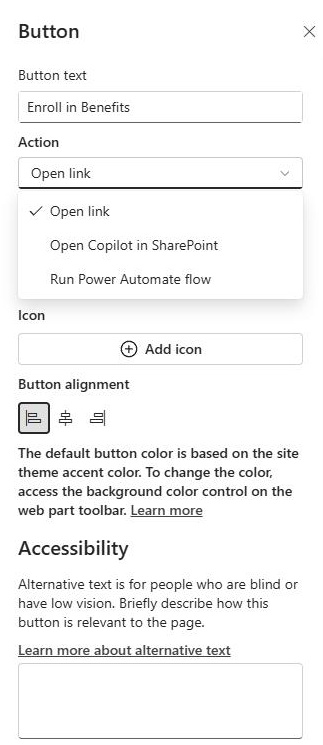
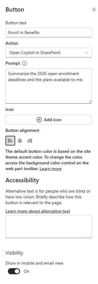
- Link: the destination site, page, document, list, external URL, or mailto: address.
- Alignment: left, center, or right within the button’s column.
- Open in same tab or new tab: choose how the destination opens.
- SharePoint content: route people to a key page or another site, a policy or form stored in a library, or a tracker or request list.
- External URLs: any website or web application outside SharePoint.
- Email (mailto:): open a new, pre-addressed message to a person or shared mailbox.
Limits and Nuances
- The button color cannot be set in the web part: it always follows the site theme accent color. To change the button, change the site theme.
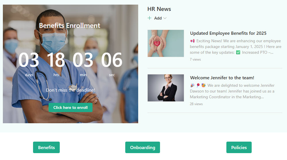
- One button per web part: build a row of buttons by placing several Button web parts side by side in the same section.
- Links must start with http://, https://, or mailto: paste a bare address and SharePoint adds https:// for you automatically.
- Alignment is relative to the column, not the page: in a three-column section, center means the center of that column.
- There is no image or color picker by design: if you need a button over an image, that is the Call to Action web part.
- Buttons inherit theme changes instantly: rebrand the site theme and every button on every page updates, with no page edits needed.
Button vs. the Alternatives
- Button vs. Call to Action: both center on one action, but Call to Action layers the button over a background image; pick Button for clean simplicity, Call to Action for visual punch.
- Button vs. Quick Links (button layout): Quick Links manages many destinations in one web part with layouts and icons; Button is a single, prominent action.
- Button vs. Hero: Hero promotes up to five large visual tiles, usually at the top of the page; Button is a lightweight action you can drop anywhere.
- Button vs. hyperlinked text: a text link disappears into the paragraph; a button gets theme color and white space around it, so the action is impossible to miss.
Common Questions About the Button Web Part
Can I change the color of the Button web part?
Not directly in the web part. The button color is based on your site theme’s accent color and cannot be changed independently. To change it, update the site theme – every button on the site updates together. That is by design: buttons stay visually consistent across all pages. The designs on LookBook 365 get their button colors from a custom theme – the only way Greg Zelfond builds.
Can a button open a document or start an email?
Yes to both. The link can point to a SharePoint site, page, document, or list, an external URL, or a mailto: address that opens a pre-addressed email. Links must start with http://, https://, or mailto: – if you paste a link without one of those, SharePoint adds https:// for you automatically.
Can I put several buttons in a row?
Each Button web part holds exactly one button, so a row of buttons means several Button web parts placed side by side in the same section. That is a common pattern on intranet homepages – three or four buttons under a banner for the most important actions. If you need many links, the Quick Links web part handles them in a single web part.
Does the button open links in a new tab?
You can choose. The web part includes an option to open the destination in the same tab or a new tab. A practical rule: keep intranet destinations in the same tab so the back button works naturally, and send people to external websites or applications in a new tab so they do not lose their place on the intranet.
Where do I find the Button web part when editing a page?
The Button web part is part of modern SharePoint Online and appears in the web part toolbox on any modern page. Open the toolbox with the plus icon and either scroll to it or type ‘Button’ in the search box to add it. If it does not appear, confirm you are editing a modern page rather than a list or library view, since the toolbox only offers web parts on modern pages.
When should I use the Button web part instead of Call to Action or Quick Links?
Use the Button web part for one clear action, like Submit a Ticket or Book Time Off. Use the Call to Action web part when you want that button on top of a background image for more visual weight. Use Quick Links with the button layout when you have five or ten destinations and want them managed in one web part. Several Button Web Parts on a SharePoint Page Button Web Part Settings