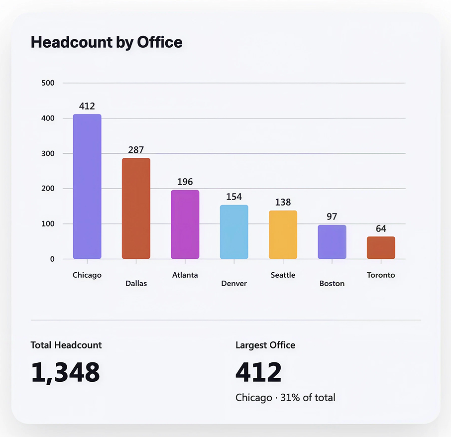
Headcount by Office (Chart)



Overview
- Column chart rendering headcount by office, one of the thirteen chart forms the Chart web part can draw
- Two summary tiles below the plot – total headcount and largest office with its share – generated from the same prompt rather than added as separate web parts
- A value label above every column and staggered office names along the axis, both placed by the web part rather than configured
- A distinct color per office instead of a single accent, produced by asking for it – styling here is a conversation, not a property pane
- The whole visual described in plain language in a chat on the page, with follow-up prompts to add data, change the look, or undo a step
- Roughly thirteen chart forms available – bar, line, pie, donut, area, scatter, histogram, heatmap, funnel, sankey, gauge and more – so the shape follows the question rather than the tool
- Authoring needs a Microsoft 365 Copilot license while readers need none, and the chart holds its data as a snapshot that is refreshed by asking
Benefits
- Puts the total headcount and its distribution on the same card, so nobody has to add up the numbers
- Shows concentration risk at a glance – when one office carries a large share of the company
- Ranks the offices for you, which turns a list into an argument about where capacity should go next
- Works as an intranet visual, not just an HR report, so the whole organization can see the shape of the company
- Takes minutes to build, because the chart is described in words rather than configured field by field
- Needs no Power BI workspace, no gateway, and no report developer
- Embeds directly into a SharePoint page, so it can sit on the HR hub beside the office directory
Details
- Chart Types: Column chart
Common Questions About the Headcount by Office Chart
What is this headcount chart built with?
The Chart web part, the AI-powered chart web part that sits under the AI category in the SharePoint web part toolbox. The columns, the value labels, and the two summary tiles all come from a plain-language prompt rather than a property pane. There is no HR reporting add-on to buy and nothing to license beyond Microsoft 365 and a Copilot seat for whoever builds it – the kind of low-maintenance reporting Greg Zelfond builds for HR teams.
What does the headcount by office chart show?
Offices as ranked columns with their counts labeled, from largest to smallest. Below a divider sit two summary tiles: Total Headcount, and Largest Office, noting which office holds the biggest share of the total.
Where does the chart data come from?
A two-column dataset of office and employee count, held in a file the web part reads when the chart is created. The Chart web part does not bind to a SharePoint list the way the classic Quick Chart web part does; it takes the numbers it is given and draws them.
Does the chart refresh automatically when the numbers change?
No. The Chart web part holds its data as a snapshot, so editing the source file does not redraw the chart on its own – you ask the web part to refresh the data and republish the page. For a headcount view refreshed monthly or quarterly, that suits the reporting rhythm. When a live-refreshing view is the requirement instead, the classic Quick Chart web part can point straight at a SharePoint list, and Power BI handles scheduled refresh.
Should we use the Chart web part, a Copilot dashboard, or Power BI?
It depends on how much you need. The Chart web part is the quickest way to put one good-looking chart on a page, described in a sentence and styled by asking. A Copilot-generated dashboard suits a full page with filters and several linked charts that move together. Power BI earns its place when data volumes are large, sources need joining, or row-level security and scheduled refresh matter.
Can Greg build this chart for our organization?
Yes – this is exactly the kind of work Greg Zelfond does. As an independent SharePoint consultant and Microsoft MVP, he shapes the underlying data so the chart is worth drawing, picks the visual that answers the question your leadership actually asks, and puts it on a page your employees already visit. Reach out through the contact page.