Banner Web Part
Benefits
- Gives every page a strong opening: a bold title, image, or color block sets the tone before anyone scrolls.
- Six layouts, zero design work: Image and Title, Plain, Color Block, Overlap, Fade, and Author cover most branding needs out-of-the-box.
- More flexible than the old title area: banners can be removed, repeated, and placed in any section or column.
- Structures long pages: additional banners act as headings that break content into clear chapters.
- Accessibility built in: SharePoint keeps an H1 on the page even when no visible title exists, meeting WCAG 2.1 requirements automatically.
Settings
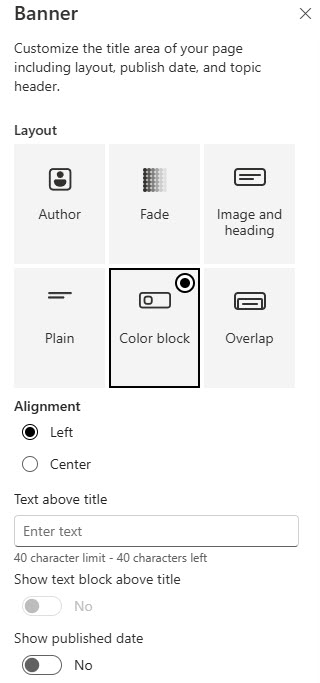
- Layout: pick one of the six layouts.
- Background: choose a background image or a background color to match the layout.
- Title text: enter the banner text; on the first banner of the page, this is the page title.
- Text alignment: position the title within the banner.
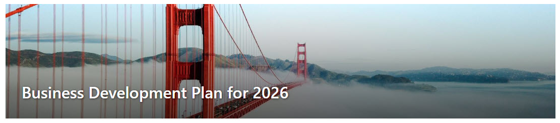
- Image and Title / Plain: a background image with the title over it (the standard page header look), or text only with no image or color block for simple pages.
- Color Block: a solid block of color behind the title; strong branding without sourcing an image.
- Overlap / Fade: Overlap puts the title in a block that covers more of the image than any other layout, so choose the image accordingly; Fade dims the image behind a gradient to push emphasis to the text.
- Author: showcases the page author with a profile photo beside the title; suits news posts and leadership messages, but the author block is large, so preview before publishing.
Limits and Nuances
- The first banner is the page title: the banner at the top of the page (in a full-width section) becomes the H1 and synchronizes with the page Title on the command bar. Any additional banners act as headings, not titles.
- You cannot publish without a title: enter a title in the first banner or on the command bar, or Save and close and Publish stay blocked.
- The title area is no longer mandatory: a page can have no banner, one banner, or several, and you can remove the title area entirely.
- It works in every section type: full-width, one column, two columns, three columns, and one-third sections all accept banners, in any column, and the banner scales responsively across devices.
- Accessibility is handled for you: if the page has no visible title, SharePoint emits a hidden H1 from the command bar title to keep the page WCAG 2.1 compliant.
- Email rendering changes the layout: when a page or news post is sent as email, the banner image moves above the banner text instead of behind it.
- Older pages keep the fixed title area: pages created before the 2024 rollout do not rename automatically; you choose whether to keep the old title area or switch when editing or copying the page.
- Rollout completed in August 2024: the Banner web part reached all tenants by end of August 2024 (Microsoft 365 Roadmap ID 386904), so every current tenant has it.
Banner vs. the Alternatives
- Banner vs. Hero web part: Banner is a title and message block; Hero is a clickable tile grid built for navigation. If users should click through to other content, use Hero.
- Banner vs. Image web part: the Image web part shows a picture with an optional caption; Banner pairs imagery with large formatted title text and six layout treatments.
- Banner vs. Call to Action web part: Call to Action pairs a short message with a button; use it when the goal is a single click, and Banner when the goal is context, branding, or a section break.
- Banner vs. the old title area: the old title area was fixed at the top of the page; the Banner can be removed, repeated, and placed in any section or column.
Common Questions About the Banner Web Part
What is the Banner web part in SharePoint?
The Banner web part displays a prominent title, message, or visual block on a modern SharePoint page. It is the evolution of the old fixed title area – Microsoft rebranded the title area as a standalone web part in 2024, which means it can now be removed, duplicated, and placed in any section or column of the page, including full-width sections, rather than living only at the top.
What layouts does the Banner web part offer?
Six: Image and Title (text over a background image), Plain (text only), Color Block (a solid color behind the title), Overlap (the title block overlaps the image), Fade (the image fades behind a gradient), and Author (the page author’s photo and name beside the title). Each layout accepts a background image or color, so the same page title can look dramatically different depending on the choice.
Can I remove the title area from a SharePoint page?
Yes – since the 2024 update, the title area is no longer mandatory. A page can have no banner at all, one banner, or multiple banners. Accessibility is covered automatically: if there is no visible title, SharePoint generates a hidden H1 from the page title on the command bar, so the page still meets WCAG 2.1 requirements without any extra work from the author.
Why can’t I publish my page without a banner title?
SharePoint requires a page title before Save and close or Publish will complete. The first banner at the top of the page acts as that title and synchronizes with the page Title field on the command bar – so either type the title into the banner itself or enter it on the command bar while in edit mode. Once a title exists in either place, publishing proceeds normally.
Can I add more than one Banner web part to a page?
Yes. Banners work in every section type – full-width, one column, two columns, three columns, and one-third – and you can place one in any column. The first banner at the top is treated as the page title (H1); additional banners function as headings that break the page into chapters. This is a clean way to give long pages clear visual structure without custom design work.
When should I use a Banner instead of a Hero web part?
Use Banner when the job is a statement – a page title, a section break, a branded message. Use Hero when the job is navigation – clickable tiles that send people to other pages. The two often share a homepage: many LookBook 365 designs open with a Banner for identity and follow with a Hero for wayfinding, all out-of-the-box – the only way Greg Zelfond builds. Banner Web Part Color Block Layout Example Banner Web Part Image and Heading Layout Example Banner Web Part Configuration Settings