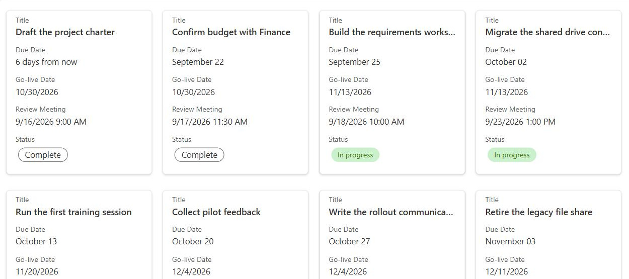
Gallery View
Common Use Cases
- Photo libraries: display event photos or marketing assets as thumbnails for quick visual browsing and selection
- Employee directory: combine profile photos with Name, Department, and Role fields for a visual org card layout
- Product catalog: showcase products with images, descriptions, and pricing metadata in a browseable card grid
- Training resource library: display course thumbnails alongside course name, duration, and audience for a visual catalog
- Project portfolio: show project thumbnails with key stats like owner, status, and budget in a card layout for executive reviews
- Brand asset library: allow the marketing team to browse logos, icons, and templates visually rather than navigating file name rows
Benefits
- Visual browsing efficiency: thumbnails allow users to identify the right document or record at a glance, reducing time spent opening and closing items
- Configurable card layout: choose exactly which metadata fields appear on the card to provide the right context without overwhelming the visual design
- Automatic document thumbnails: for Office files and PDFs, SharePoint generates preview thumbnails automatically; no manual image upload required
- Responsive design: Gallery View adapts to screen size, reflowing the card grid from multiple columns on wide screens to a single column on mobile
- Bulk selection support: card checkboxes enable multi-select for bulk operations like move, copy, or delete
Details
- Feature Category: Columns & Views
How It Works
- Automatic thumbnails: in document libraries, SharePoint generates card previews for Office files, PDFs, and images with no manual artwork
- Image column: in lists, the card image comes from an Image column; upload or paste a picture per item
- Multi-select: cards support checkboxes, so bulk move, copy, delete, and tagging still work
- Responsive grid: the layout reflows by screen width, multiple columns on a monitor and a single column on a phone
- Card designer: pick which columns appear on each card and drag them into the order you want
- Sort, filter, and group: the standard view controls still apply and shape which cards appear and in what order
Limits and Nuances
- Lists need an explicit image source: without a populated Image column, cards fall back to a generic placeholder icon
- Gallery view trades density for visuals: records with many fields are easier to work with in a standard list view; offer both views
- Sorting nuance: sorting works the same as in standard view, but multi-column sorting is harder to read in a card grid; keep gallery views to one obvious sort order
- No inline editing on cards: users select a card and edit in the details panel, or switch to a standard view with Edit in grid view
- 5,000 item threshold: the list view threshold applies to gallery views too; filter and index large lists just as you would for any view
- JSON formatting: card size and layouts beyond the designer’s options require JSON view formatting; powerful, but test the result on mobile widths
- Thumbnail coverage: previews generate for common formats like Office files, PDFs, and images; unusual file types show a file-type icon instead
Common Questions About Gallery View
What is gallery view in SharePoint?
Gallery view is a built-in view type that displays list items or library files as visual cards in a responsive grid instead of rows in a table. Each card leads with an image, an automatic file preview in libraries, or an Image column value in lists, followed by the metadata fields you select in the card designer.
How do I create a gallery view?
Open the list or library, select the view dropdown in the top right, and choose Create new view, then Gallery. You can also switch an existing view to gallery from the same menu. After that, open Format current view and select Edit card to choose which columns appear on each card and in what order.
Where do the card images come from?
In document libraries, SharePoint generates thumbnails automatically for Office documents, PDFs, and image files, so the card simply shows a preview of the file. In lists, you add an Image column and upload or paste a picture for each item. Without a populated Image column, list cards display a generic placeholder, which defeats the purpose of a visual view.
Can I edit items directly in gallery view?
No, gallery view does not support inline editing. Selecting a card opens the details panel, where you edit the item’s properties, or you can switch to a standard view and use Edit in grid view for fast bulk changes. A common pattern is gallery as the default view for browsing, with a standard view one click away for data entry.
When should I use gallery view instead of a standard list view?
Use gallery view when the visual identifies the item faster than text can: photo libraries, employee directories, product catalogs, training catalogs, and brand asset libraries. Use a standard view when users need to scan many fields at once or edit data quickly. Since views are cheap, most well-designed lists offer both and let users pick.
Can the cards be customized beyond the card designer?
Yes. The card designer covers the everyday needs: choosing columns, ordering them, and showing labels. For full control, gallery view supports JSON view formatting: you can set card height and width, build completely custom card layouts, and apply conditional styling such as color-coding by status. Test any custom format on a phone, since cards reflow at narrow widths.