Icon with Text Label (Column JSON)


Overview
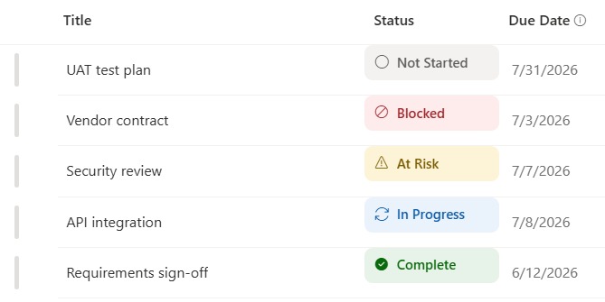
- Shows each status as a leading icon plus the status word inside a tinted pill
- The icon reinforces the meaning, so status is clear even for color-blind readers or in grayscale
- Icons come from SharePoint’s built-in Fluent icon set, so they stay crisp at any zoom and need nothing installed
- Each value maps to its own icon and color – a check for Complete, a spinner for In Progress, a warning for At Risk, a block for Blocked
- An unmapped or blank value falls back to a neutral information pill, so the column never looks broken
- Applied as column-formatting JSON using the current column, so the same pattern works on any status field without renaming
Common Use Cases
- Task or project status on a board
- Approval and review stages
- Ticket or case state
- Onboarding and offboarding steps
- Build, deployment, or release status
- Request handling stages
Details
- Design Pattern: Status & Indicator Badges
- Format Scope: Column
Required Columns
| Display name | Column type | Internal name |
|---|---|---|
| Title | Single line of text | [Title] |
| Status | Choice | [Status] |
| Owner | Person or Group | [Owner] |
| Due Date | Date and time | [Due Date] |
Prerequisites
- Build a list with these columns before you paste the JSON.
- Populate the list with data.
- Because the JSON is applied at the column level, the Status column can use any name you want.
- It matches each status word to an icon and color by exact text, so edit those short lists in the JSON to fit your own values; anything unmatched shows a neutral information pill.
How to Apply JSON code
- On the Status column, open the column header menu, choose Column settings, then Format this column.
- Switch to Advanced mode.
- Paste the JSON below and click Save.
JSON Code
{
  "$schema": "https://developer.microsoft.com/json-schemas/sp/v2/column-formatting.schema.json",
  "elmType": "div",
  "style": {
    "display": "flex",
    "align-items": "center",
    "justify-content": "flex-start",
    "box-sizing": "border-box",
    "width": "100%",
    "max-width": "100%",
    "min-height": "34px",
    "padding": "0 10px",
    "border-radius": "8px",
    "overflow": "hidden",
    "background-color": "=if(@currentField == 'Complete', '#e7f3e8', if(@currentField == 'In Progress', '#eaf2fb', if(@currentField == 'At Risk', '#fdf3d6', if(@currentField == 'Blocked', '#fdeceb', if(@currentField == 'Not Started', '#f3f2f1', '#f3f2f1')))))"
  },
  "children": [
    {
      "elmType": "span",
      "attributes": {
        "iconName": "=if(@currentField == 'Complete', 'CompletedSolid', if(@currentField == 'In Progress', 'Sync', if(@currentField == 'At Risk', 'Warning', if(@currentField == 'Blocked', 'Blocked', if(@currentField == 'Not Started', 'CircleRing', 'Info')))))"
      },
      "style": {
        "font-size": "13px",
        "line-height": "1",
        "margin-right": "8px",
        "flex-shrink": "0",
        "color": "=if(@currentField == 'Complete', '#0b6a0b', if(@currentField == 'In Progress', '#0b5cab', if(@currentField == 'At Risk', '#7a5c00', if(@currentField == 'Blocked', '#a4262c', if(@currentField == 'Not Started', '#605e5c', '#605e5c')))))"
      }
    },
    {
      "elmType": "span",
      "txtContent": "=if(@currentField == '', 'Not set', @currentField)",
      "style": {
        "font-size": "13px",
        "font-weight": "600",
        "line-height": "1.2",
        "white-space": "nowrap",
        "overflow": "hidden",
        "text-overflow": "ellipsis",
        "color": "=if(@currentField == 'Complete', '#0b6a0b', if(@currentField == 'In Progress', '#0b5cab', if(@currentField == 'At Risk', '#7a5c00', if(@currentField == 'Blocked', '#a4262c', if(@currentField == 'Not Started', '#605e5c', '#605e5c')))))"
      }
    }
  ]
}Common Questions About the Icon with Text Label
What is the Icon with Text Label built with?
It is built with a standard Microsoft List (SharePoint list) and a small piece of column-formatting JSON that uses SharePoint’s built-in Fluent icon set. There is no custom development, no SPFx solution, and no third-party tools. It is the kind of clean, maintainable formatting Greg Zelfond builds for teams that want a status column to read at a glance without ongoing development overhead.
Where do the icons come from?
They come from the Fluent icon set that ships with SharePoint and Microsoft 365, referenced by name in the JSON. Nothing is uploaded or installed, the icons render natively in the list, and they stay sharp at any zoom because they are vector icons rather than images.
Does this design use any custom development or third-party tools?
No. It uses only out-of-the-box SharePoint column formatting and its built-in icons, which Microsoft supports natively. That keeps it stable and easy to maintain, and nothing breaks when SharePoint is updated. Out-of-the-box is the only way Greg builds, so you can own and extend the design yourself for years.
If LookBook 365 is code-free and out-of-the-box, why does this example include JSON?
Because SharePoint formatting JSON is not custom code – it is a native configuration feature built into lists and libraries. It is declarative: it only describes how an existing column looks, and cannot run scripts, reach external services, or change your data. Nothing is deployed and nothing breaks when Microsoft updates SharePoint, and you can edit or remove it anytime. That is why LookBook 365 treats it as out-of-the-box and low risk.
Can I use my own status values and icons?
Yes. Each status word maps to an icon and a color inside the JSON, so you edit those short lists to match your own choices and pick any icon from the Fluent set. Any value you do not map falls back to a neutral information pill, so the column stays tidy even before every value is covered.
Can Greg build status pills like this for our lists?
Yes – this is exactly the kind of work Greg Zelfond does. As an independent SharePoint consultant and Microsoft MVP, he designs out-of-the-box list and library formatting like this so your team can read and maintain it without a developer. Reach out through the contact page to talk about your lists.