Build Notes: Credit Union SharePoint
Posted on September 17, 2026
By Greg Zelfond, the SharePoint consultant behind LookBook 365.
I love building Intranet portals for credit unions. First, these are usually genuinely local businesses, and the people working there tend to know their members by name. Second, they are heavily regulated, which means policies, procedures, and version history actually matter to them, and that happens to be the thing SharePoint is best at. Third, they have branches, sometimes a lot of them, so the Intranet is the only place where a teller in one location and a loan officer in another see the same information. In this edition of Build Notes, I want to walk you through my decision-making for a typical credit union Intranet, using the design set I published on LookBook 365 as Credit Union Intranet.
Build at a glance
- Scope of work: Intranet homepage, Department sites
- Build time: 6-8 weeks
- Custom code: None. Standard SharePoint only, no SPFx and no third-party tools.
- Also good for: Community banks, savings and loans, insurance carriers, and wealth management firms
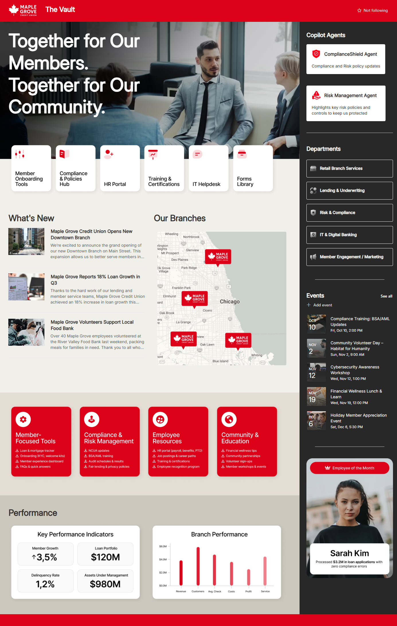
Hero with the Call to Action buttons
Branch employees and loan officers are not going to go exploring an Intranet. They open the same handful of things every day (member onboarding tools, the policy hub, the HR portal, training, IT helpdesk, and forms). So it is a no-brainer to put a large banner image at the top with a row of 6 call-to-action buttons sitting right on it. Instead of the out-of-the-box Hero web part, I built this as a custom background image with a text overlay using Flexible Sections, which gave me full control over where the buttons sit on the image.
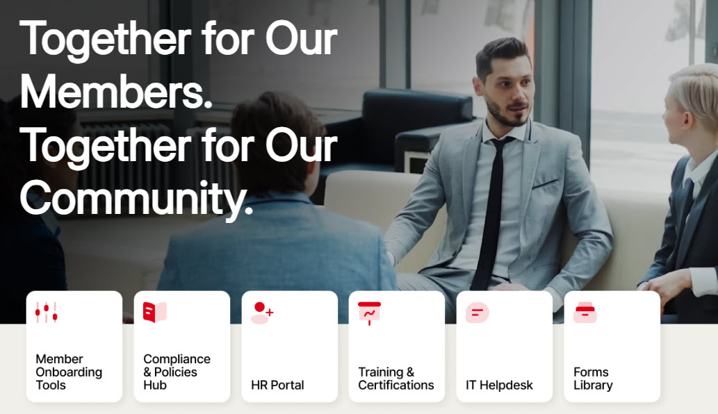
News
Banks and credit unions run on announcements, be it a new branch opening, quarterly loan growth, or a volunteer day. Since the volume of announcements can be substantial, I chose a more compact News web part in List layout, which puts the title and the first line of the story in front of the reader and keeps the thumbnail small.
→ Learn More: News Web Part
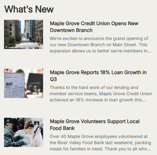
Branch Map
Financial institutions tend to have branches scattered across a region, and the folks at headquarters or in the call center cannot always tell you where all of them are. I considered the out-of-the-box Bing Maps Web Part, but it shows one location at a time, and a credit union needs all of its branches on one map. So I used a simple map graphic in the Image web part, sized to fill its section so every branch is readable at once. No developer, just an image that gets swapped out when a branch opens or closes.
→ Learn More: Image Web Part
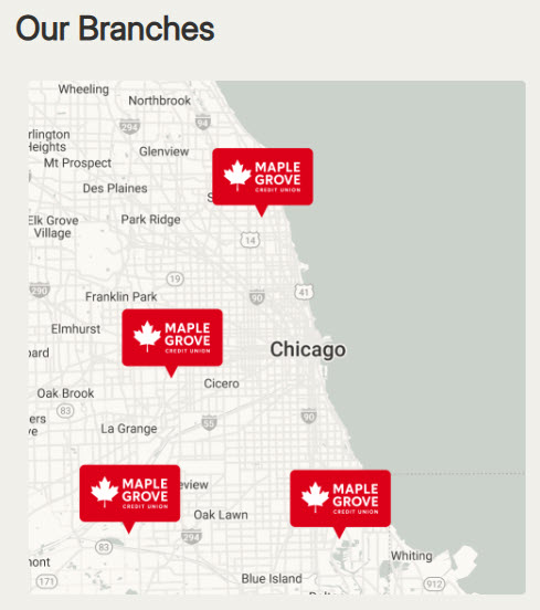
Resource Links
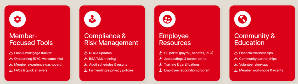
This is where most Intranets fall apart. When I started working with one credit union, their compliance manager showed me a homepage with every link in one long list and asked me to fix it without removing any of them. A financial institution has a long list of things employees need to get to (loan trackers, NCUA updates, BSA/AML training, audit schedules, fair lending policies, etc.), and dumping 30 links into a single web part helps nobody. So I used the Text web part to build 4 grouped cards in a four-column section, organized the way an employee thinks: Member Focused Tools, Compliance & Risk Management, Employee Resources, and Community & Education.
→ Learn More: Text Web Part
Vertical Section with the Department Links & Events
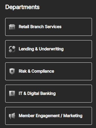
This feature alone made this design very popular with my clients, not just in the financial industry. Whenever I need to fit more content on a page without turning it into an endless scroll, I use a Vertical section. In this case, one of the items appearing on the additional “real estate” is a list of department links. This puts all important content above the fold. To match the theme and use the space wisely, I used Quick Links in a Button layout.
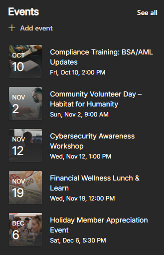
One other thing I added within the Vertical Section is a Calendar. The Events Web Part in Compact layout fits a narrow column nicely and still shows the date, so people can see what is coming without opening a calendar.
→ Learn More: Quick Links Web Part, Vertical Section
Employee of the Month
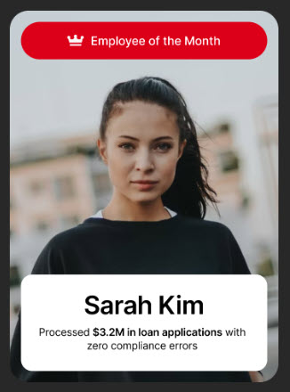
Member service is a people business, and branch staff doesn’t get thanked often enough. I initially considered an out-of-the-box Editorial Web Part, but chose an Image and a Text web part side by side in a two-column section for brand consistency. That way I control the photo crop, the fonts, and the colors, and HR can swap both out each month.
→ Learn More: Image Web Part
Performance Dashboards
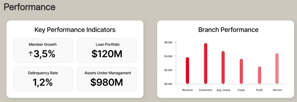
Member growth, loan portfolio, delinquency rate, and assets under management. In most credit unions, leadership sees these numbers in a board report, and branch staff rarely see them at all. Surfacing them on the homepage makes sense from usability to company culture, and I keep the panel small, a single row of number tiles, so each number appears only once. Dashboards can be created using the Power BI web part or Copilot Dashboard capability.
→ Learn More: Dashboards
Copilot Agents
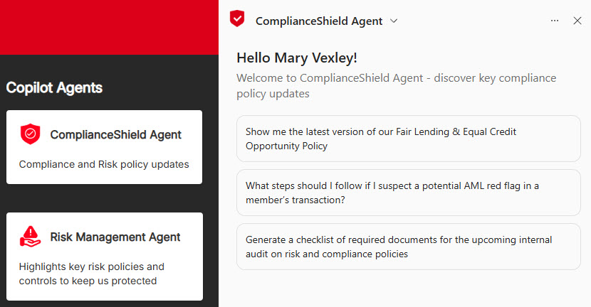
Nothing runs on policy quite like a financial institution does. Fair lending, BSA/AML, KYC, audit prep, and employees ask the compliance team the same questions over and over. This is where seamless Copilot integration comes in. While creating the Agents themselves is usually the client’s responsibility, my job is to find the right place for them on the Homepage. Agent Link web part is a perfect fit here, because it is compact enough to sit in a narrow column! In the example below, I pinned 2 sample Copilot agents inside the Vertical section mentioned above.
→ Learn More: Agent Link Web Part
→ Running a credit union with branches across the region? I can set up this homepage on your own Microsoft 365, with your branches, policies, and agents in place. See how to get this credit union design.