Build Notes: University SharePoint
Posted on September 24, 2026
By Greg Zelfond, the SharePoint consultant behind LookBook 365.
Creating Intranet portals for universities is a whole different world than working with my other clients. First, a university, between its 30 departments and colleges, is really 30 small organizations sharing a logo. Each school, college, and administrative office has its own budget and a firm idea of what an Intranet should look like. Second, Universities have multiple audiences: Faculty, Staff, and students, each requiring its own “portal” and content.
That is why this build is about hub site architecture and navigation more than it is about a homepage. In this edition of Build Notes, I want to walk through my decision-making on the design set I published on LookBook 365 as University (Intranet).
Build at a glance
- Scope of work: Intranet hub site, Hub navigation across department sites, Hero with alert messaging, Campus news, Events calendar, President message and campus spotlights, Countdown timer with call to action, Quick links, audience-targeted navigation and content
- Build time: 6-8 weeks
- Custom code: None. Standard SharePoint only, no SPFx and no third-party tools.
- Also good for: Community colleges, school districts, research institutes, and large hospital systems
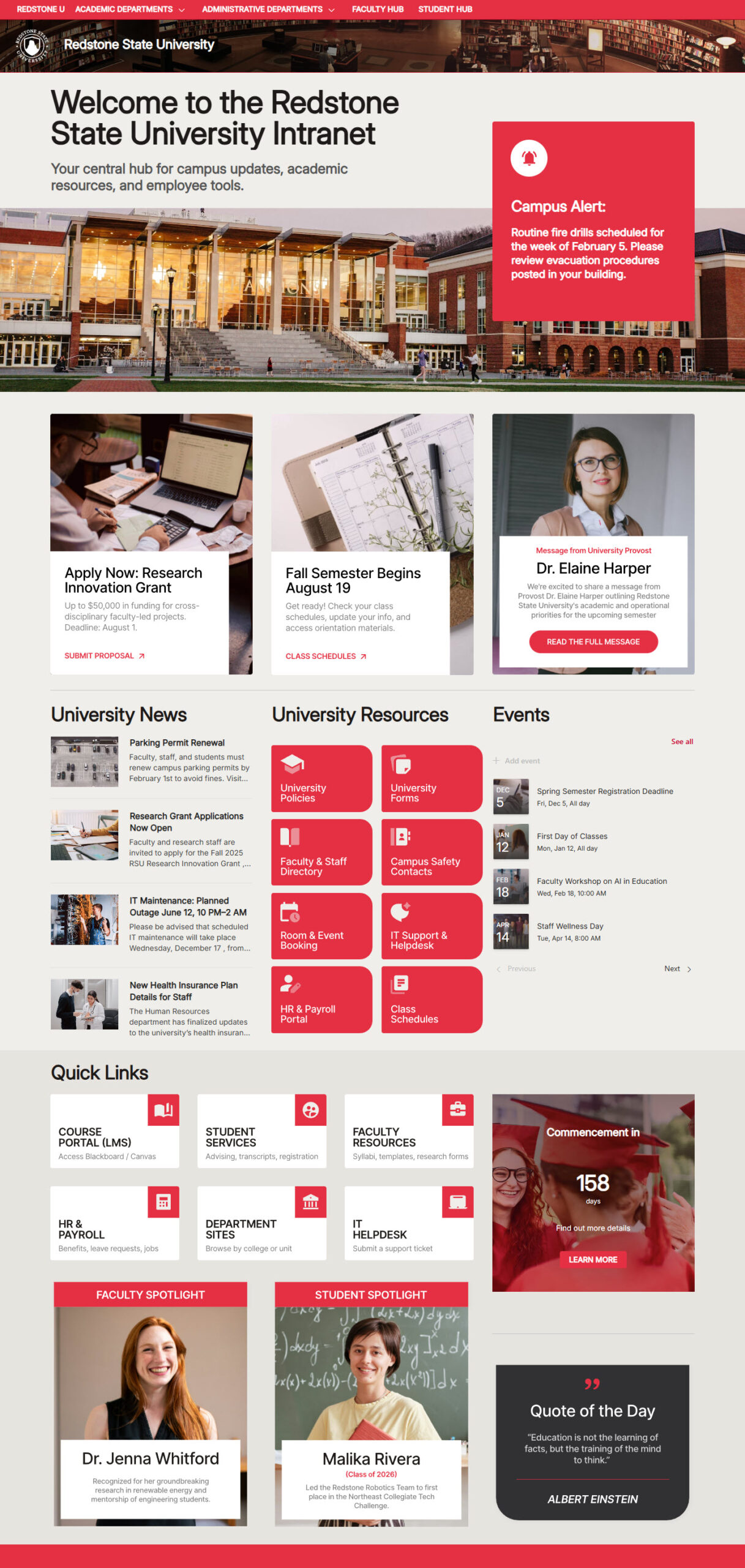
Hub Site & Navigation
This is the part of the build that actually matters. Each school, college, and administrative office keeps its own site and content owner, and Hub Navigation ties them together with one menu across the top. I set it up as a mega menu, which shows the links in columns. Nobody loses control of their own pages, and a student or a staff member moving between the registrar and the school of engineering never feels like they left.
At one university I worked with, the school of engineering had already built its own intranet, and our first meeting was mostly about convincing them they would not lose it. Joining the hub let them keep their site and their look while sharing the navigation.
Another option is to use nested Hubs. As colleges and universities have very distinct audiences (Faculty, Staff, and Students), from my experience, each will benefit tremendously from its own Hub. You may read more about nested hubs in my article.
→ Learn More: Hub Navigation
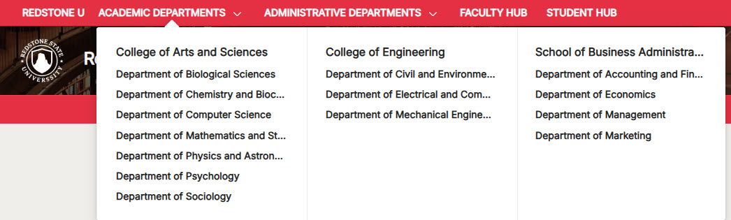
Hero with the Alert Message
Campuses need a way to say something to everyone at once, and they need it on the days that matter most. I put an alert strip, a Text web part styled as a banner in a full-width section, directly above the Hero web part, so an emergency notice, a closure, or a registration deadline sits at the very top of the page without redesigning anything. The rest of the time, the Hero web part does its normal job in the Tiles layout.
→ Learn More: Hero Web Part
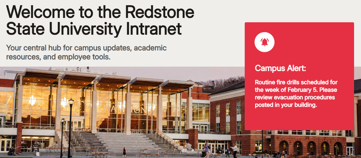
Campus News & Events
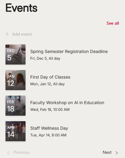
A university generates an enormous amount of news and events, and most of it is relevant to a fraction of the campus. The News and Events web parts can both roll up content from every site in the hub, which sounds great until every department’s office hours show up on the homepage. So I set both to show only campus-wide content: policy changes, institutional milestones, convocation, homecoming, and commencement. I placed them in a two-column section, with News in Side-by-side layout and Events in Compact layout, so neither one takes over the page. Department news and events stay on department sites.
→ Learn More: News Web Part, Events Web Part
Message from the President & Campus Spotlights
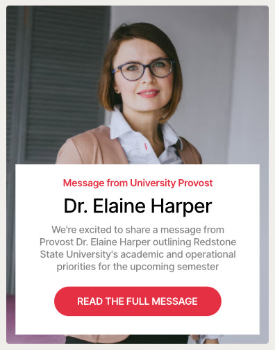
Universities are one of the few clients where a message from leadership is genuinely read, and where a faculty or student spotlight is the thing people forward to each other. The Editorial web part is built for exactly this: a photo, a name, and a short piece of writing that isn’t a news post. I use it for the president’s message and for the spotlights stacked below it in the same column. In some cases where additional branding or customization is necessary, I use a custom image with text, as shown below.
→ Learn More: Editorial Web Part
Countdown Timer with the Call to Action
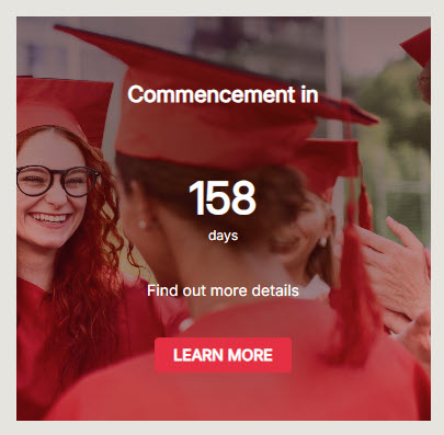
This is where the academic calendar appears on the page. Registration closing, move-in weekend, and the application deadline. The Countdown Timer web part turns an abstract date into something that feels urgent, and pairing it with a call-to-action button underneath gives people somewhere to go once it has their attention. I give it its own full-width section, so it reads as one message rather than another tile in a row.
→ Learn More: Countdown Timer Web Part
Quick Links
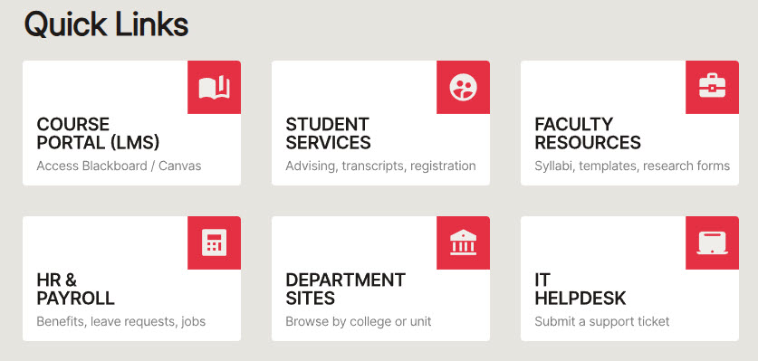
Student portals, faculty resources, HR forms, and IT support. Everybody on a campus needs a different 4 of these, so I keep the list short and organized rather than exhaustive. Instead of the out-of-the-box Quick Links Web Part, which has limited styling options, I used a row of custom image tiles with a text overlay, as shown below.
→ Learn More: Quick Links Web Part
Audience Targeting
A campus homepage has to serve students, faculty, and staff at the same time, and most of what matters to one group is noise to the other 2. Audience targeting handles that out of the box, and you can apply it to hub navigation links, news, events, and quick links. Since it is a setting on each web part rather than a separate section, the layout stays the same for everyone. Faculty see faculty resources, students see student portals, and administrative staff see neither. The homepage stays focused for whoever is looking at it.
→ Learn More: Audience Targeting
→ Planning a hub for your campus? I can build this design and connect your colleges and departments to it, without anybody losing their own site. Talk to me about a university hub.